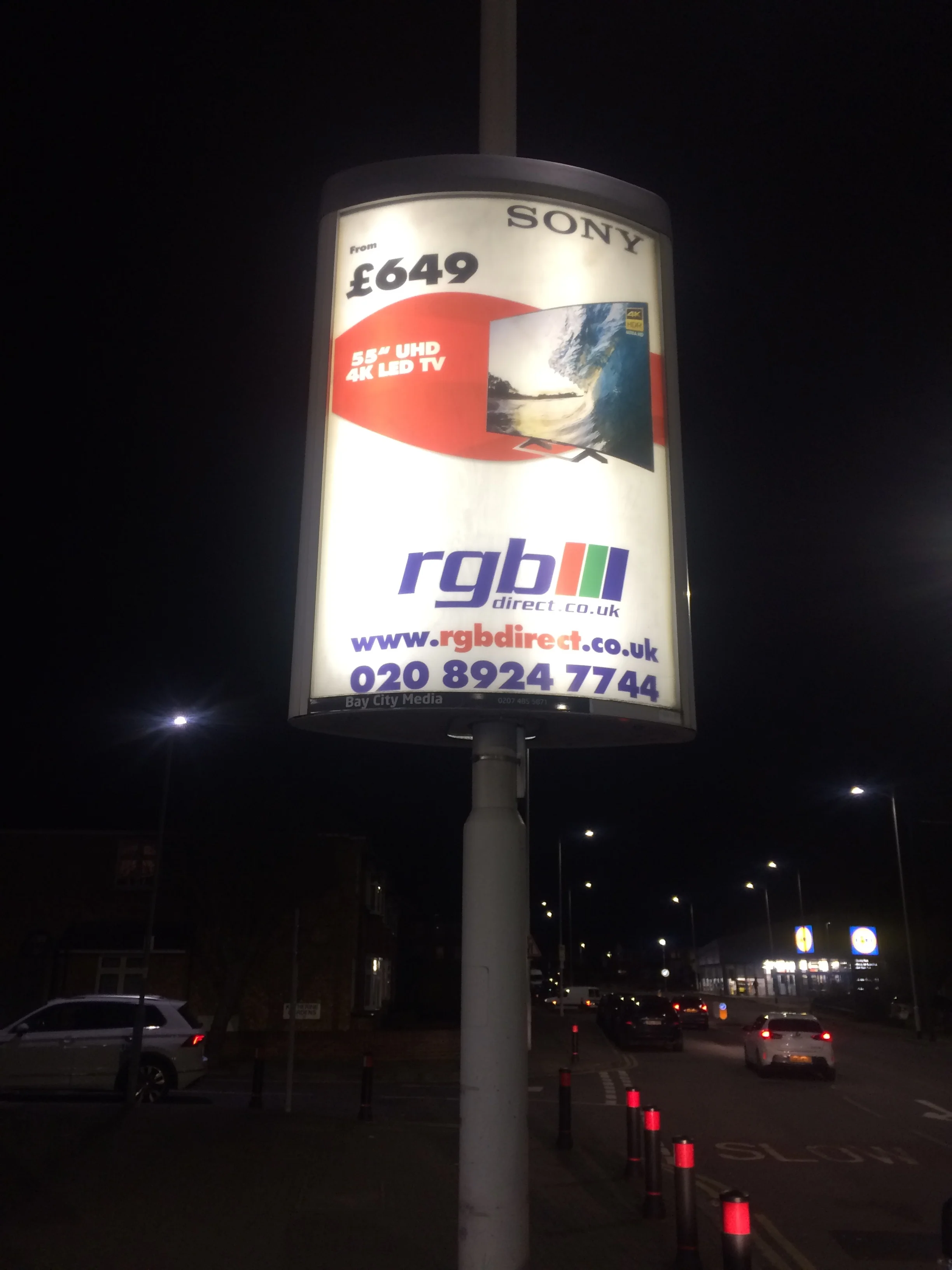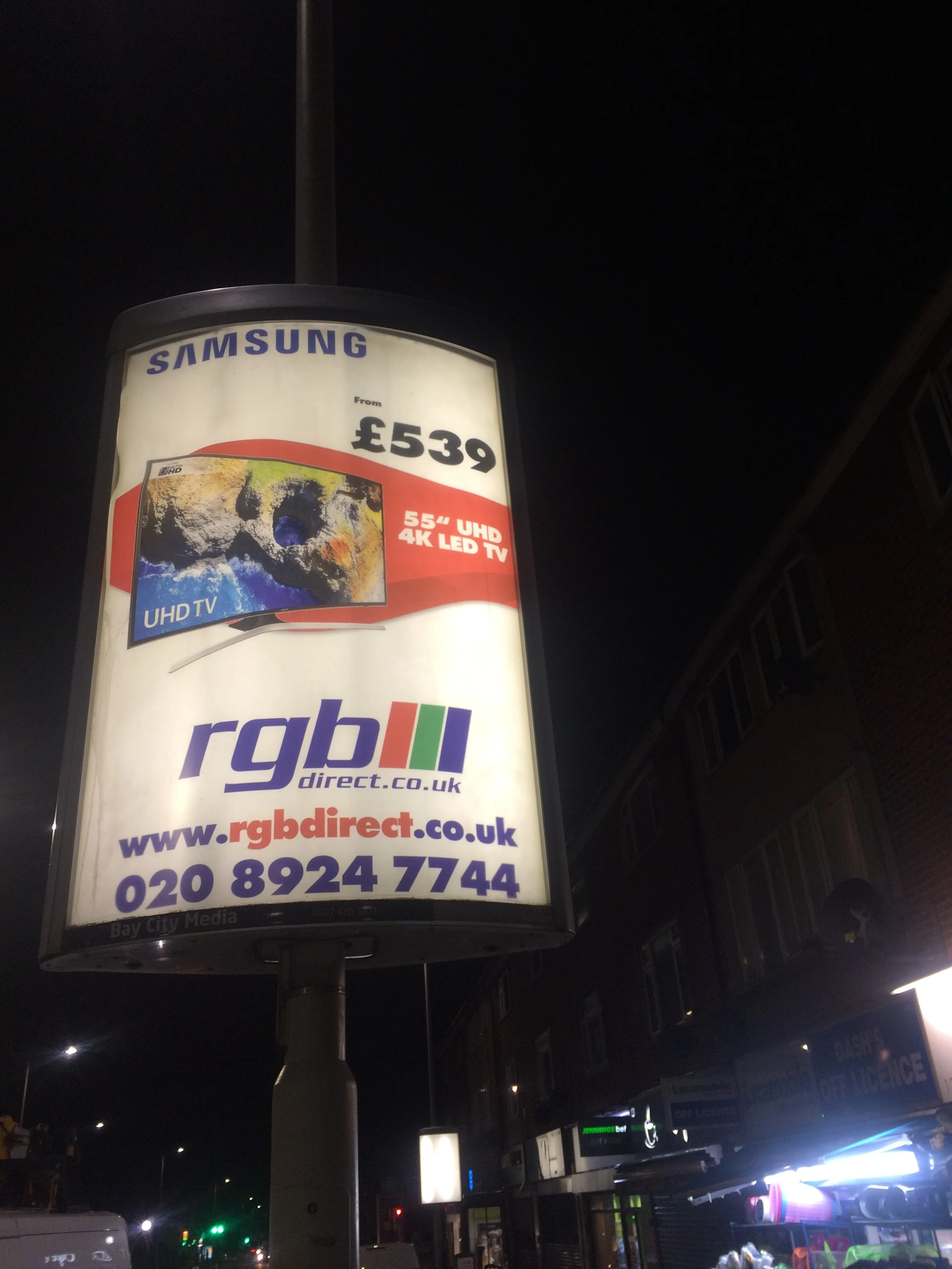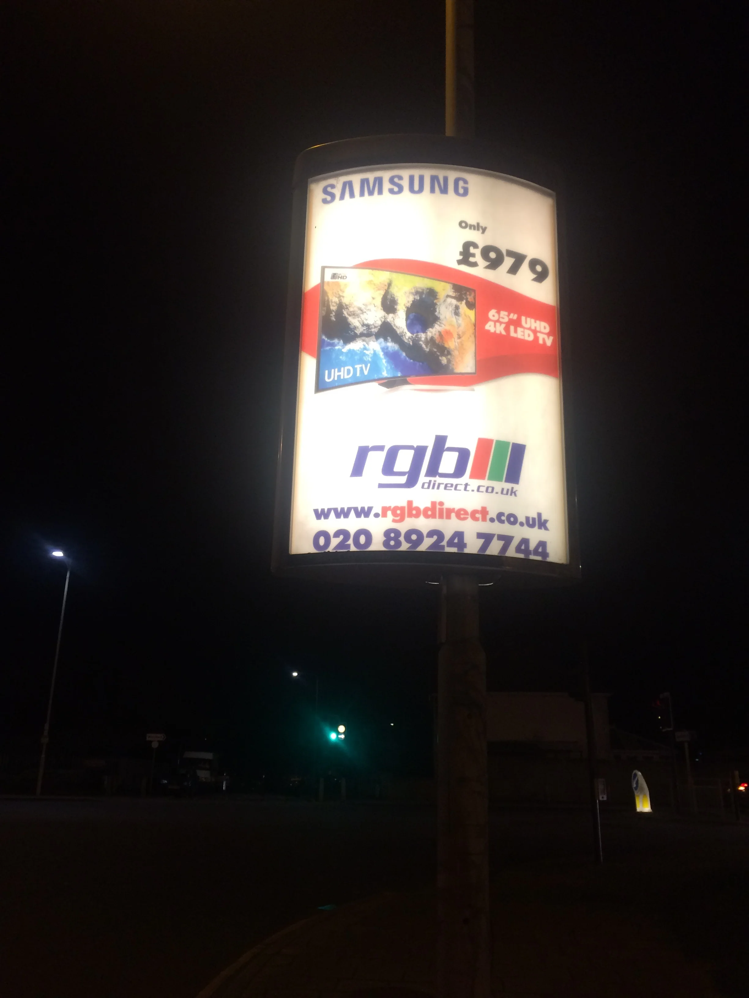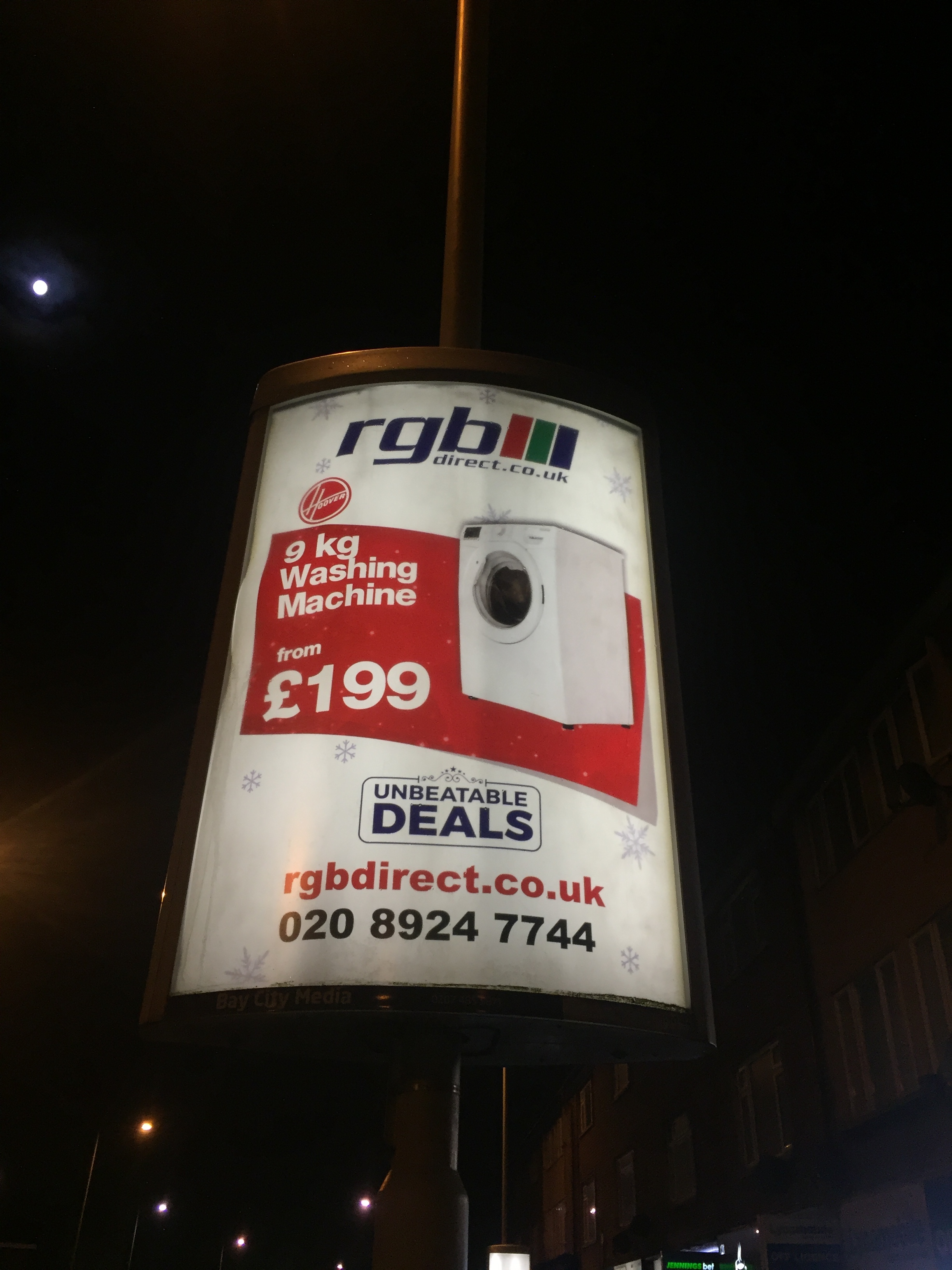
Graphic Design
Graphic Design
My goals as a graphic/multimedia/ e-learning designer are as follows
Creating a design that can make complex subjects easy to understand.
Make the content NOT boring.
Break it to small chunks to make it engaging.
Create diverse and inclusive designs.
Grow creatively by adapting contemperory techniques and staying upto date with the new trends.
Make the design personal so the viewers can relate to them.
Less is more.
Learn new software to make life easy and for effective time management.
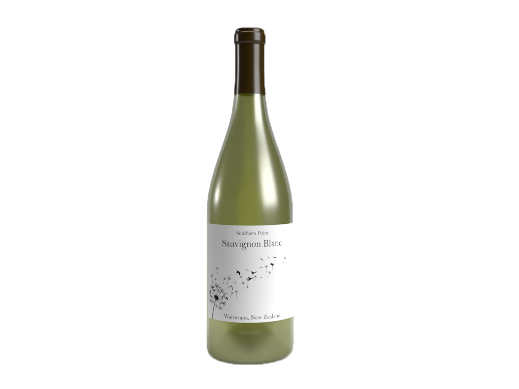
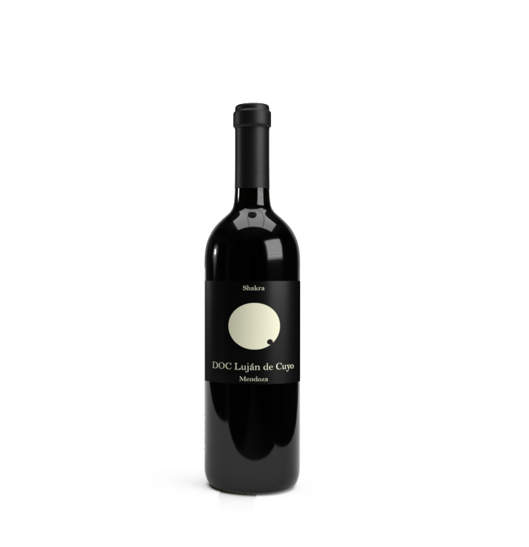
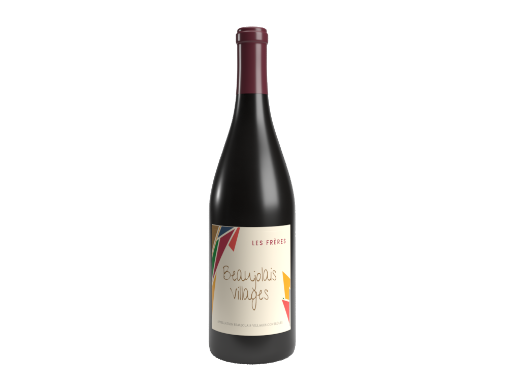
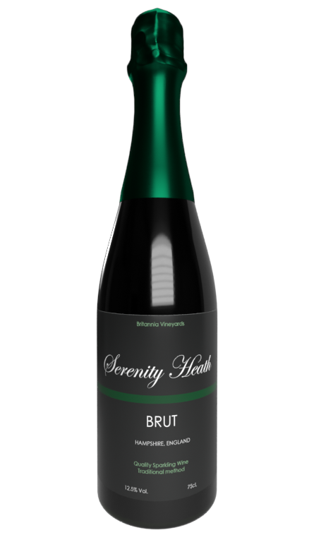
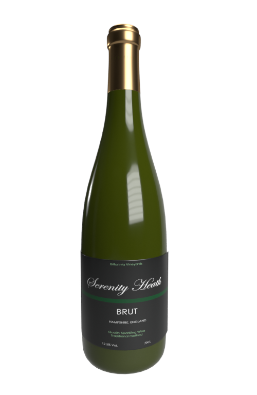
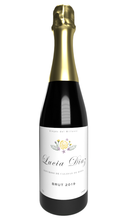
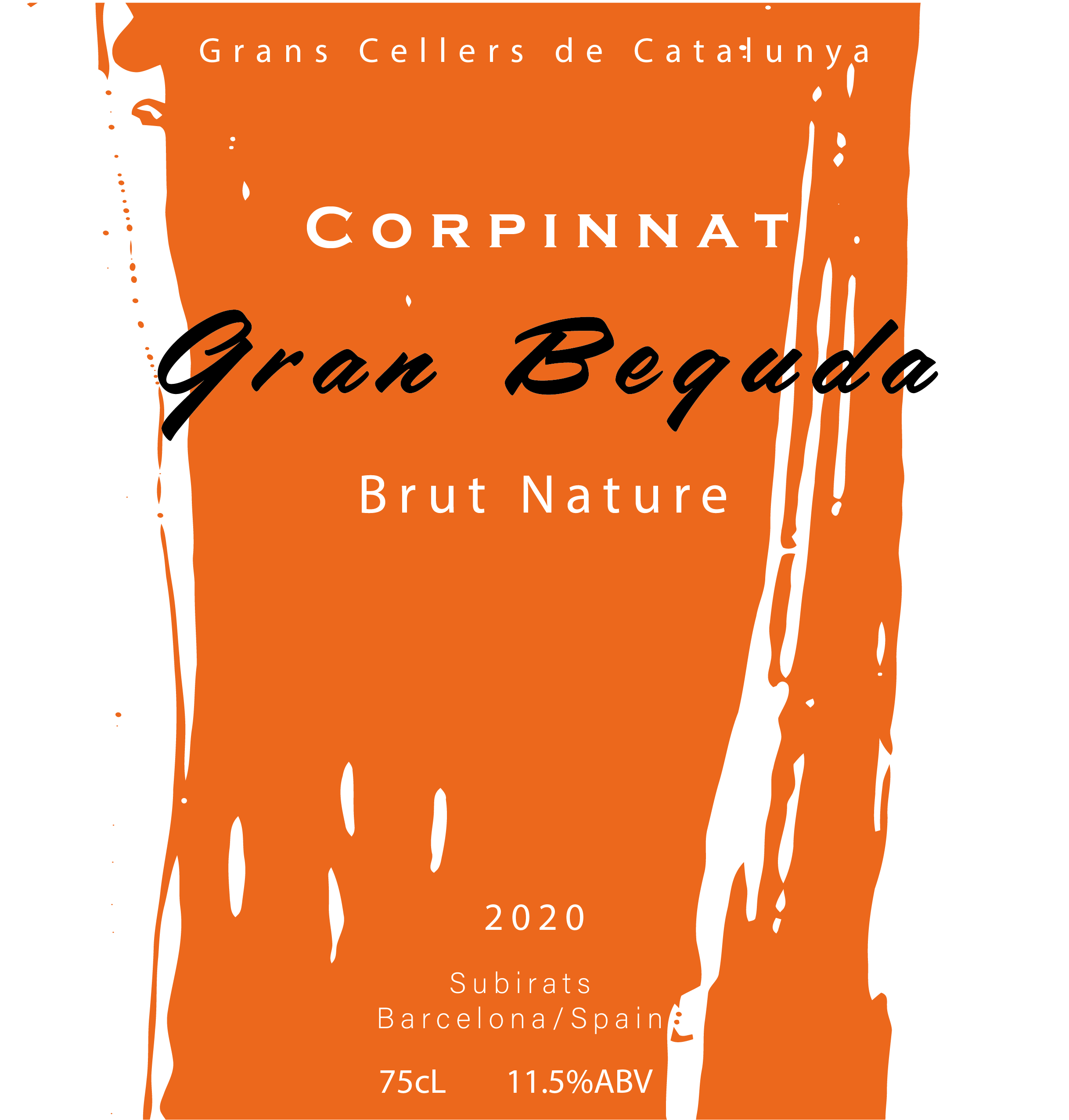
WINE LABELS ON 3D BOTTLES
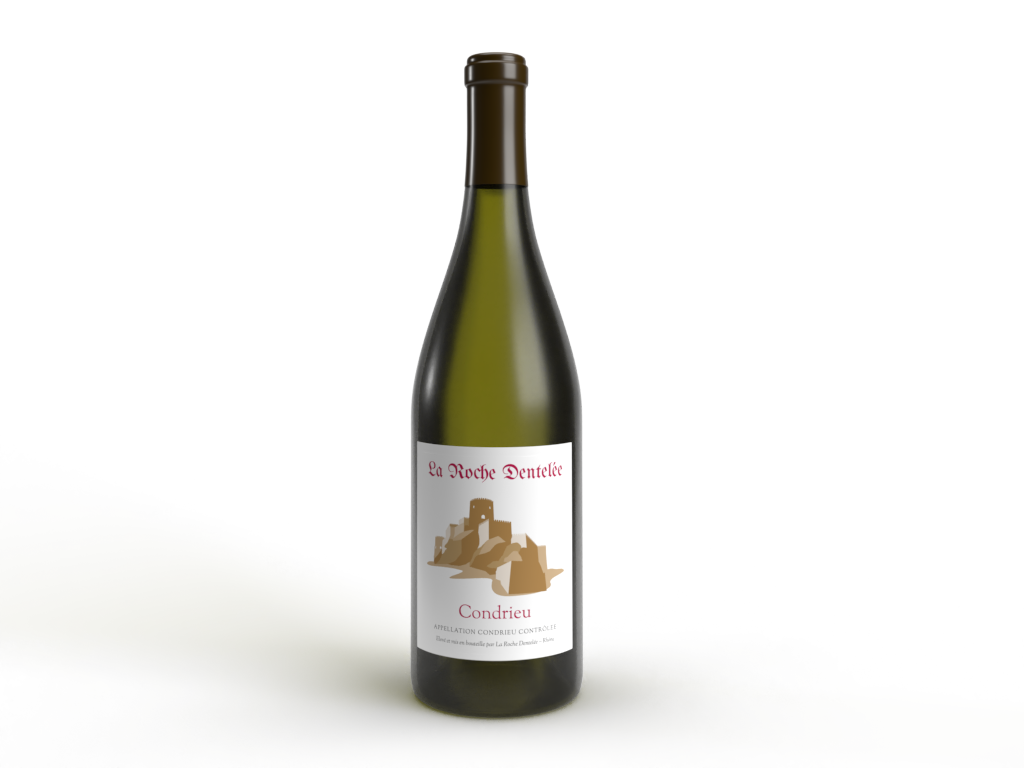
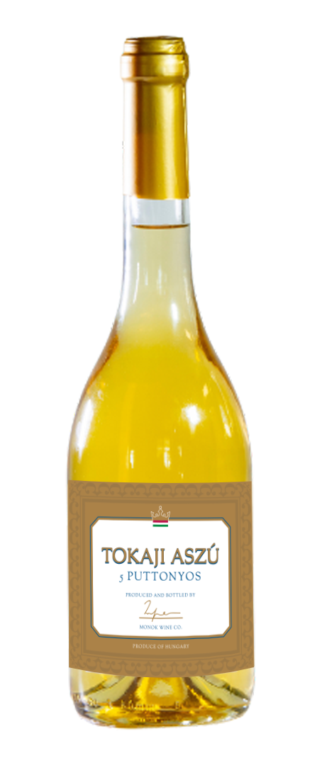
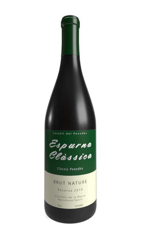
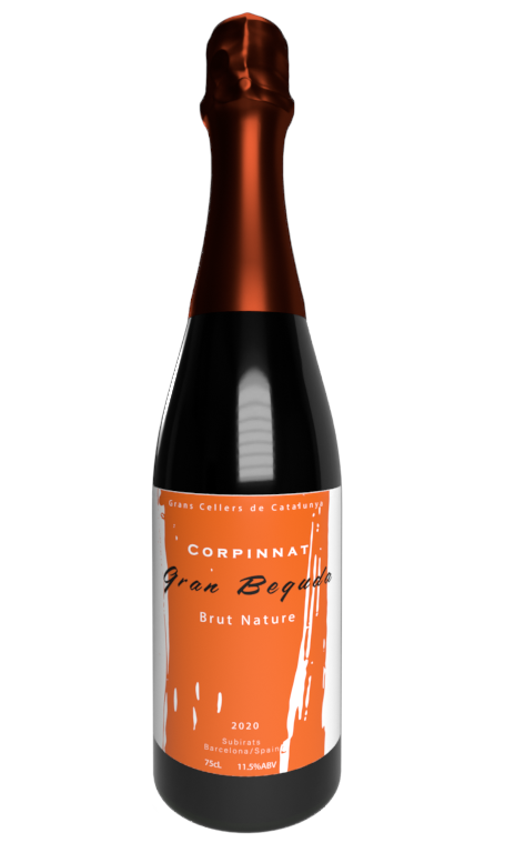
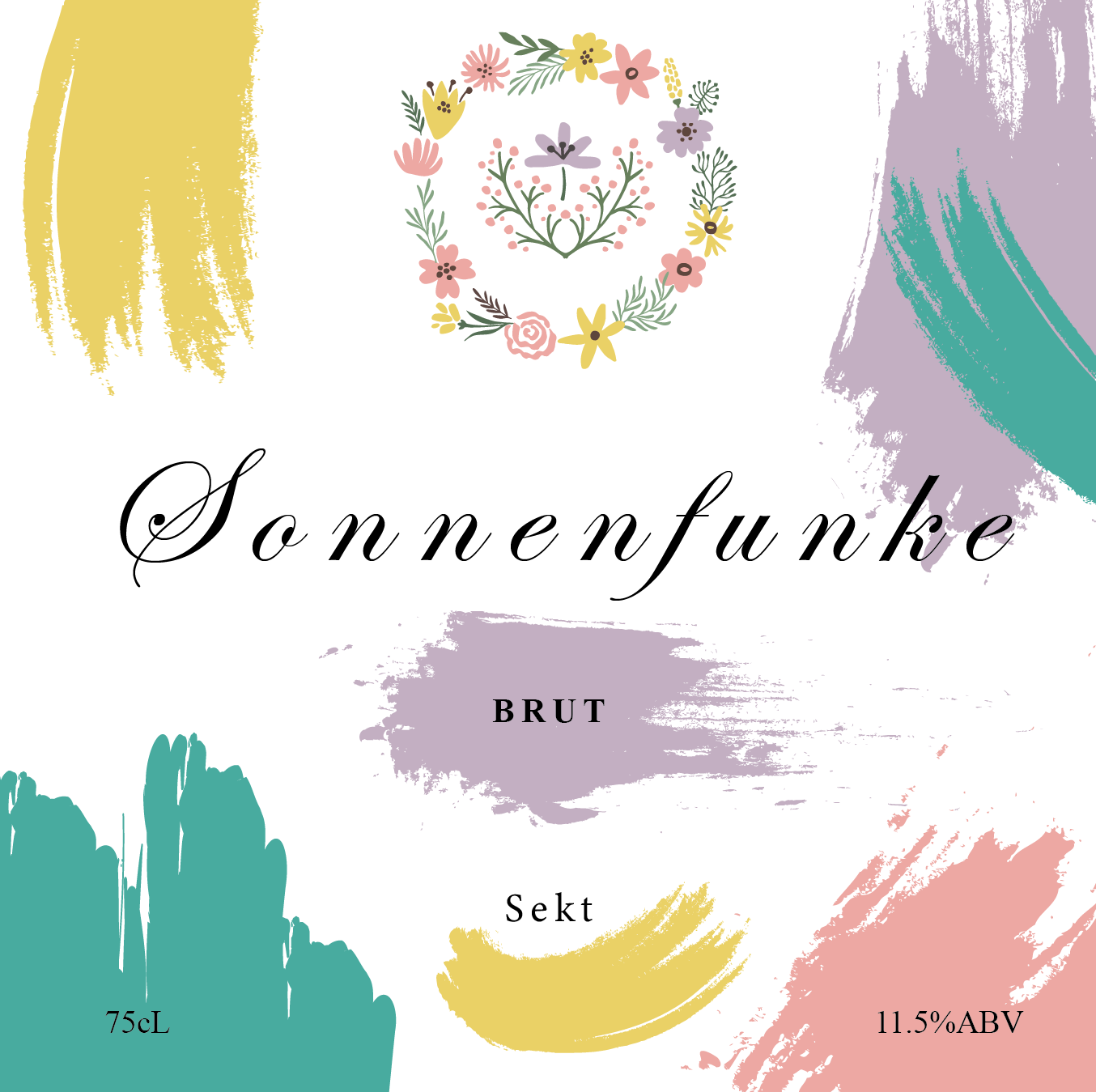
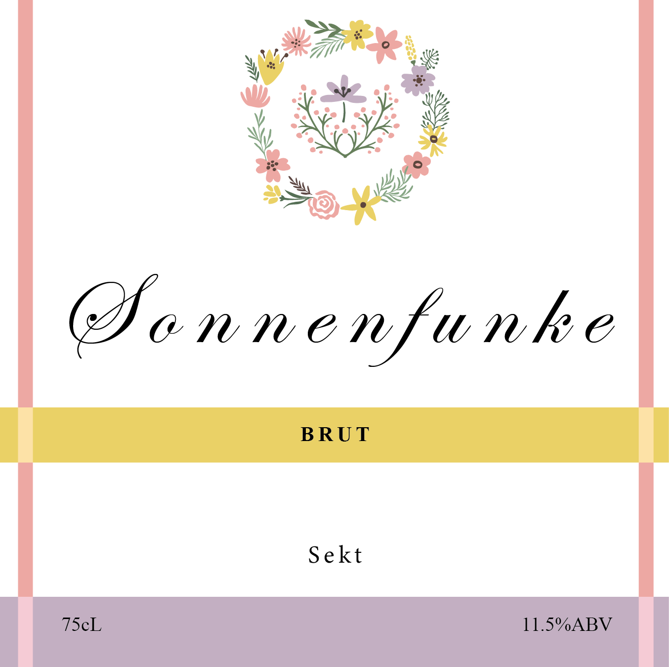
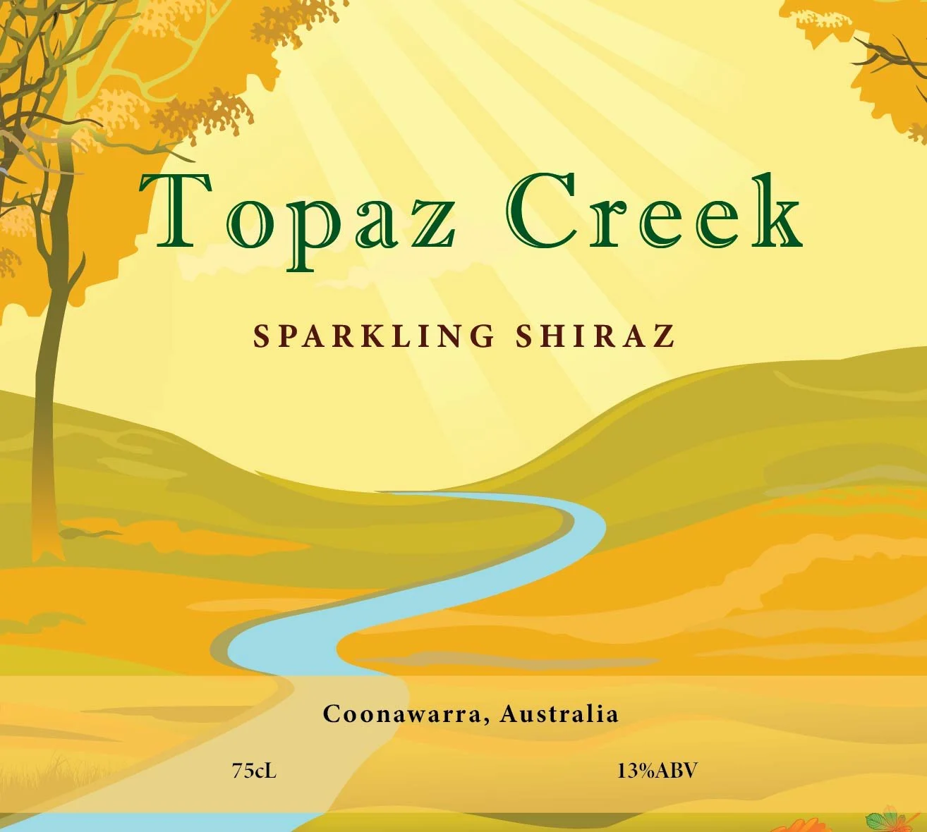
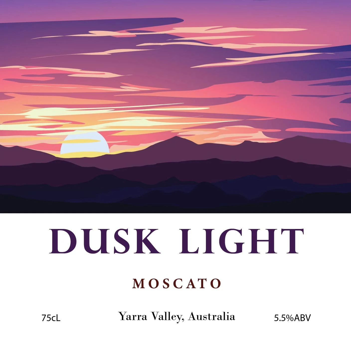
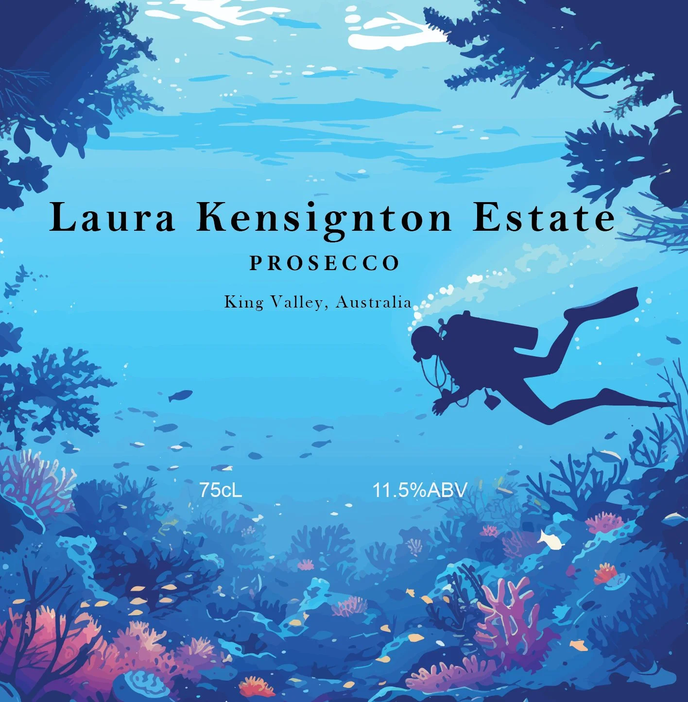
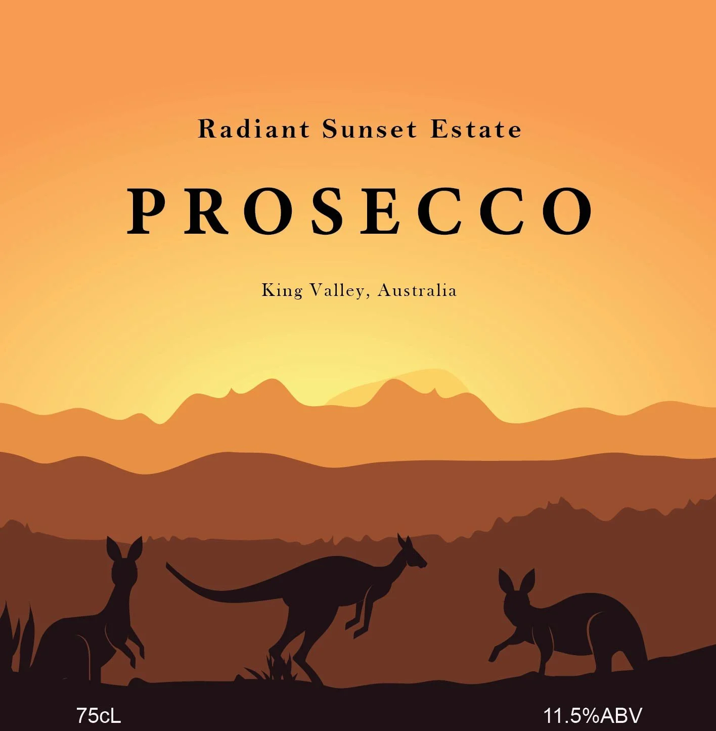
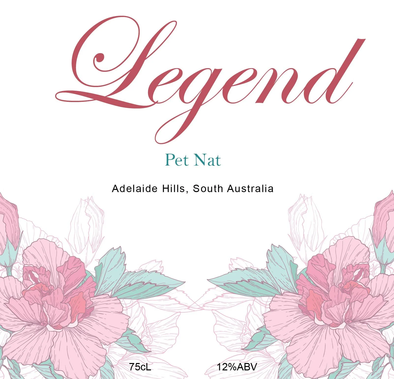
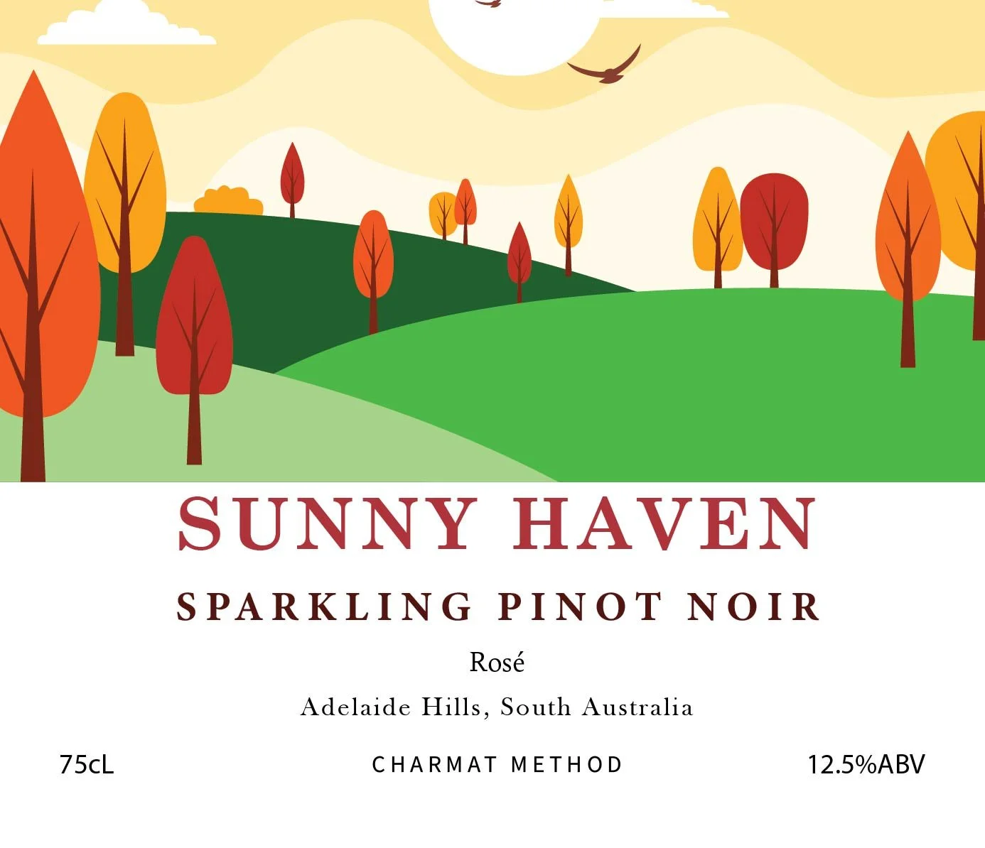
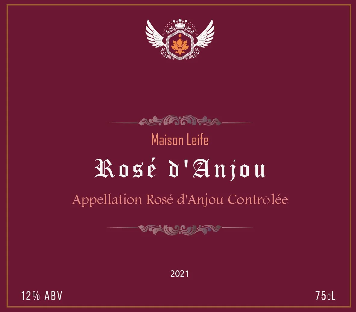
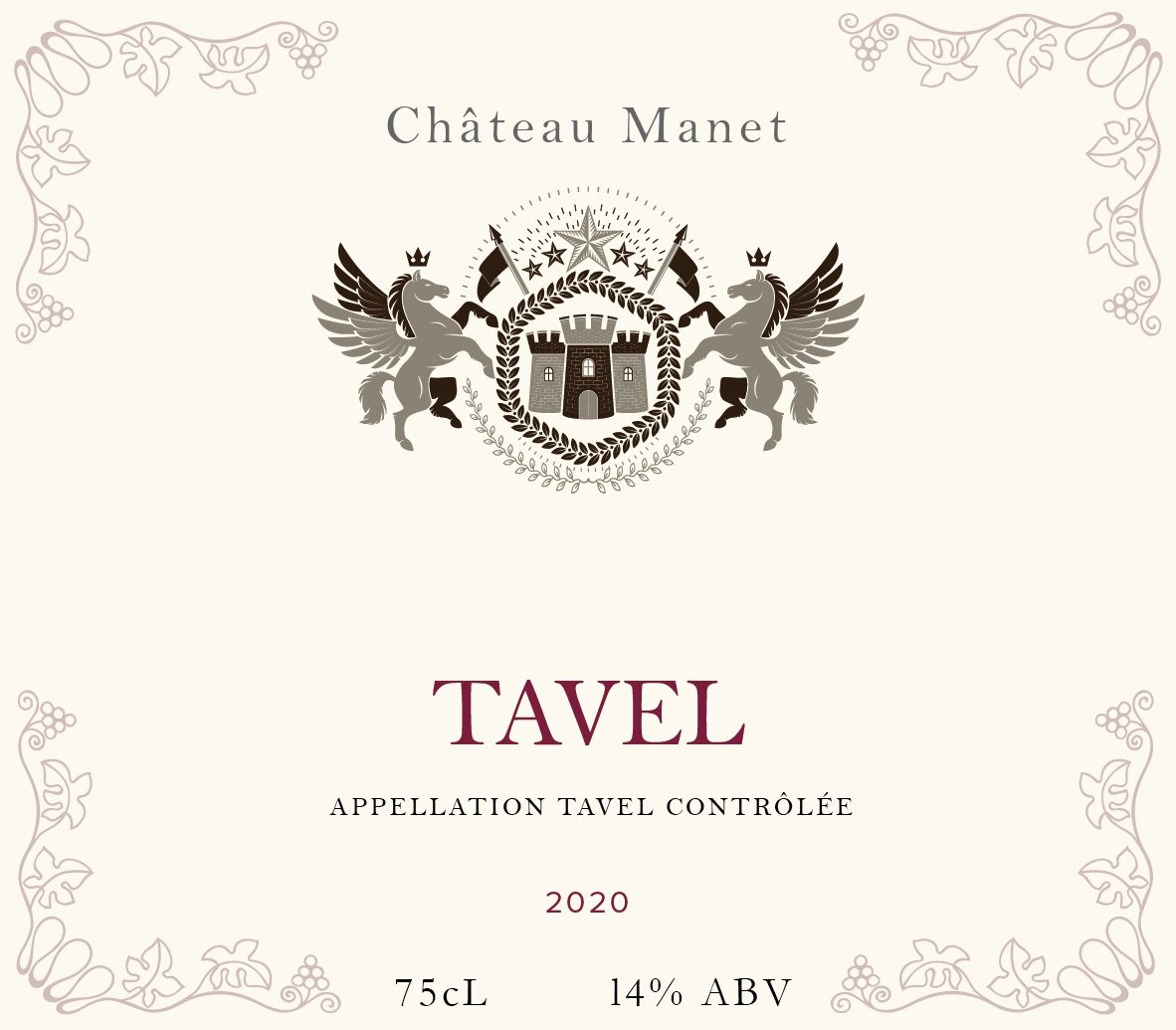
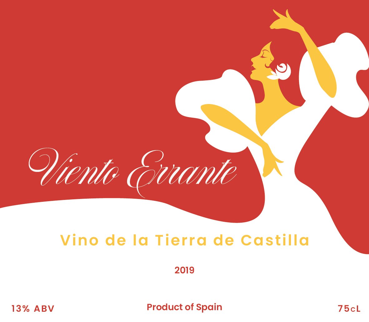
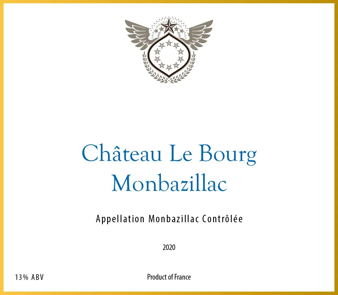
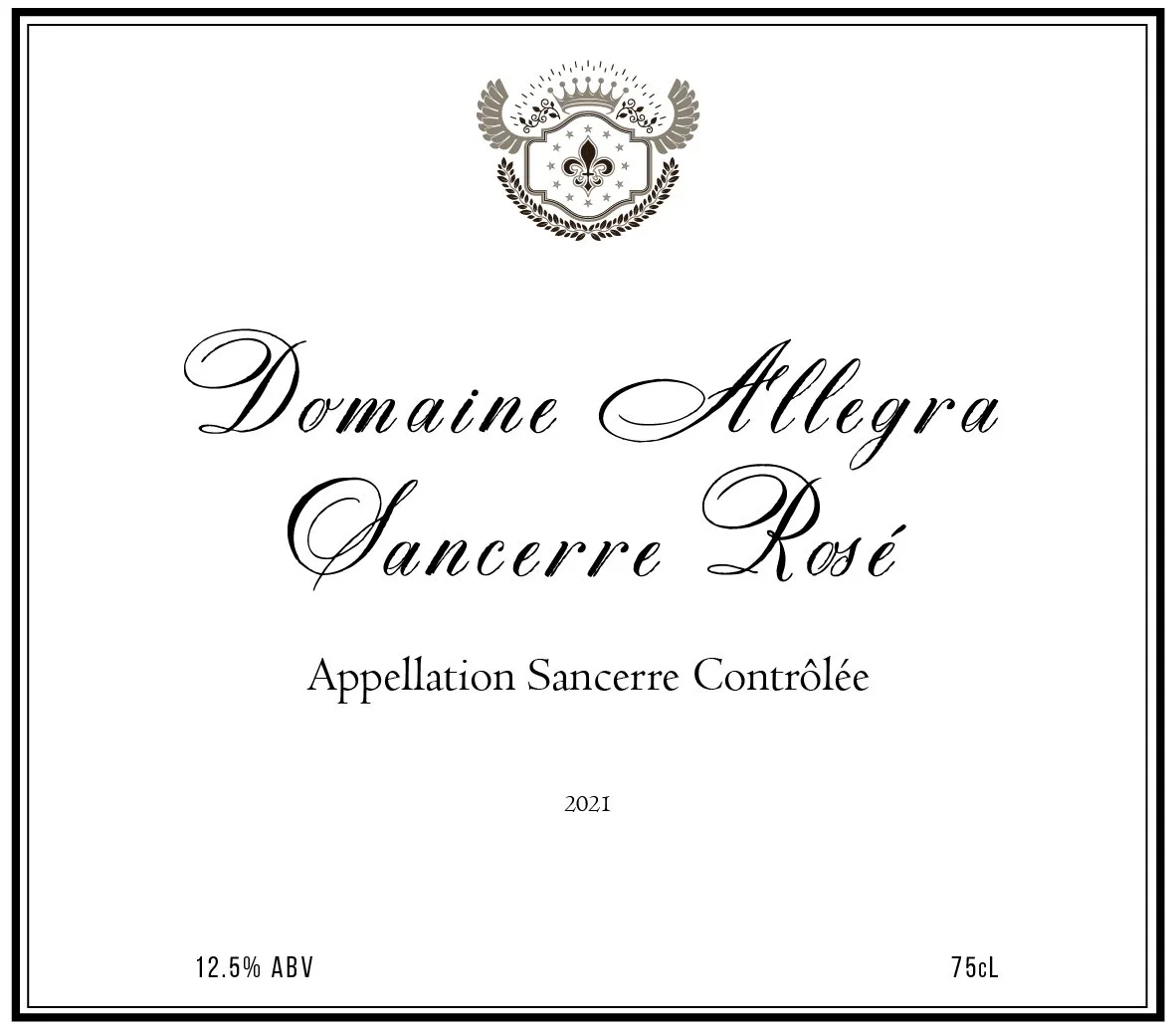
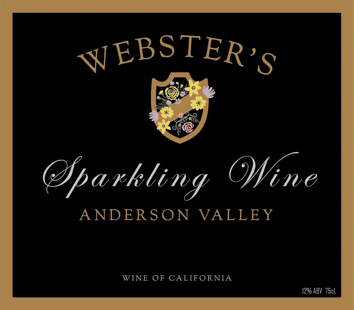
I initiated the idea by pitching it to the head, drawing on my experience with 3D software and past projects. I’ve been working on wine labels for the WSET course for some time now. At first, the plan was simply to apply flat label images within the course materials, but we decided to take it a step further by placing them on 3D bottle models. This approach provides students with a more realistic, tactile sense of how the labels sit on actual bottles and noticeably enhances the overall learning experience for those pursuing the wine qualification.
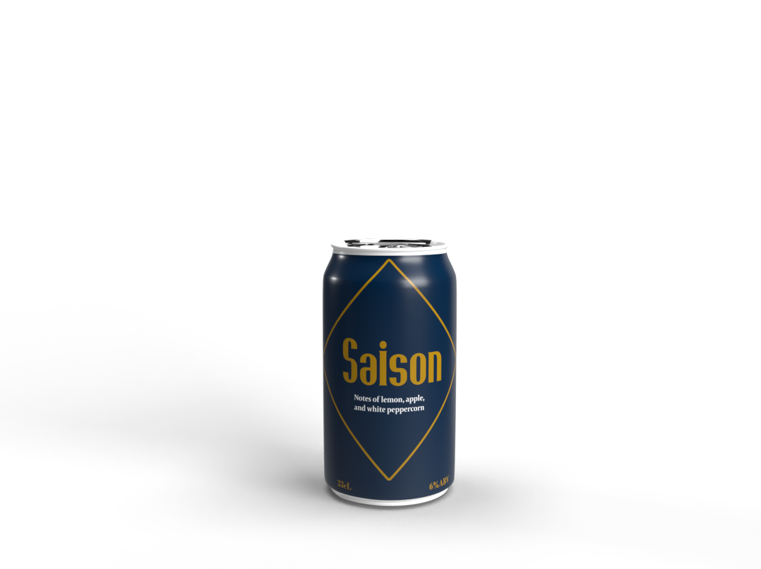
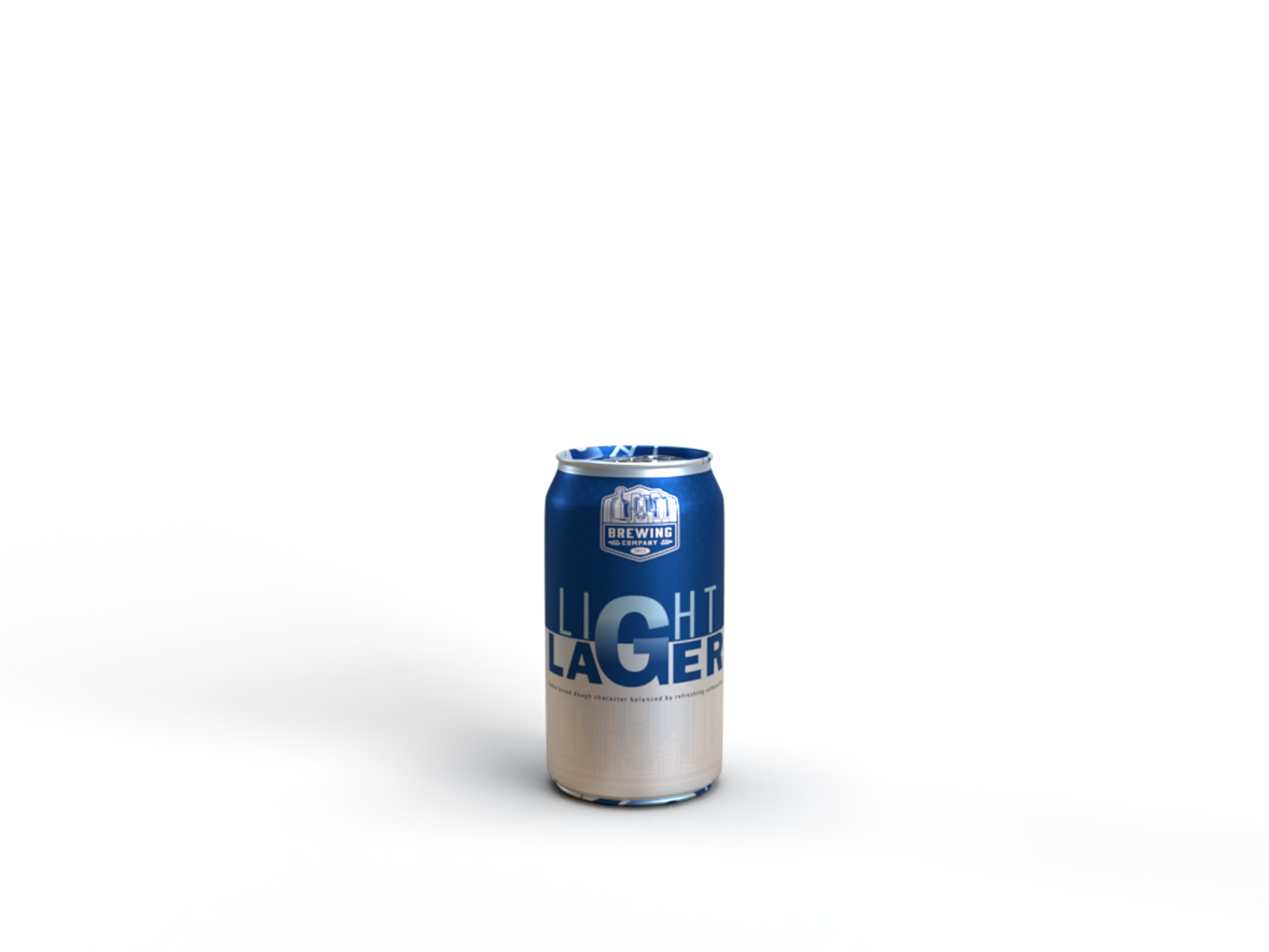
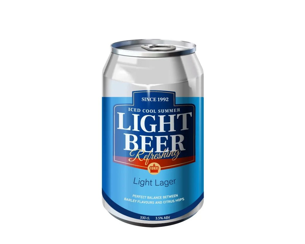
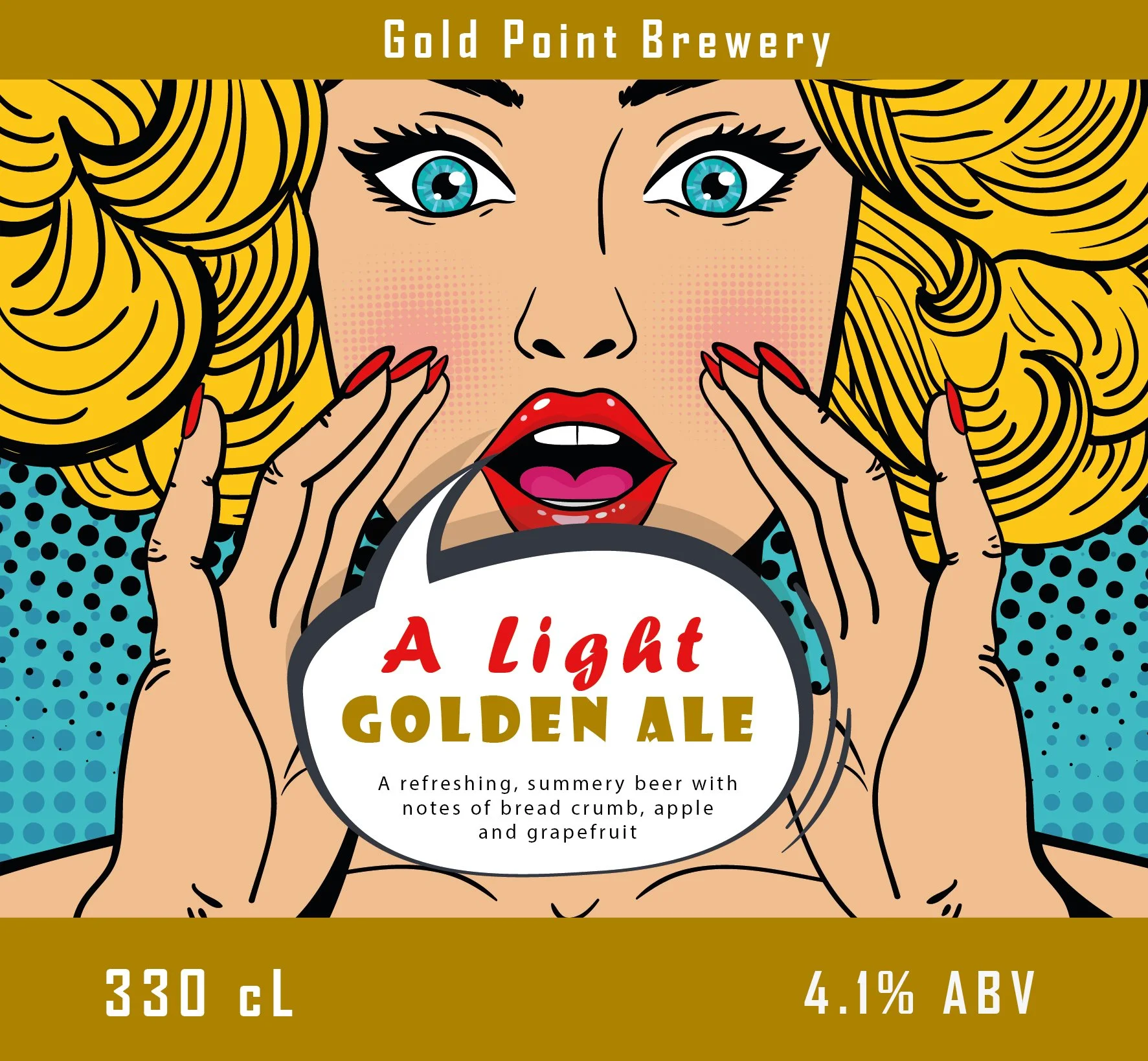
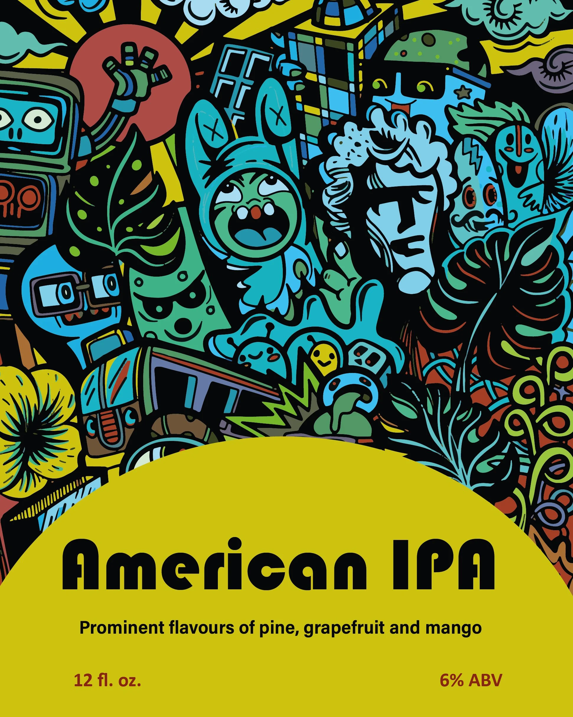
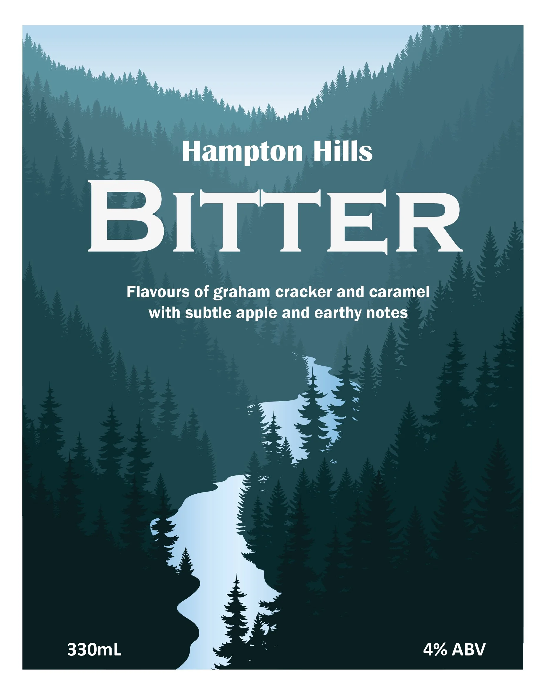
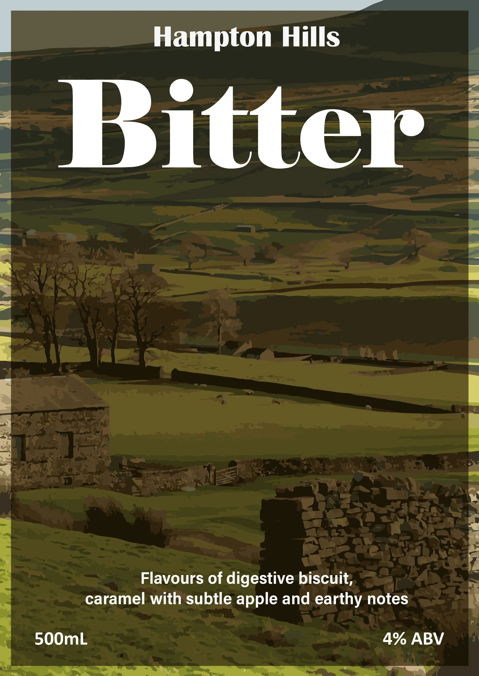
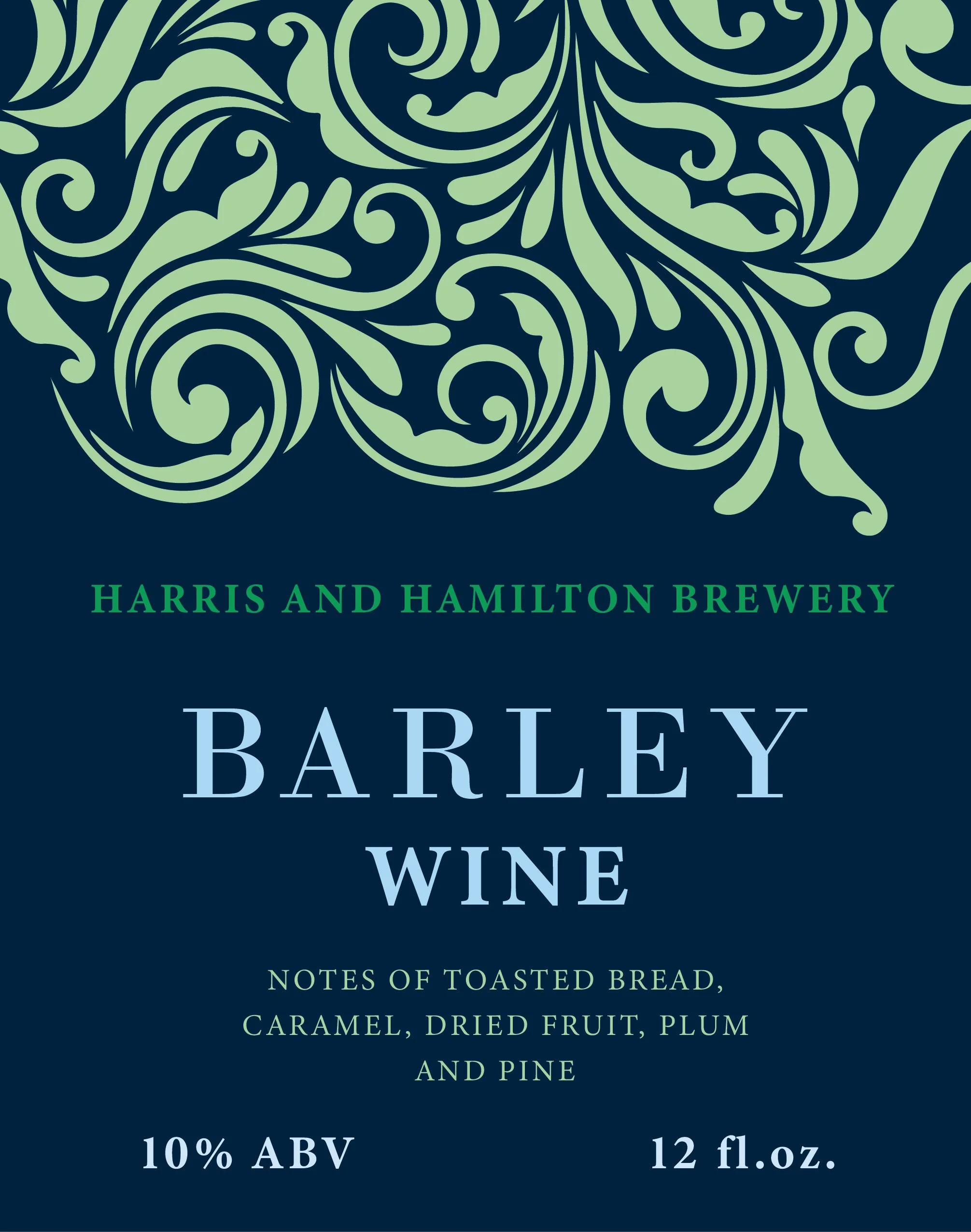
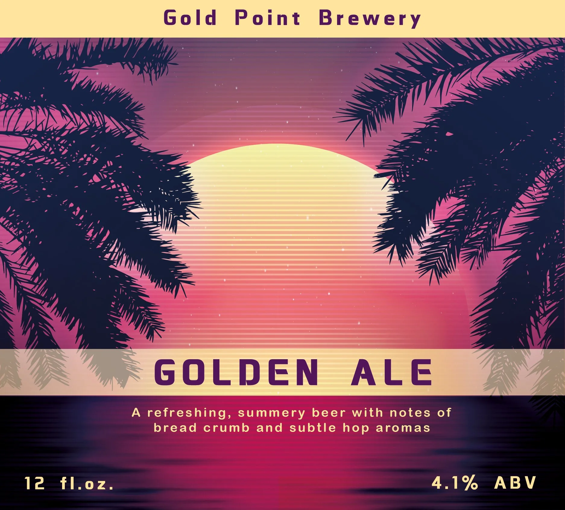
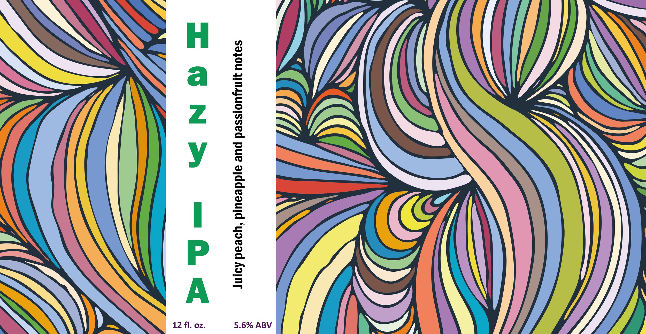
BEER LABELS ON 3D CANS
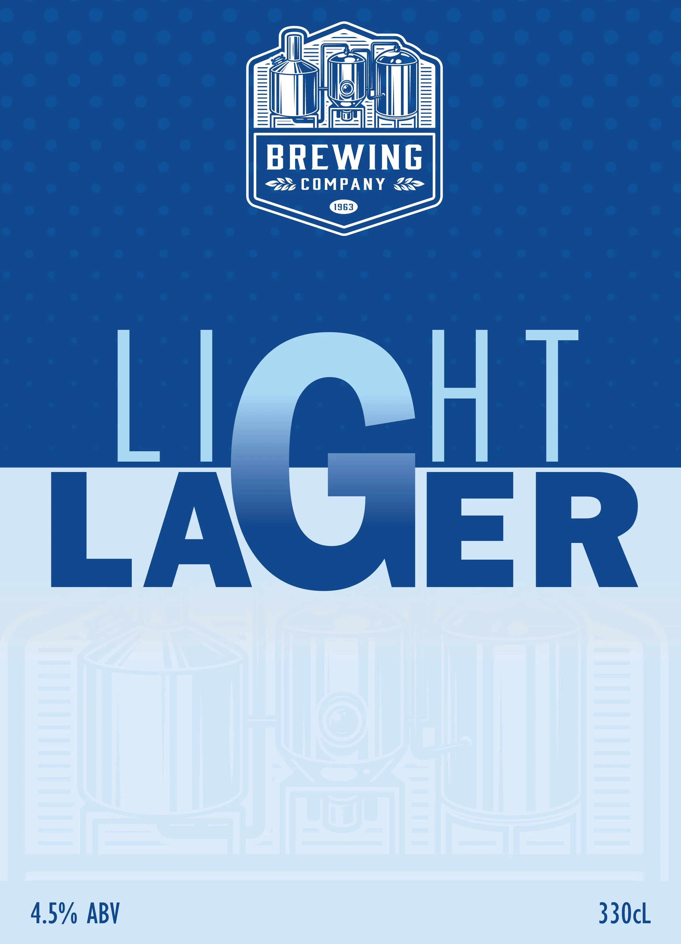
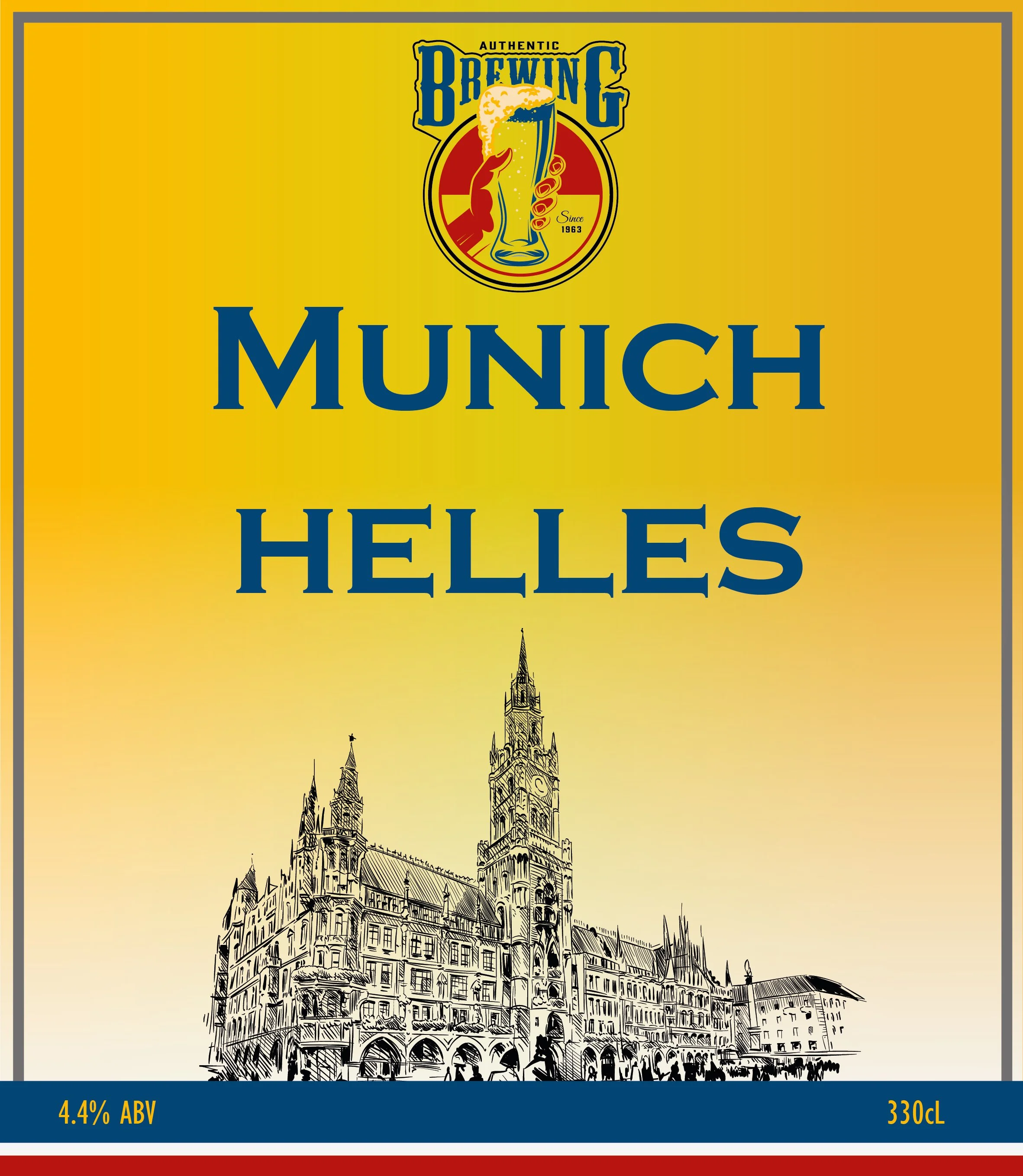
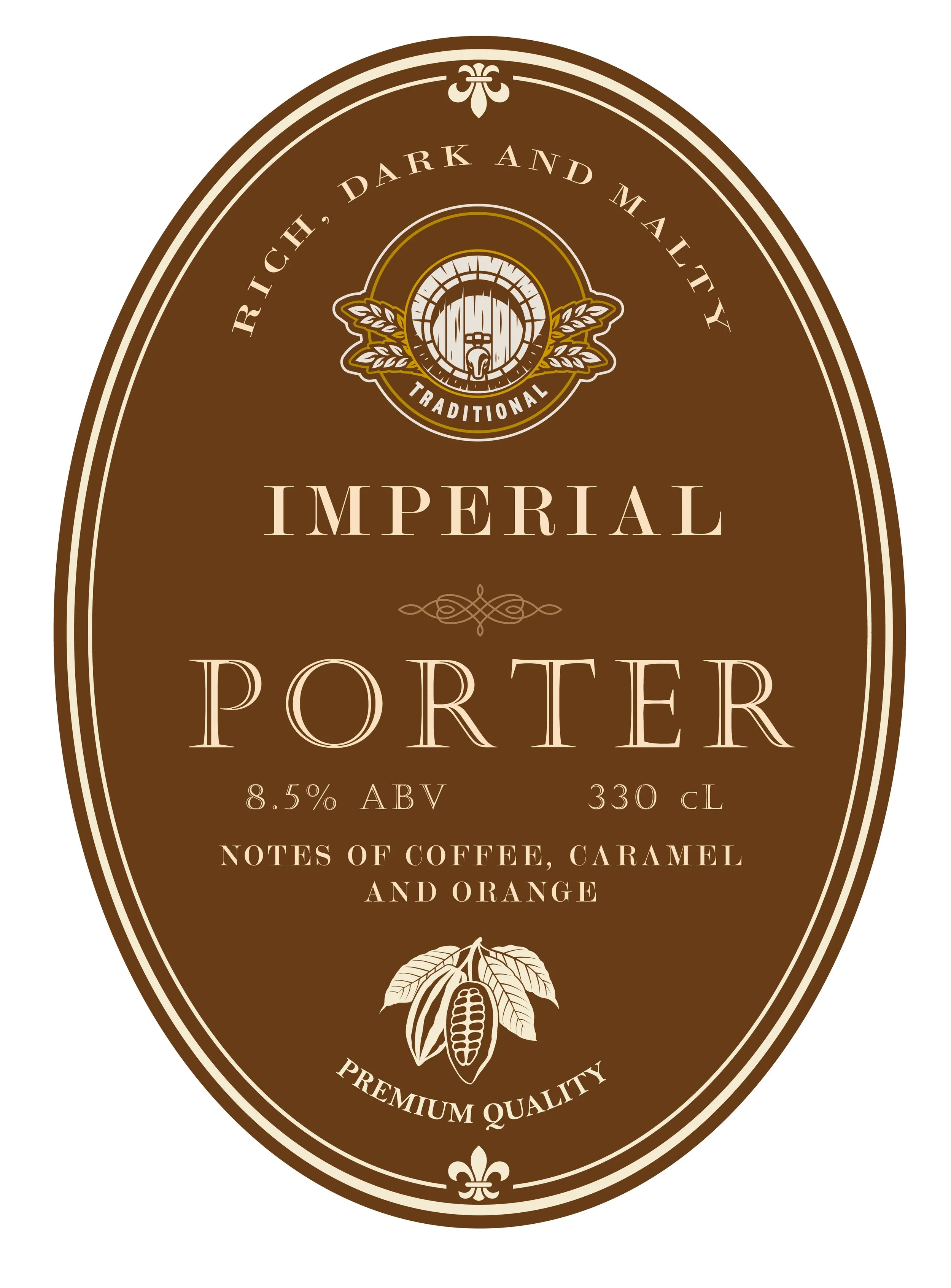
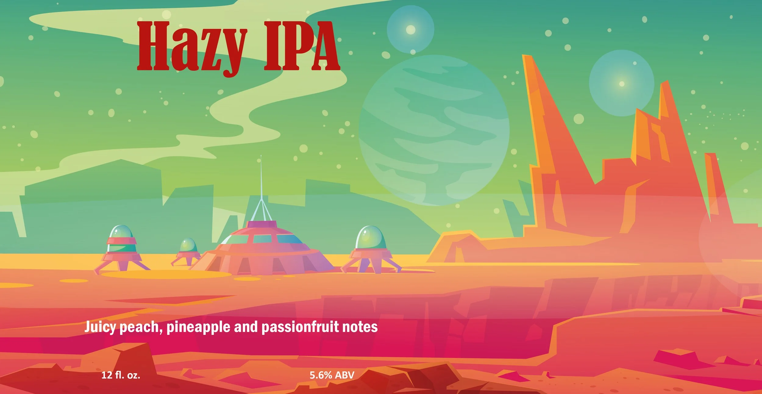
Recently I have been working on beer labels for WSET course. Initially the plan was to place the labels on beer bottles but we went one step ahead and placed them on cans too to create a more realistic experience for the students undertaking beer qualification.
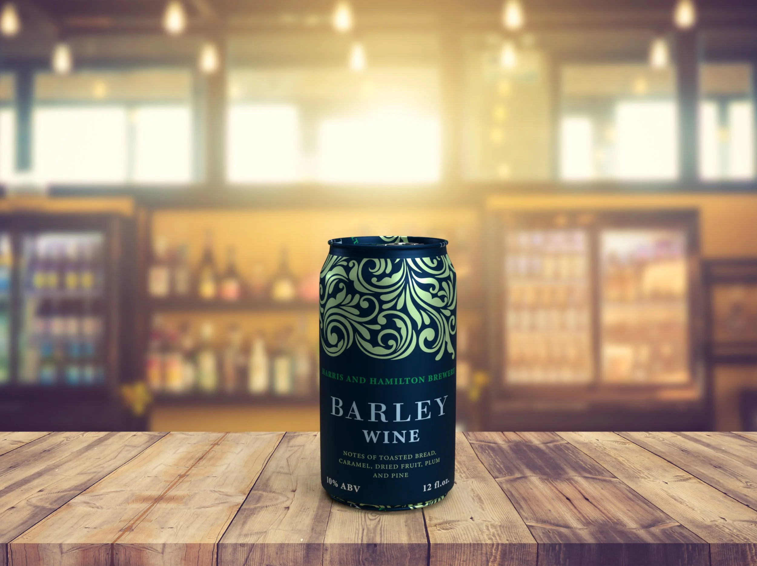
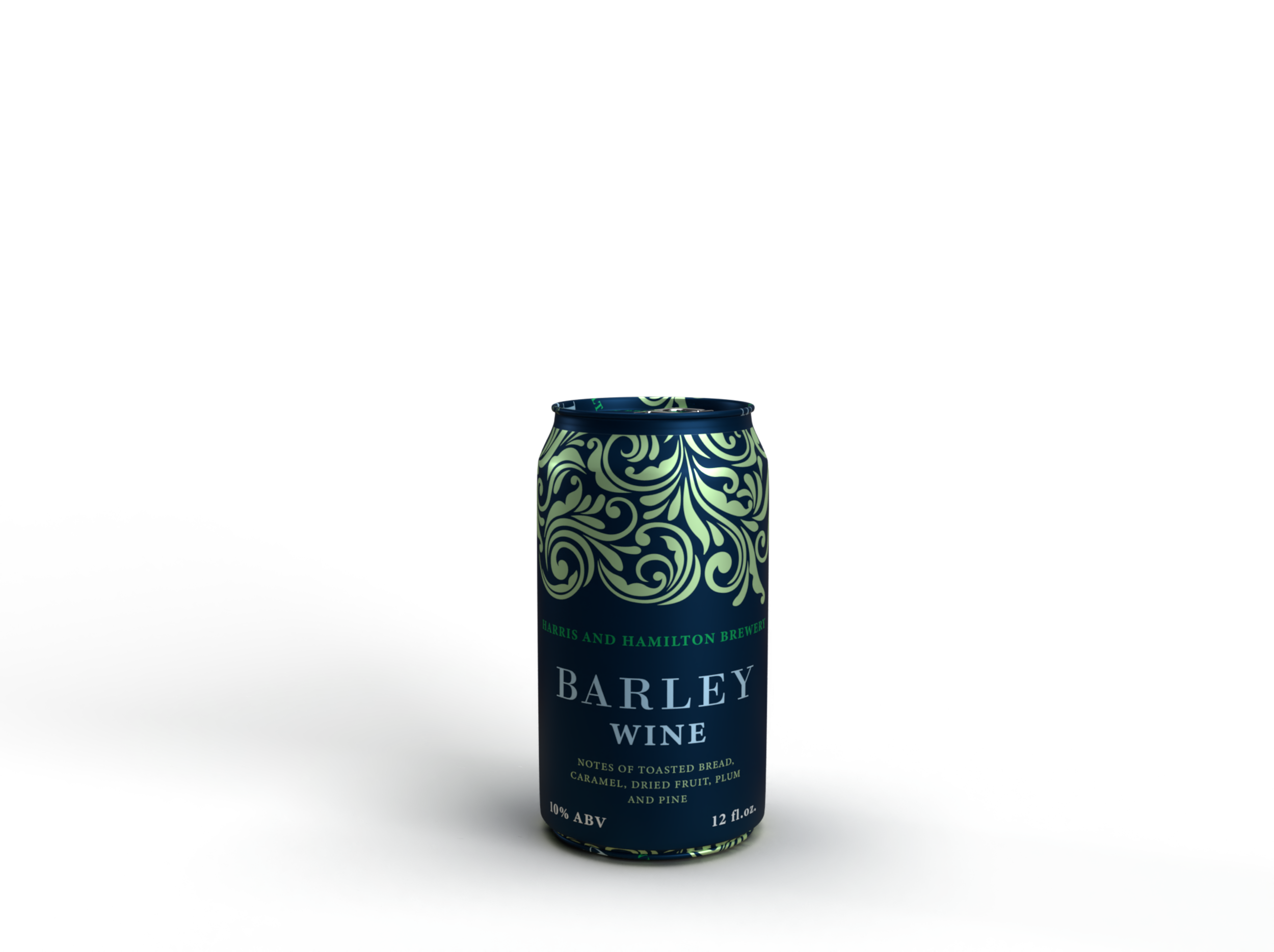
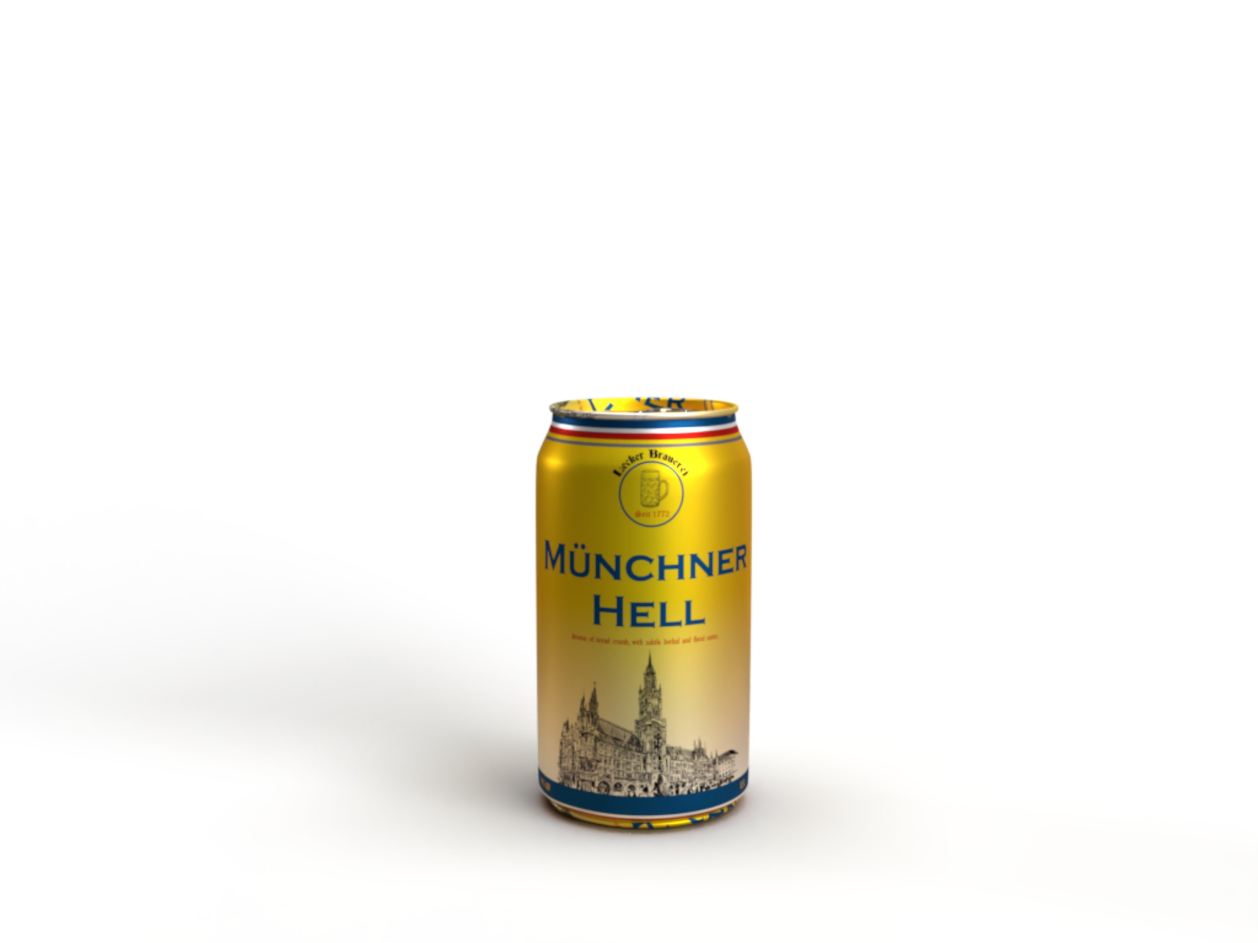
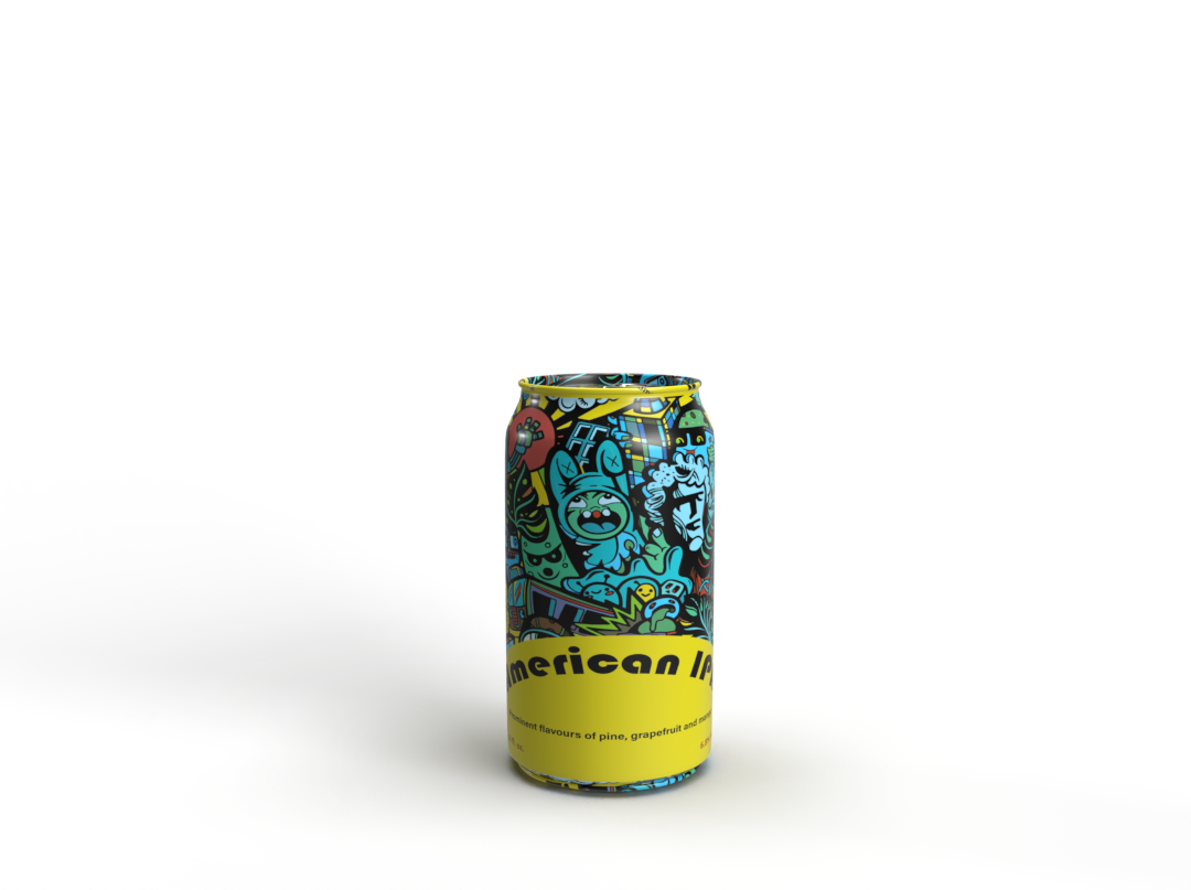
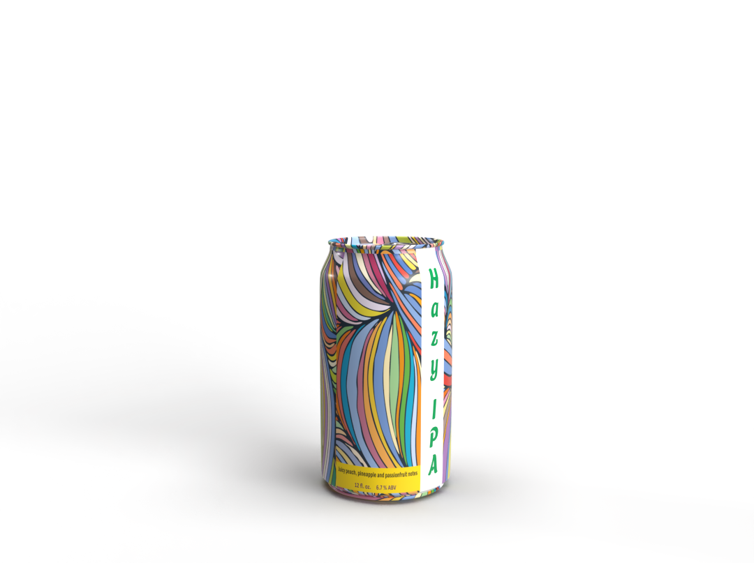
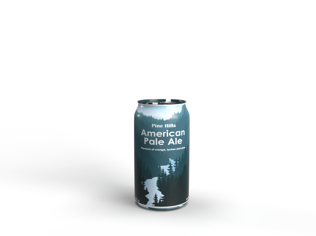
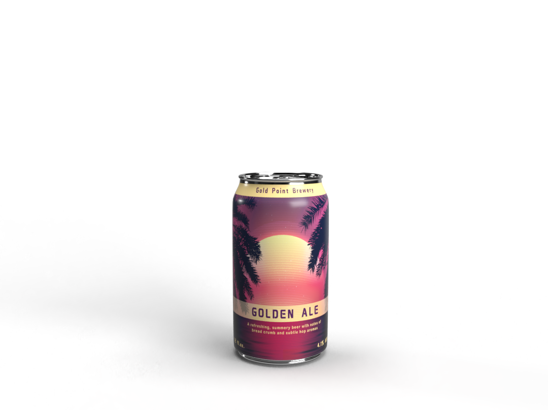
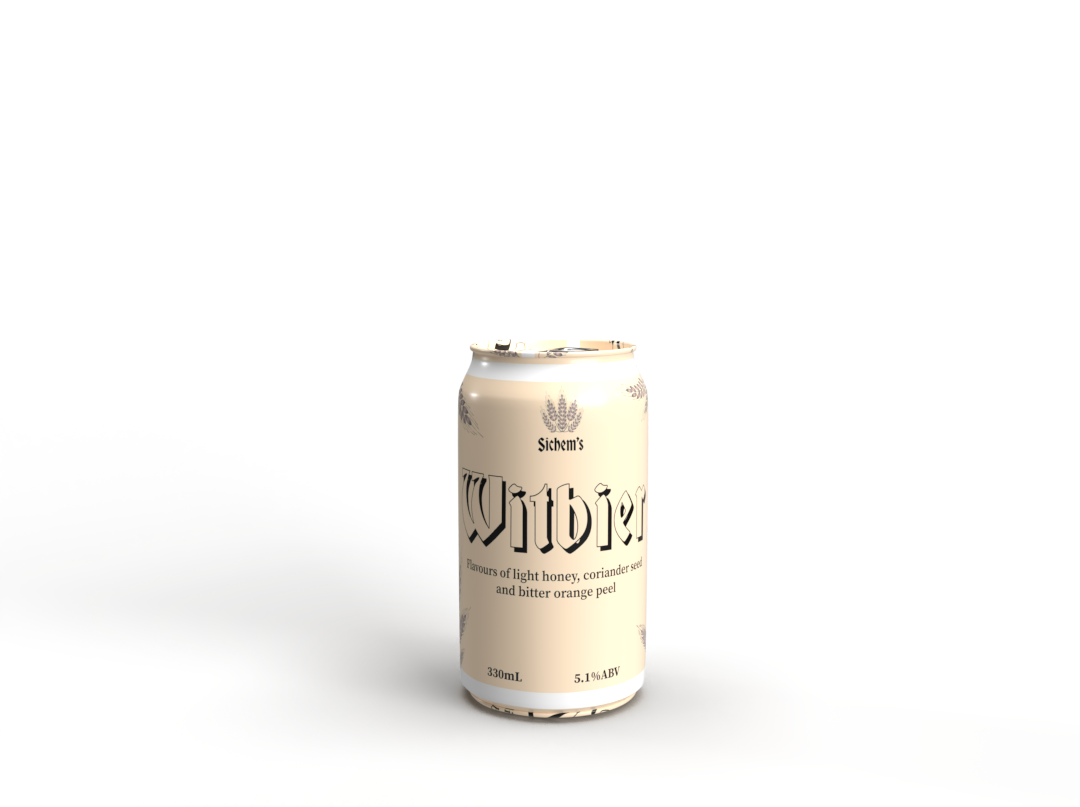
Beer Labels
Case study
Poster Brief:
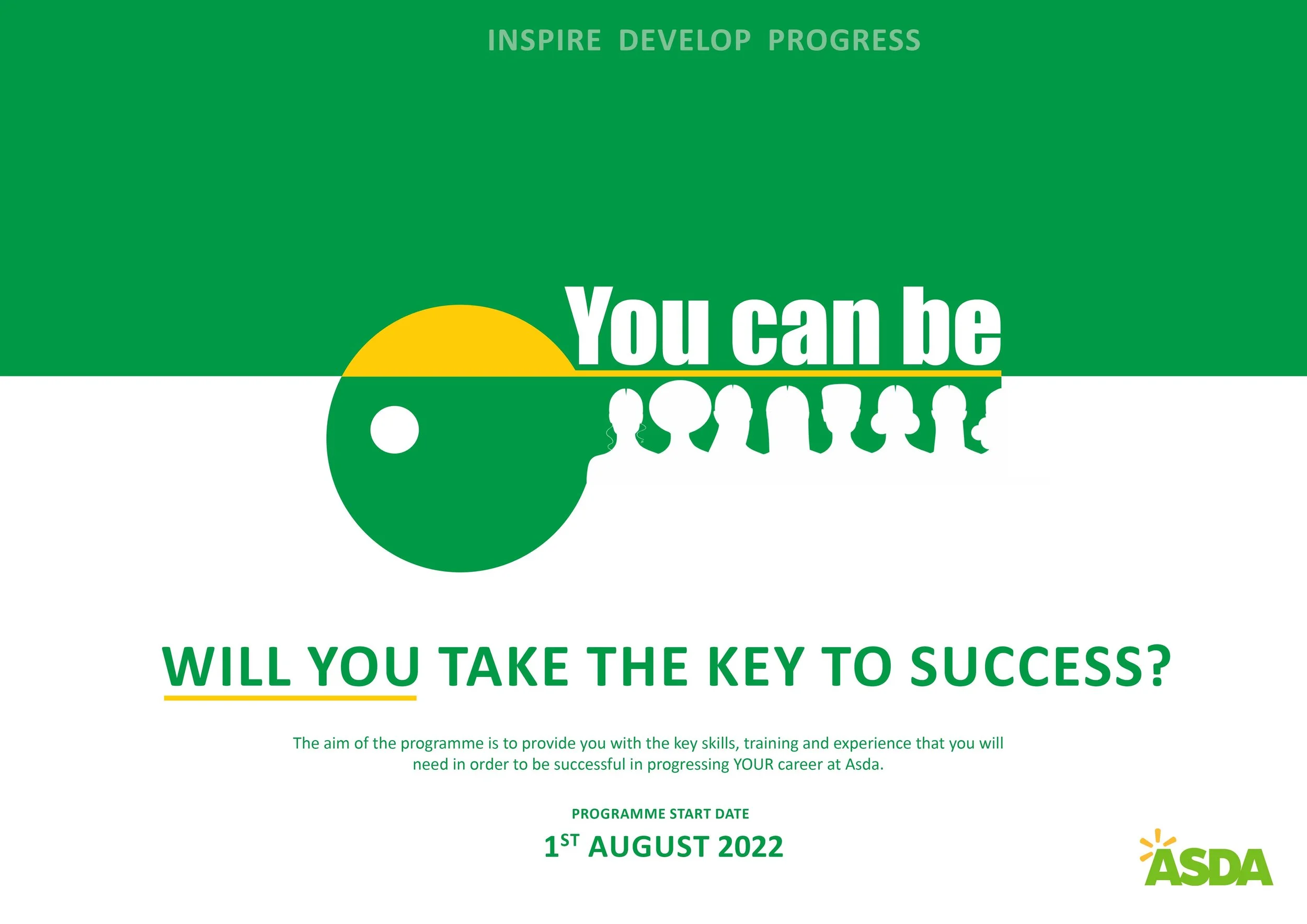
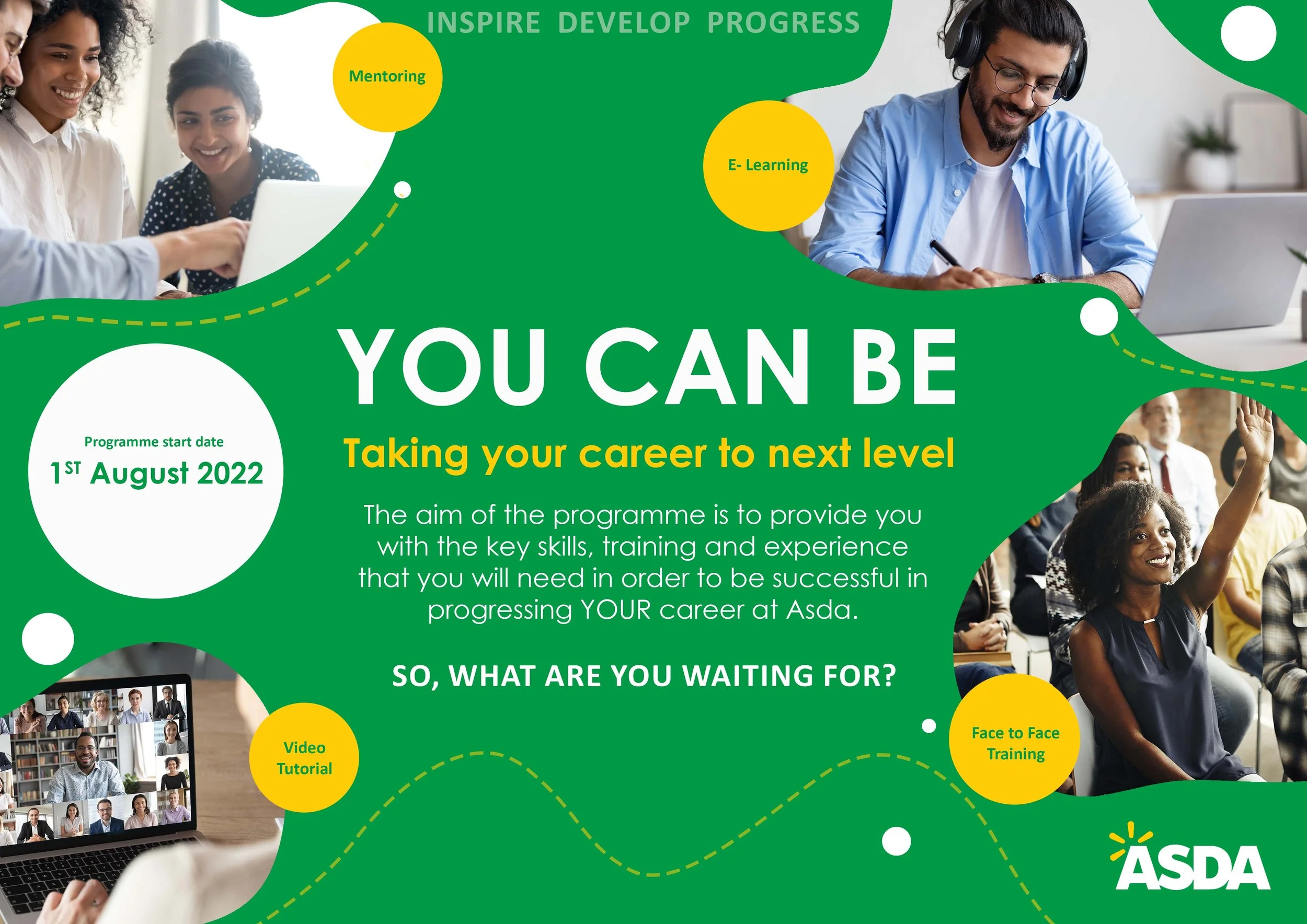
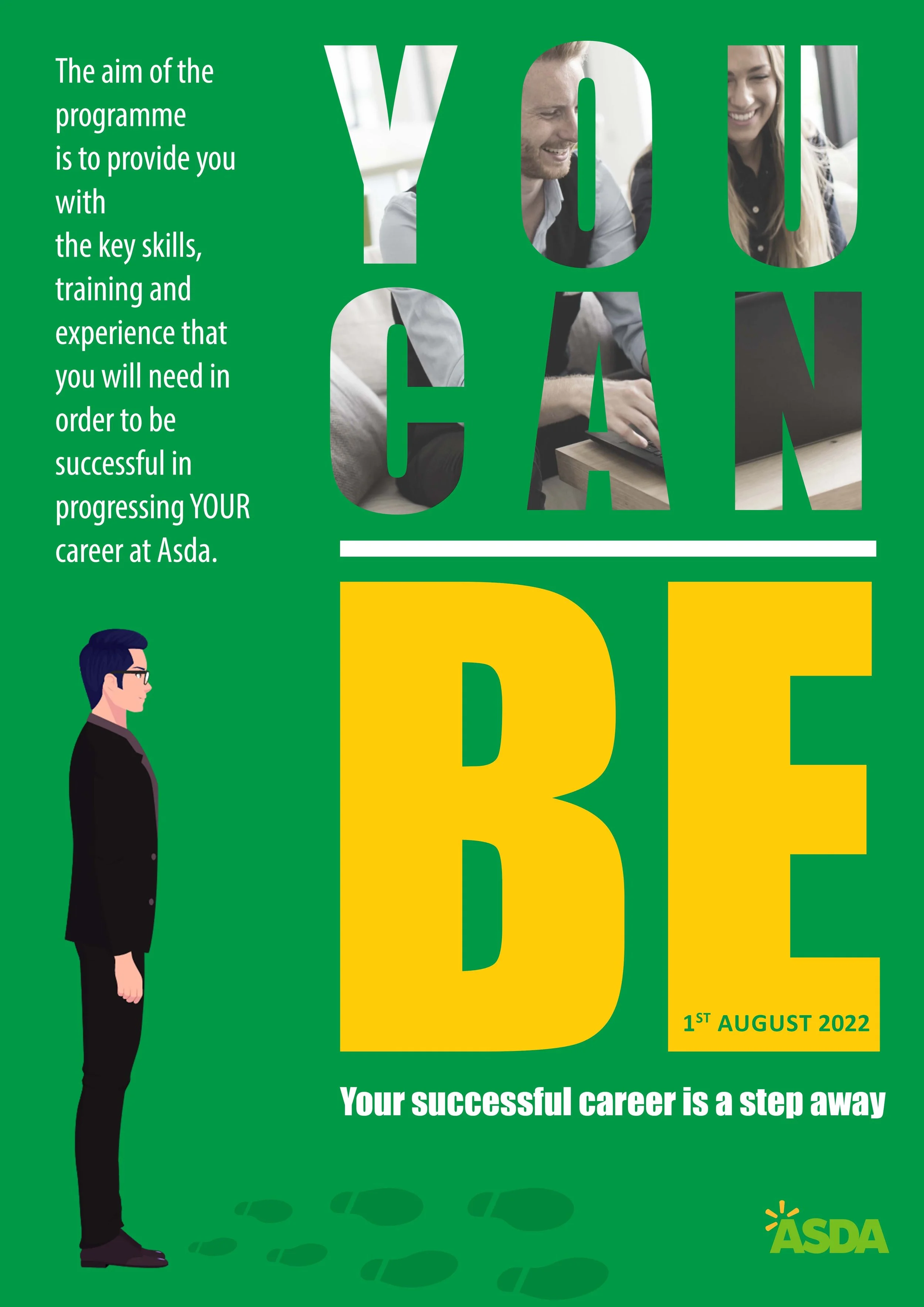
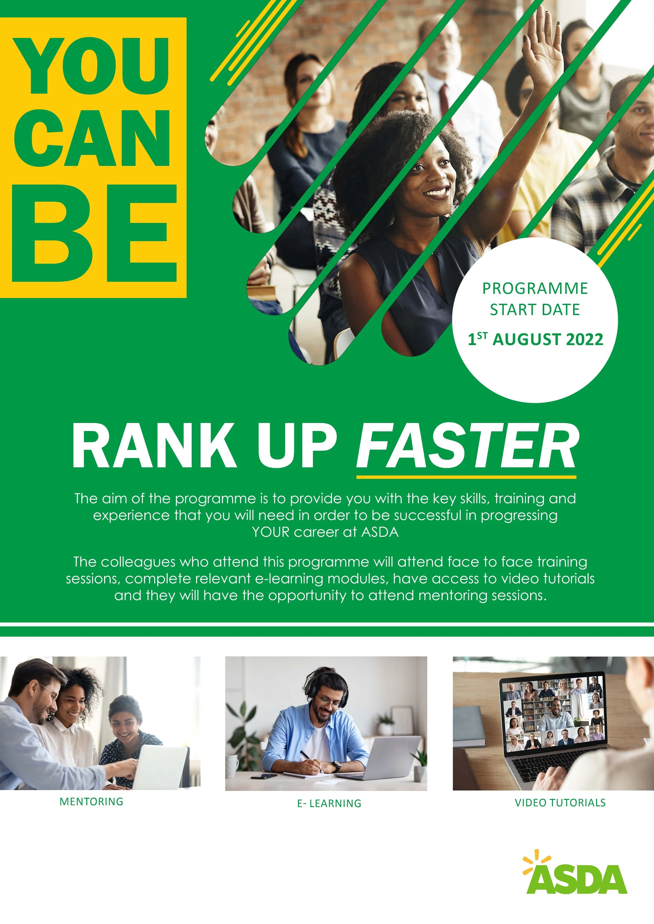
Create two concept poster designs for the ‘You Can Be’ Development programme to present back in the interview.
The information below should be used to help develop your design and you must use the brand colours listed below when creating your concept.
The ‘You Can Be’ Development programme:
Asda are launching a new development pathway for colleagues which will help them to get ready for their next role within the business.
The programme has been designed for colleagues from the Retail sector of the business which has around 140,000 staff. Specifically it will allow colleagues to progress from the following roles:
Hourly colleague - Section Leader
Section Leader - Section Manager
Trading Manger - Operations/Deputy/Store Manager
The aim of the programme is to provide colleagues with the key skills, training and experience that they will need in order to be successful in progressing their career at Asda.
Brand colours:
Green - #009946
Yellow #ffcc07
White
Additional key information:
The poster needs to inspire colleagues to develop, learn new skills and progress their career. It should also include a memorable strapline which will grab the learners attention.
Programme start date: 1st of August.
Types of learning content included on the development programme: The colleagues who attend this programme will attend face to face training sessions, complete relevant e-learning modules, have access to video tutorials and they will have the opportunity to attend mentoring sessions.
Planning stage
KEY POINTS FOR DESIGN ONE:
Abstract, Minimalistic and Balanced design
Diverse
Less is more (impactful)
Impactful words
Key info only
Yellow used as accent color just like the ASDA logo
Can be used as bigger scale posters
e.g. Billboards
KEY POINTS FOR DESIGN TWO:
Create Energy with morph and different sized shapes, Imbalanced and Contemporary design (eye movement, urgency)
Diverse Relatable Imagery
Impactful words
Key and additional info
Yellow and white used as accent color
Can be used as smaller scale poster
e.g. A3 printouts for offices, Canteens etc.
The posters produced for the above brief:
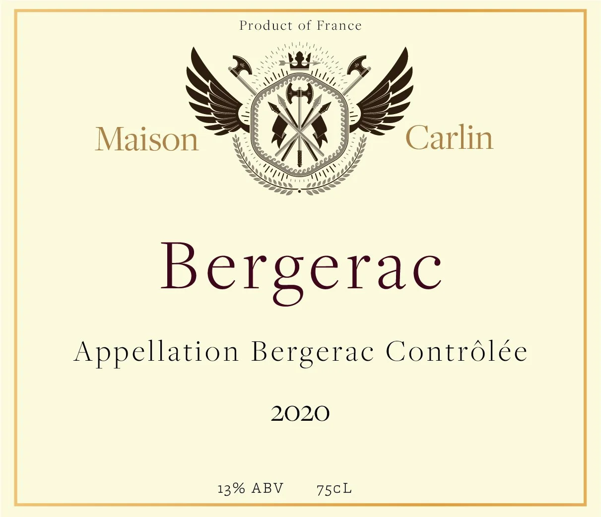
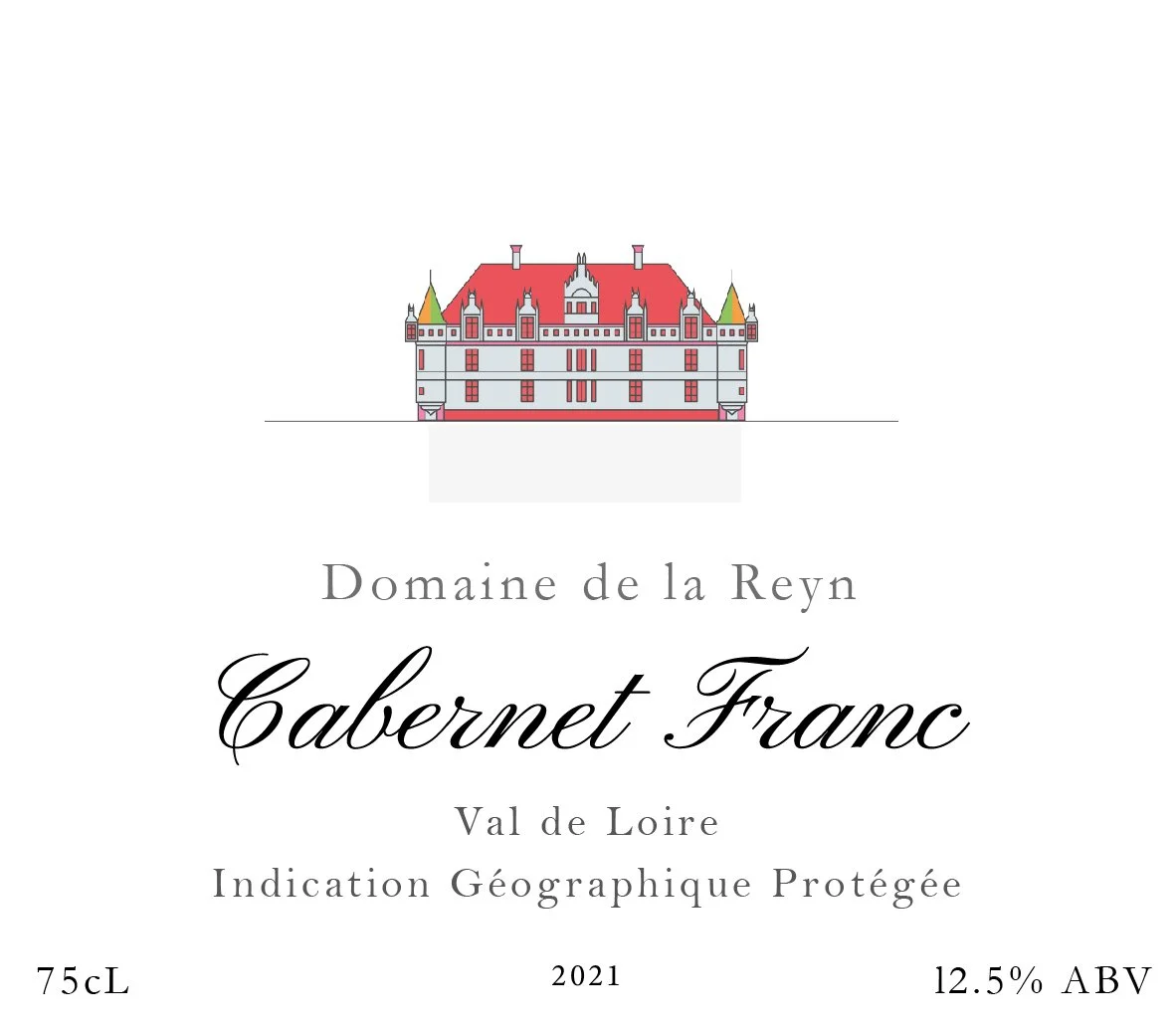
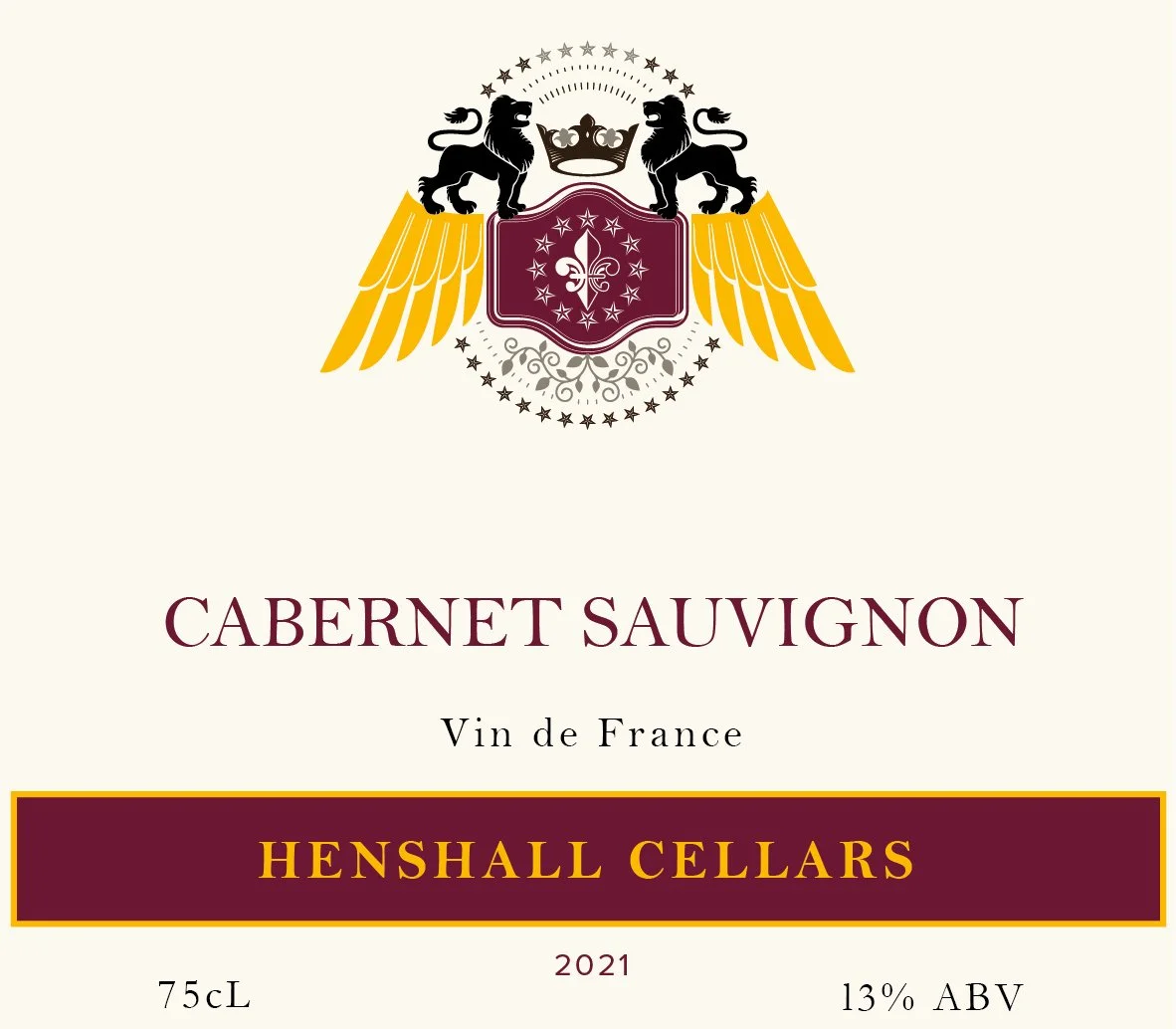
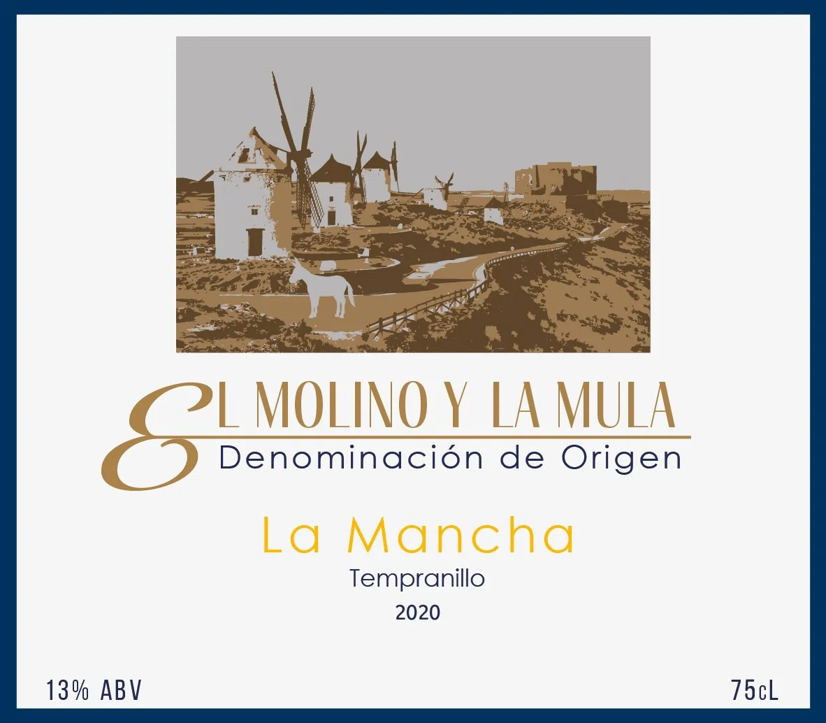
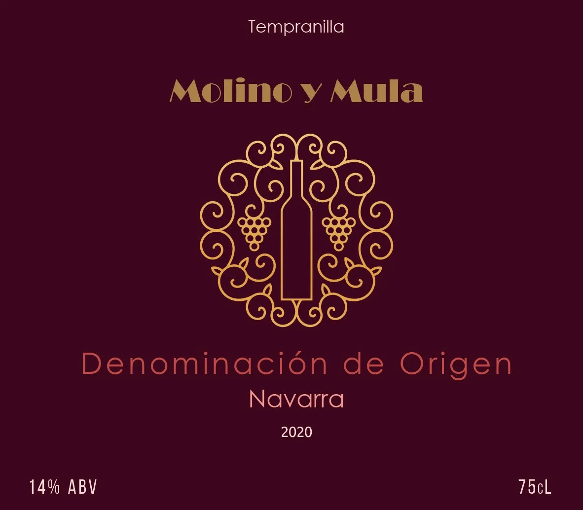
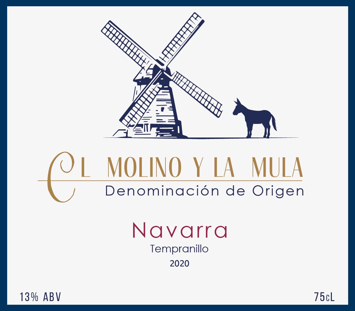
Wine Labels
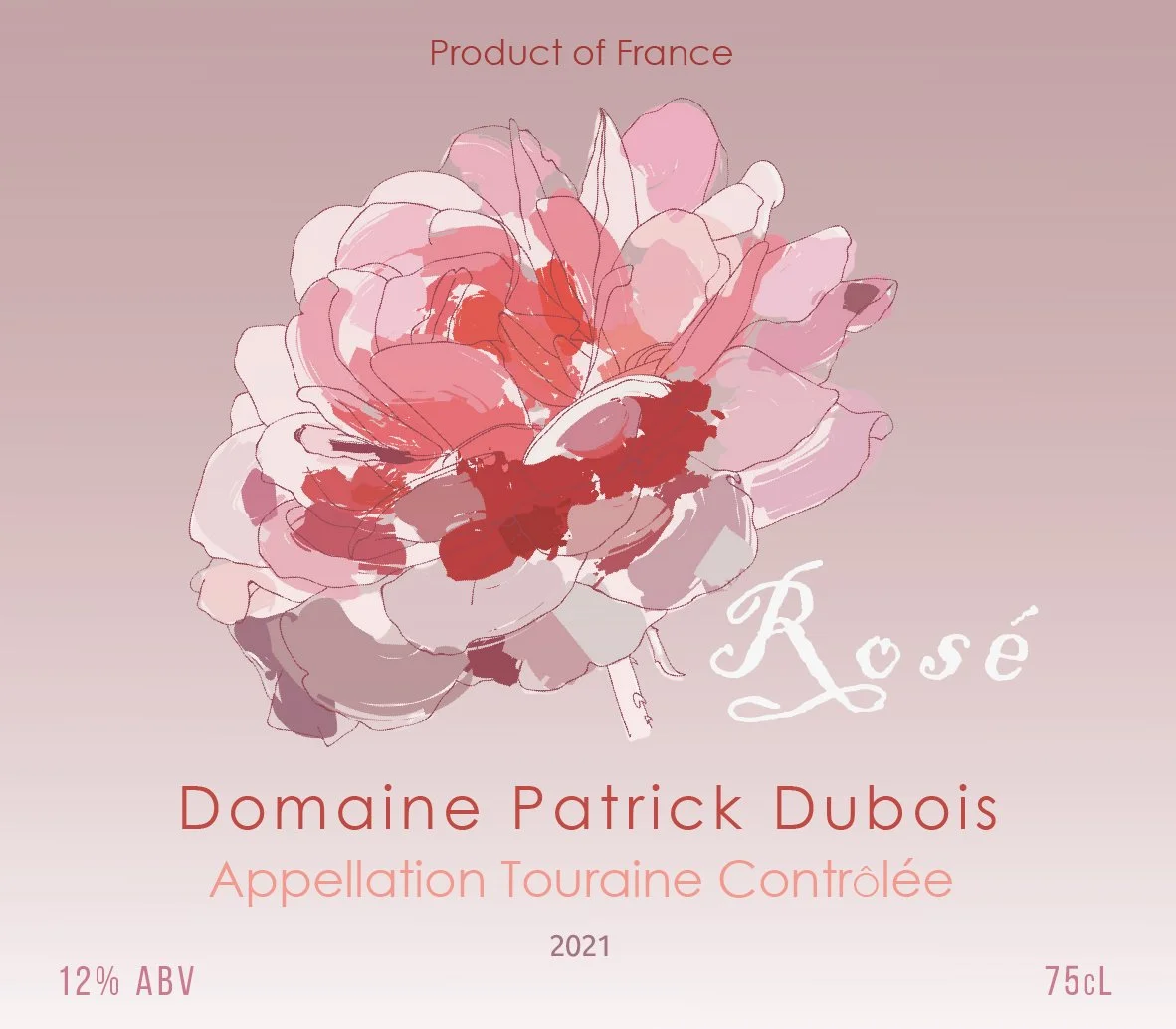
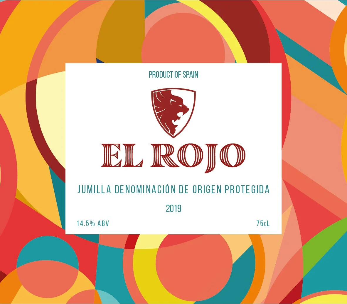
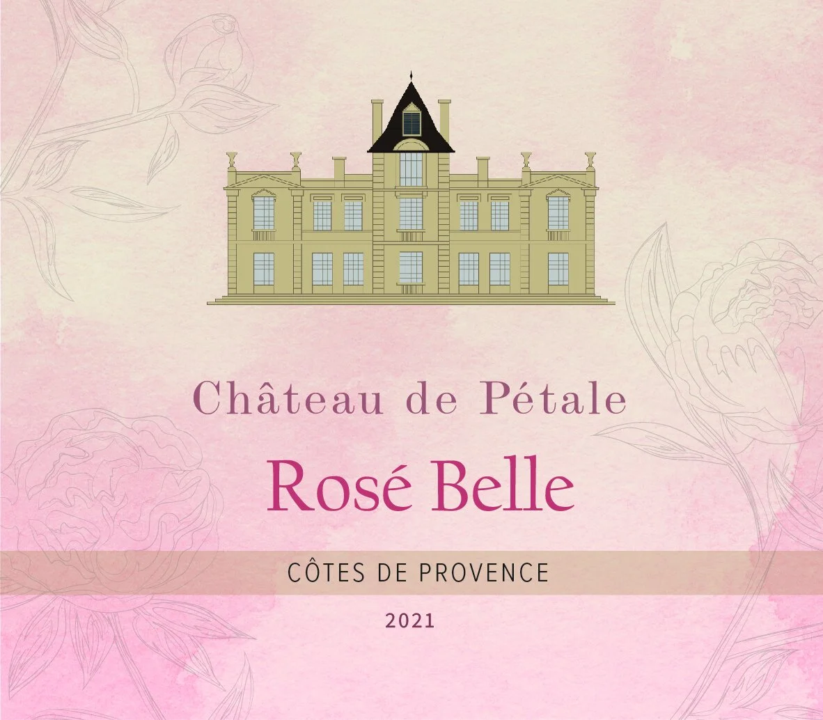
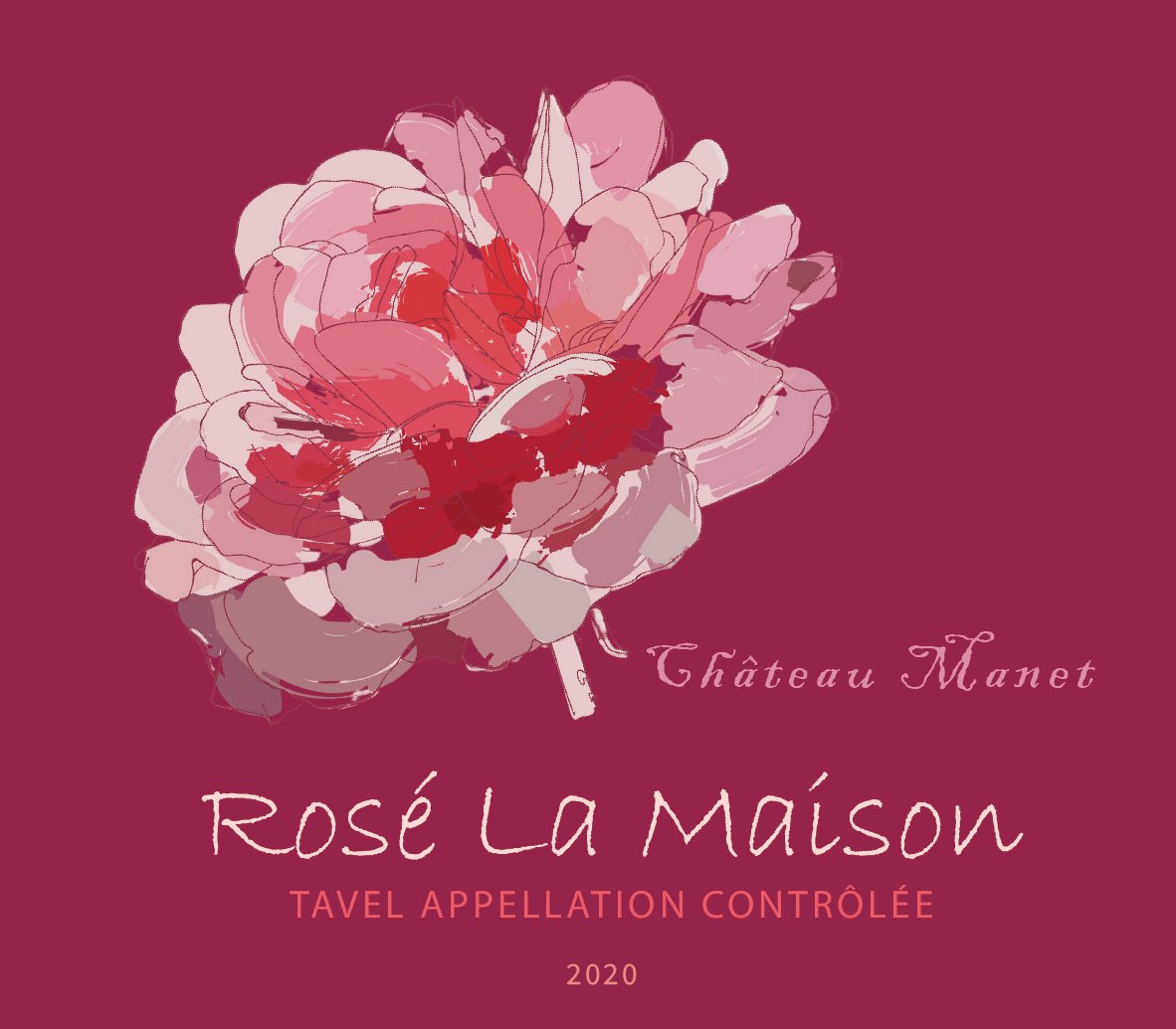
I am so proud of these wine labels I created for WSET (Wine and Spirit Education Trust) where I currently work. It has been an exciting journey getting to know different vinyards, the style of each wine. While designing these I had to keep in mind the colour of the wine so the label stands out; the origin so the design reflects that and also the intensity and flavours of the wine to create an appropriate design, for example delicate Rose Belle wine has delicate rose background with shades of pink to reflect the delicacy of the rose wine. These labels are now being used on the online wine courses WSET provides.
These wine labels are only for educational purpose and are not intended for commercial use.
E-Learning Design
The video below is an example of an e-learning interface on a mobile app about rice sorting at Buhler, where I worked in 2020. This interface was developed using Articulate 360, Storyline, GOMO, and the Onpoint LMS, with additional design work carried out in Adobe Photoshop and After Effects. The app was originally created for sales training of internal Buhler employees and has since been adopted as a corporate-level blueprint.
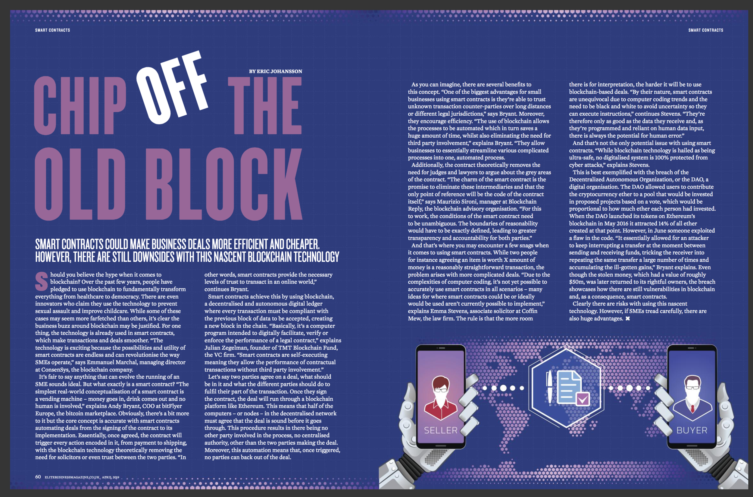
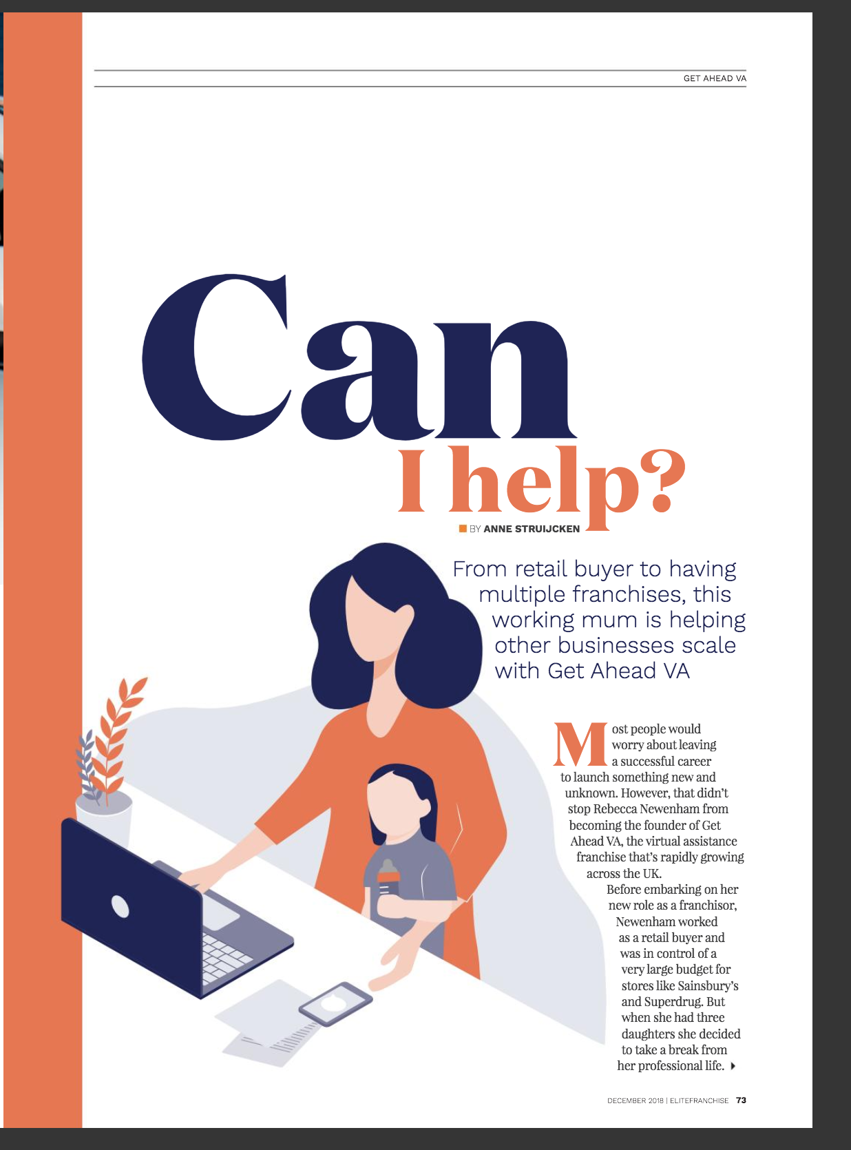
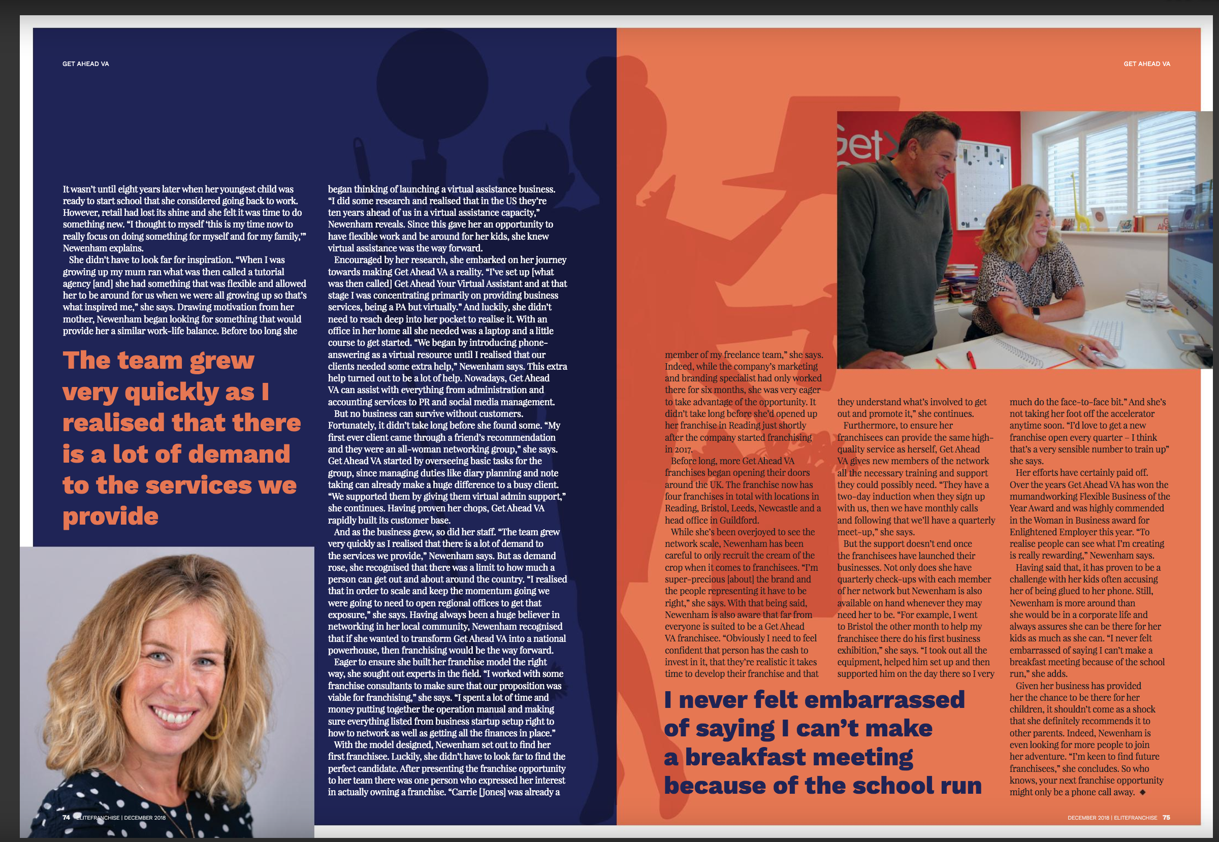
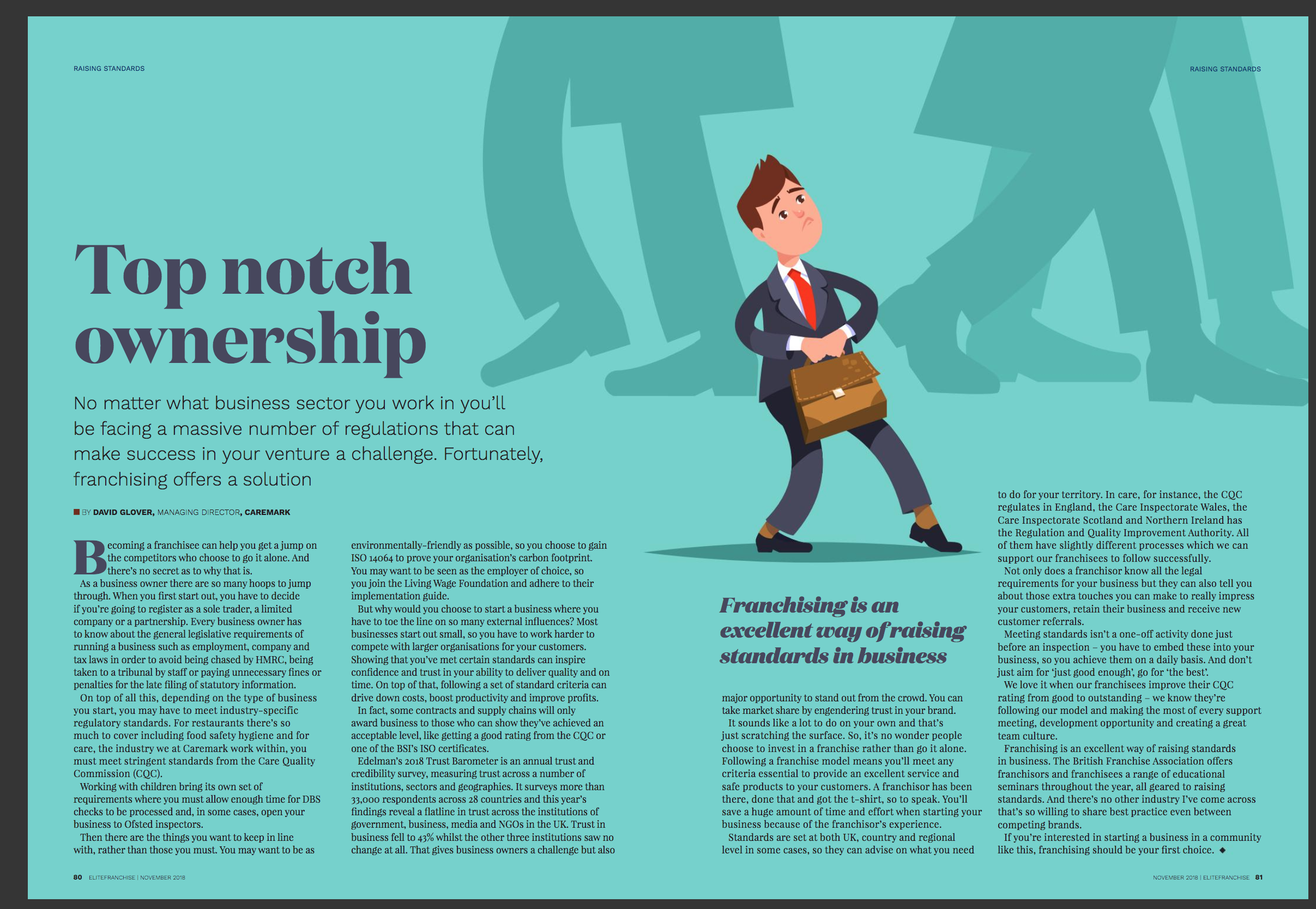
PRINTS
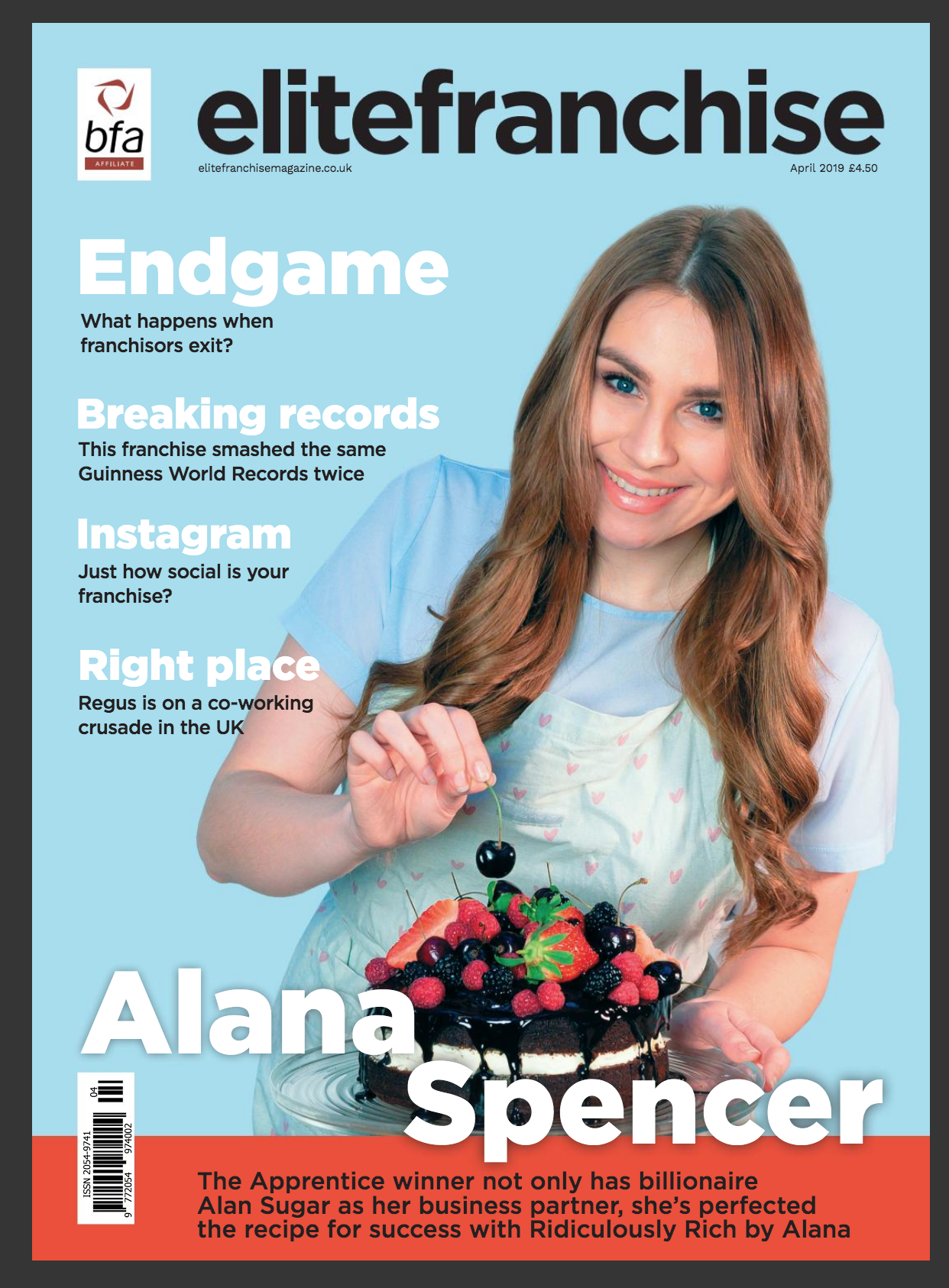
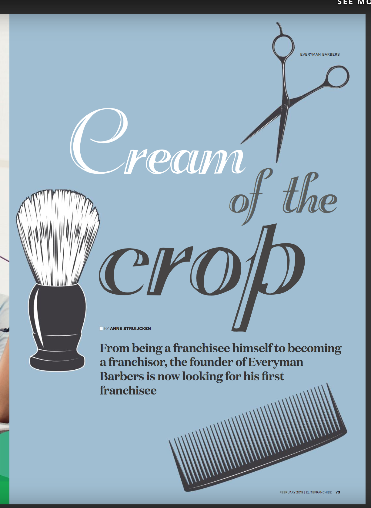
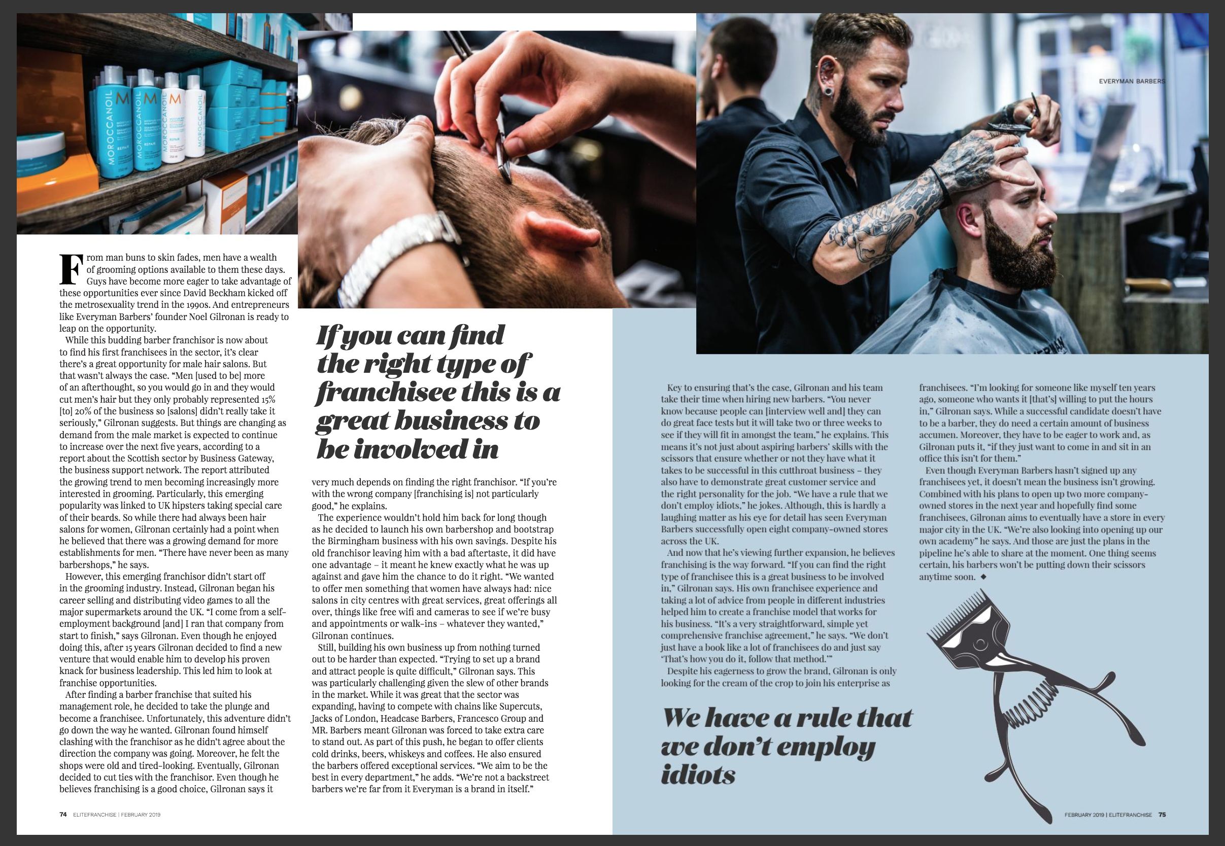
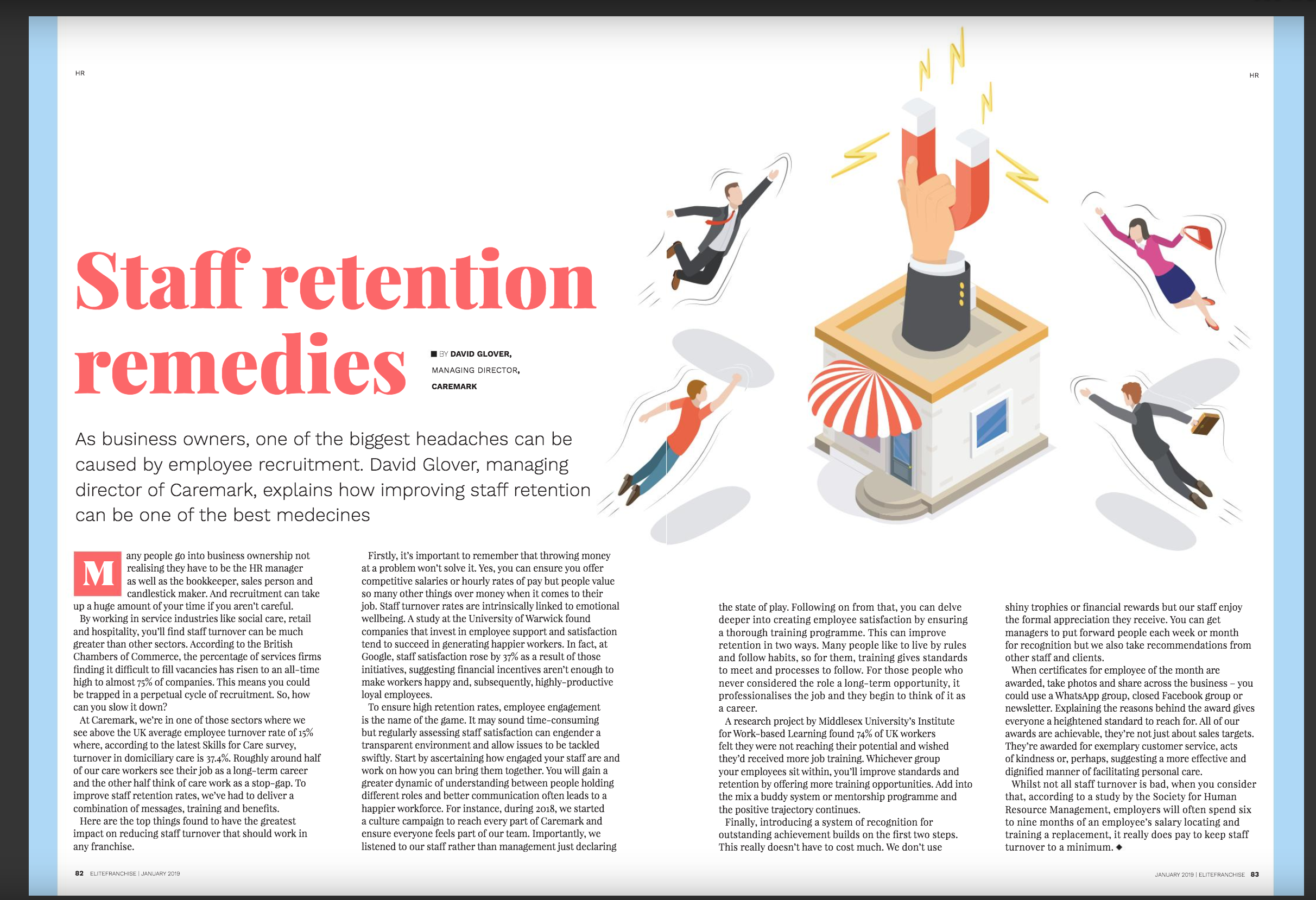
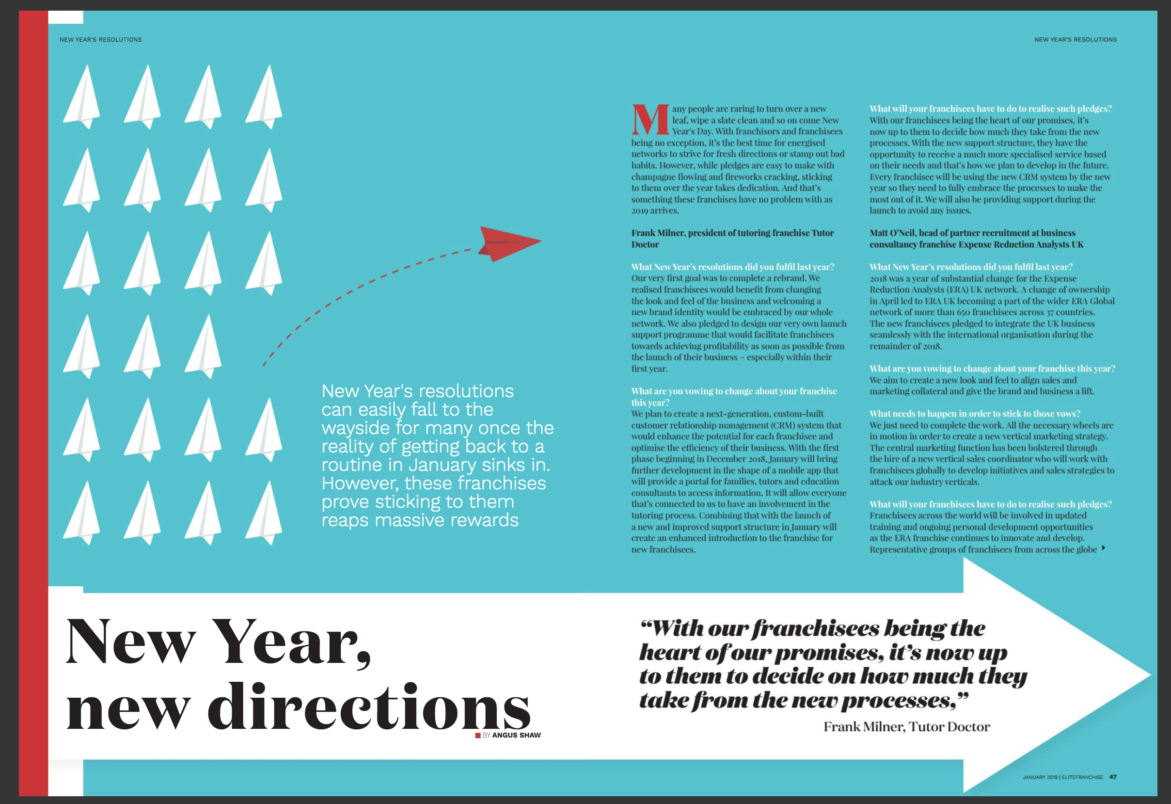
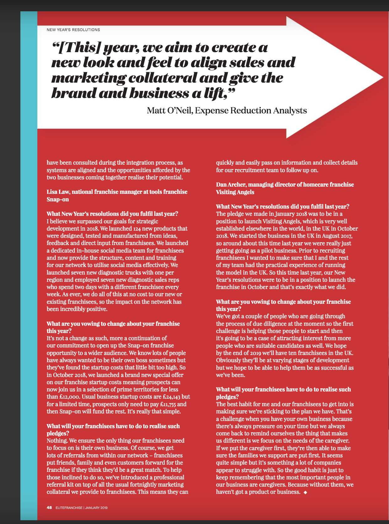
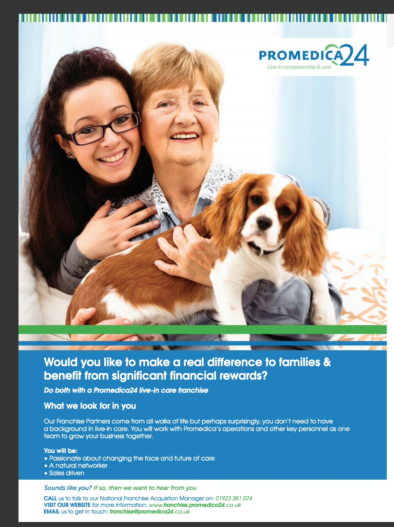
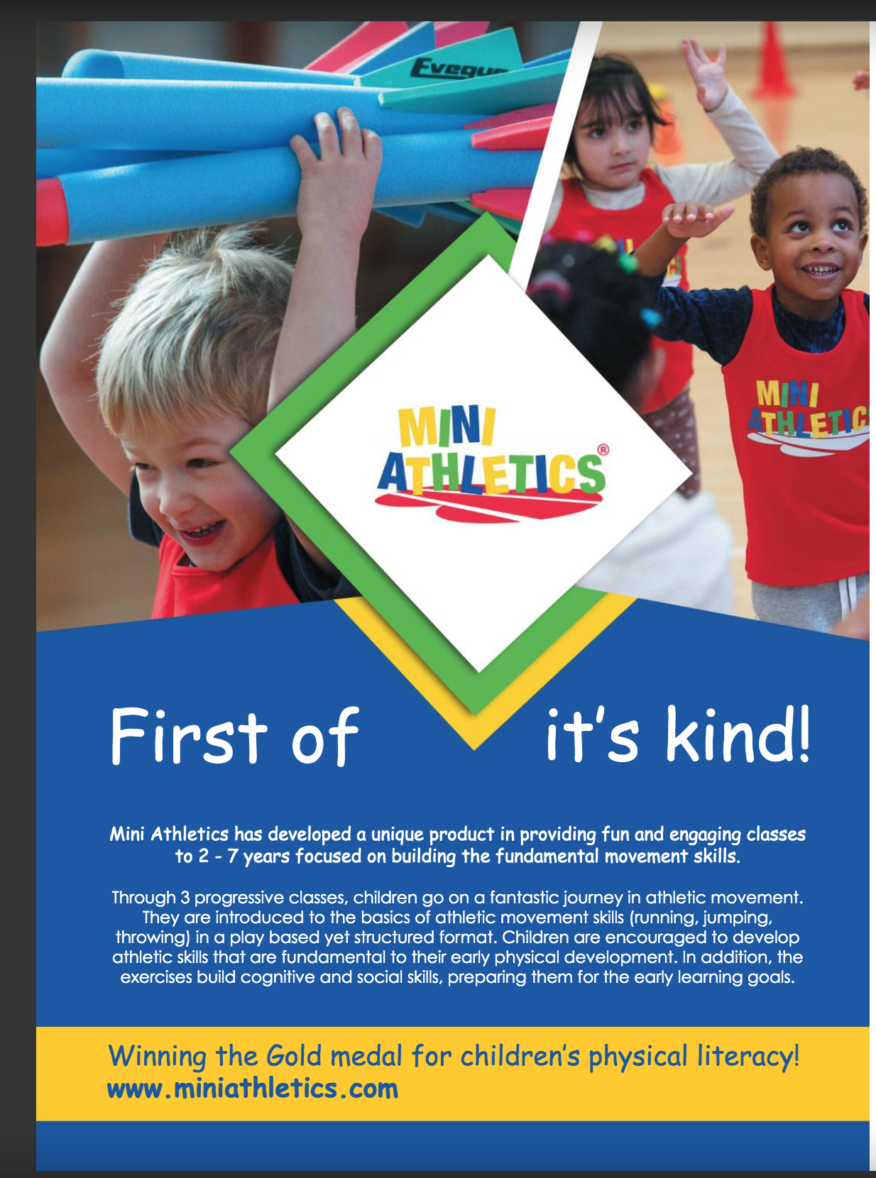
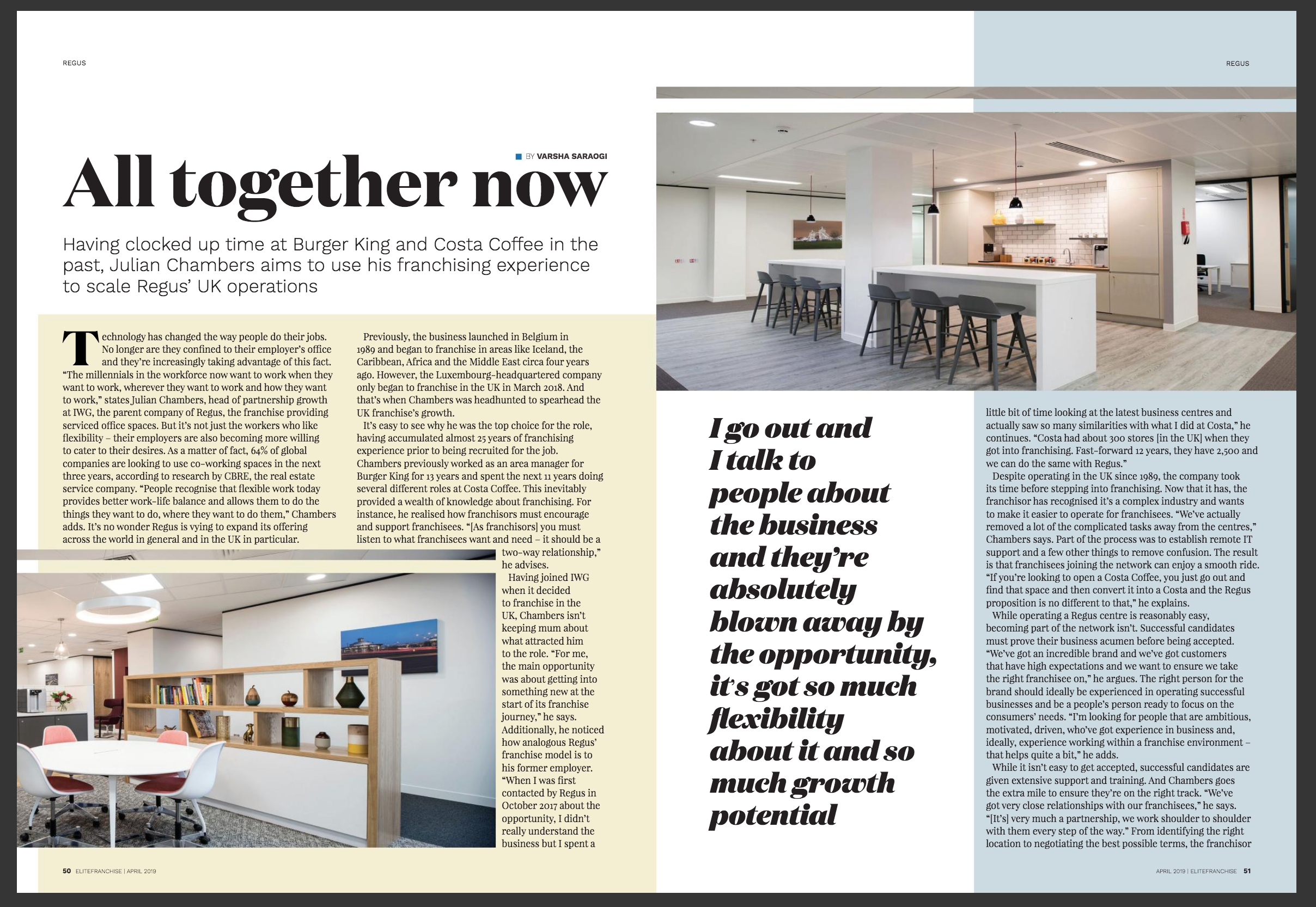
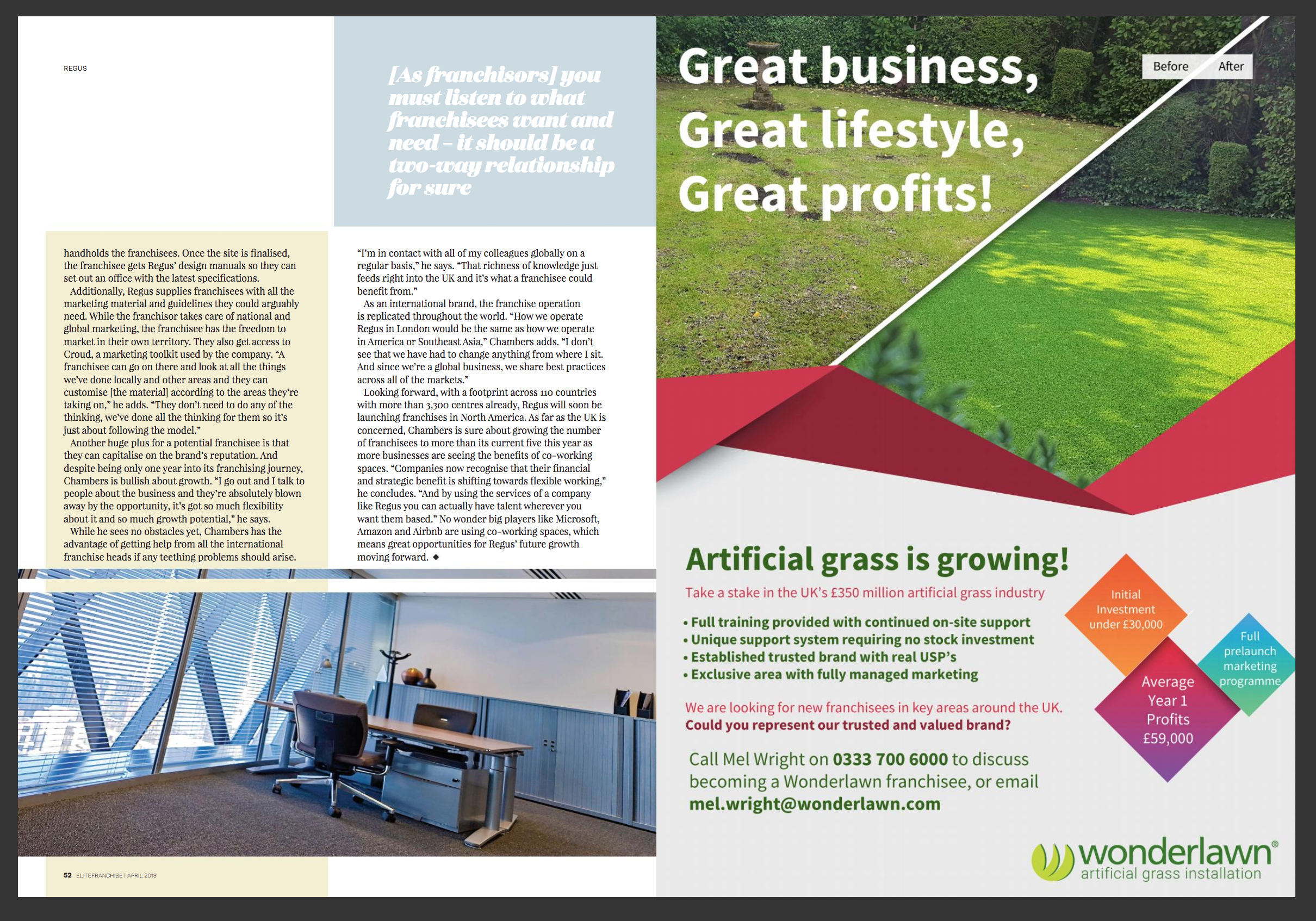
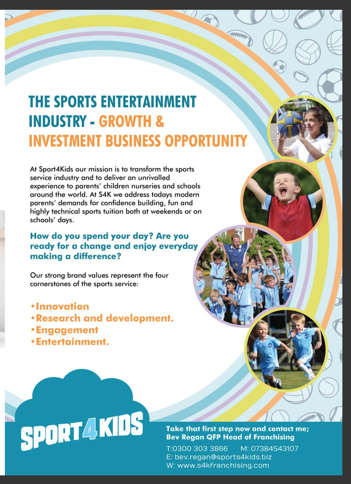
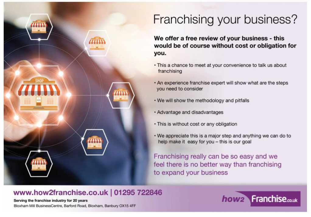
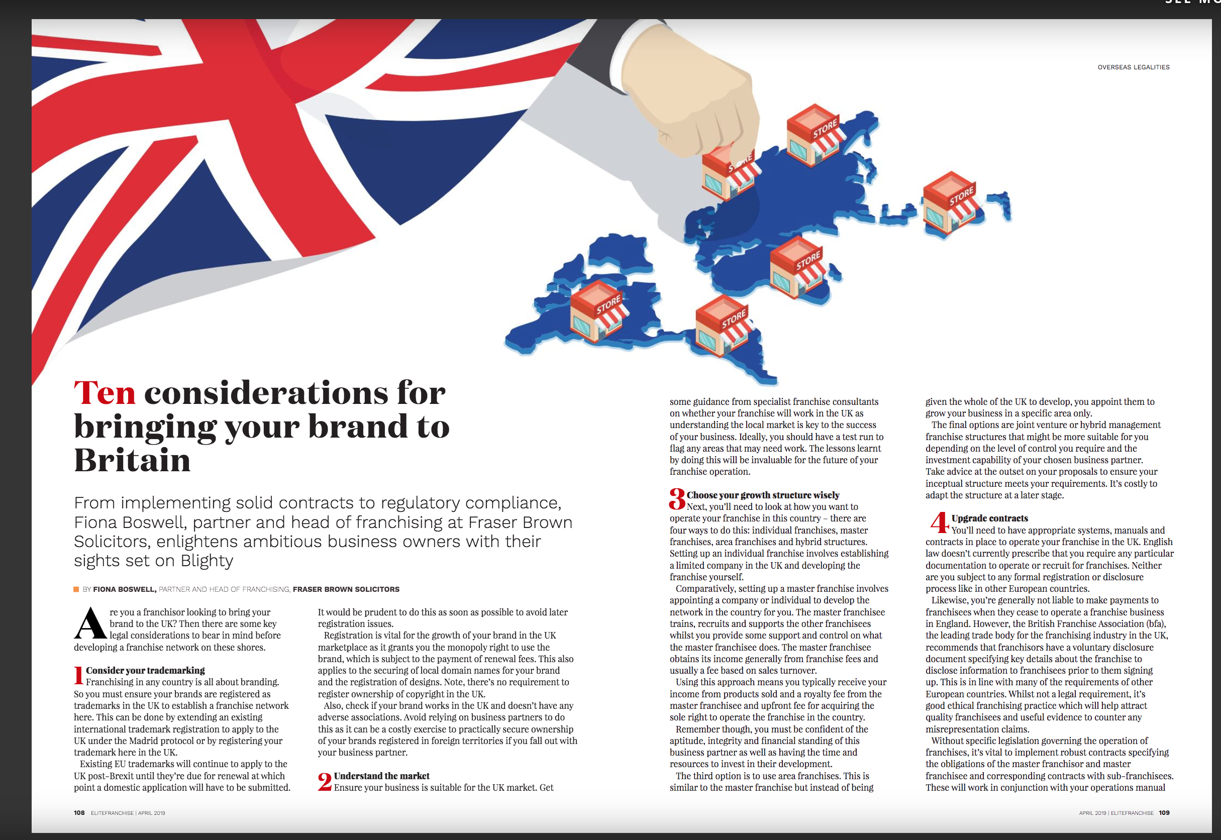
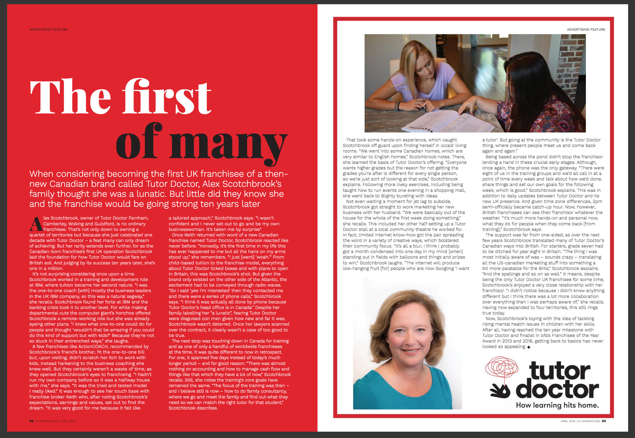
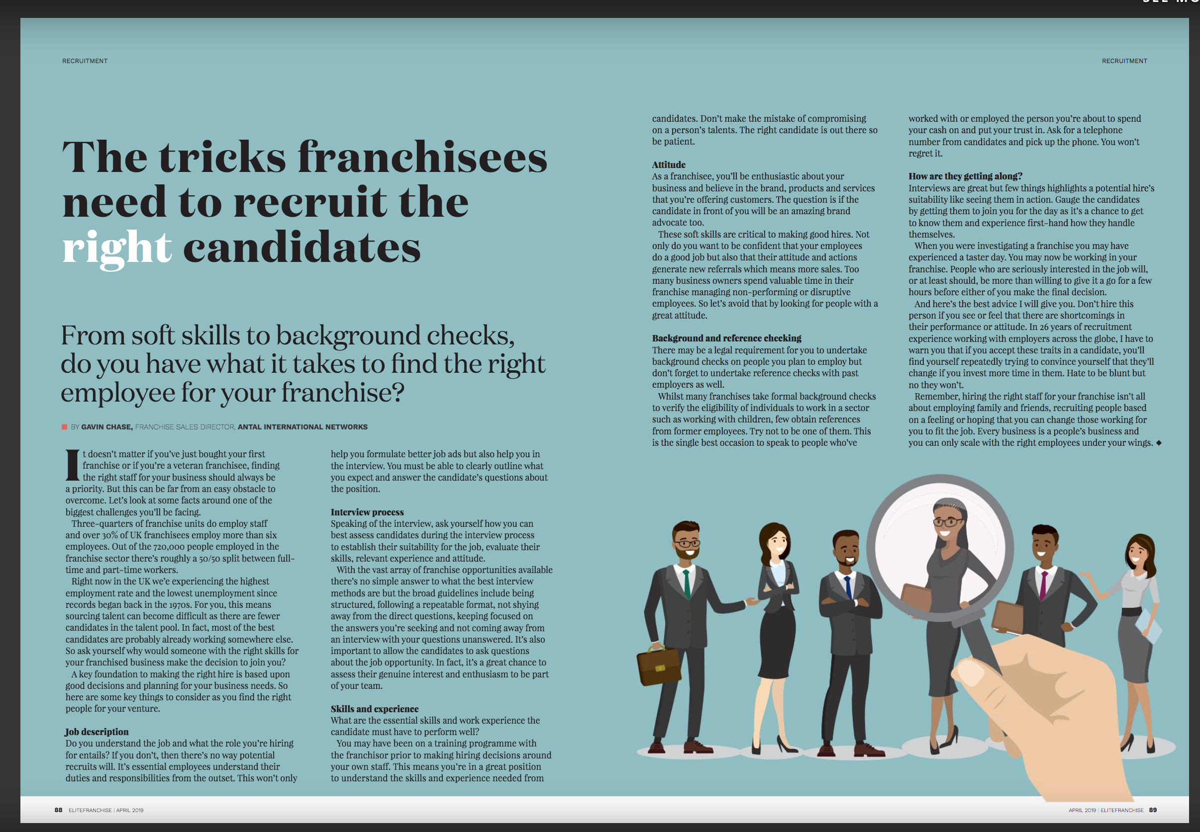
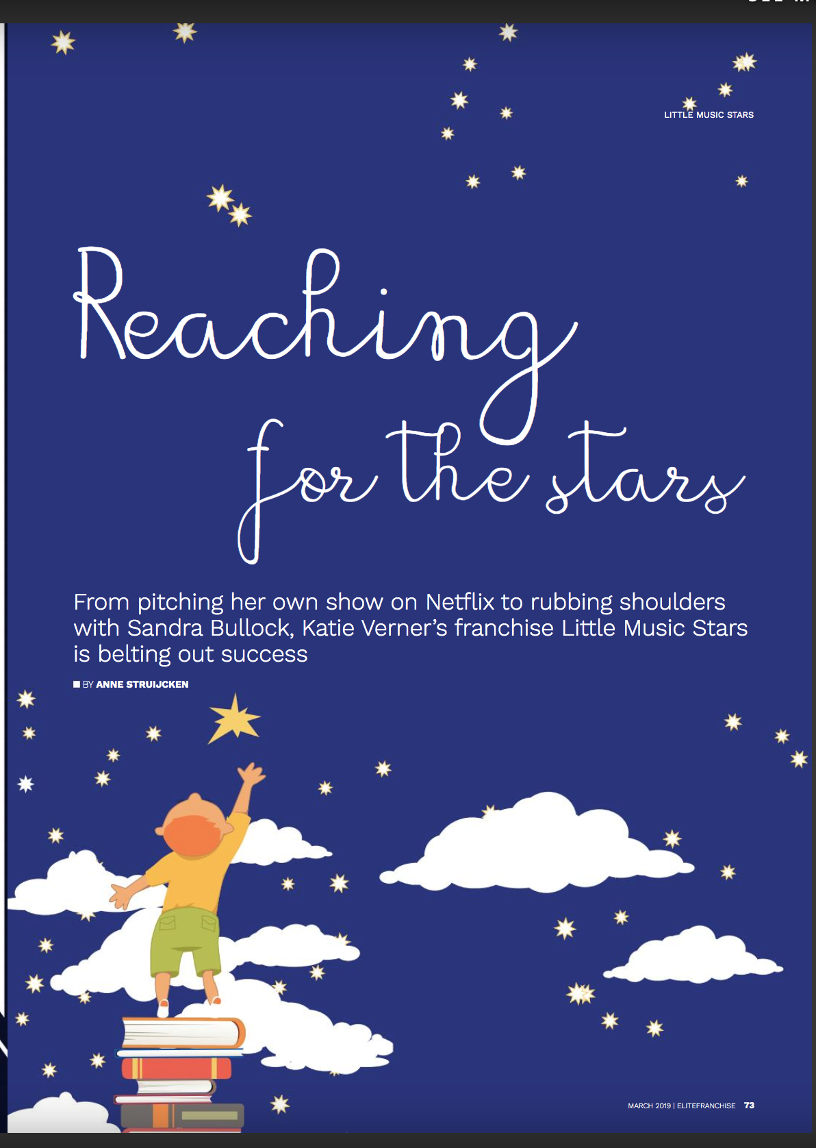
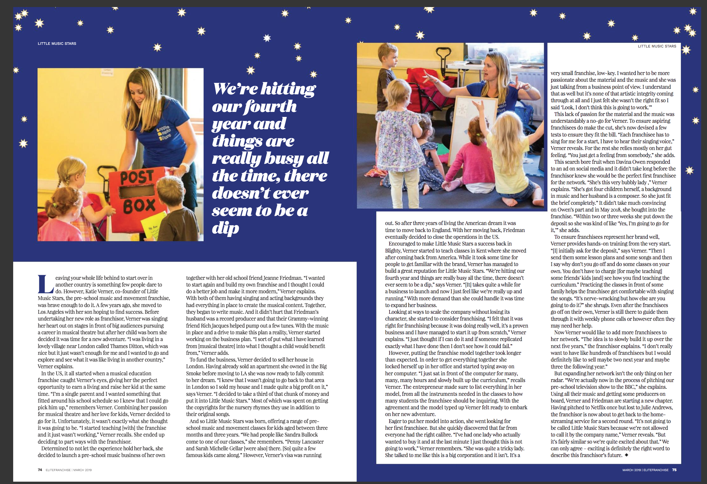
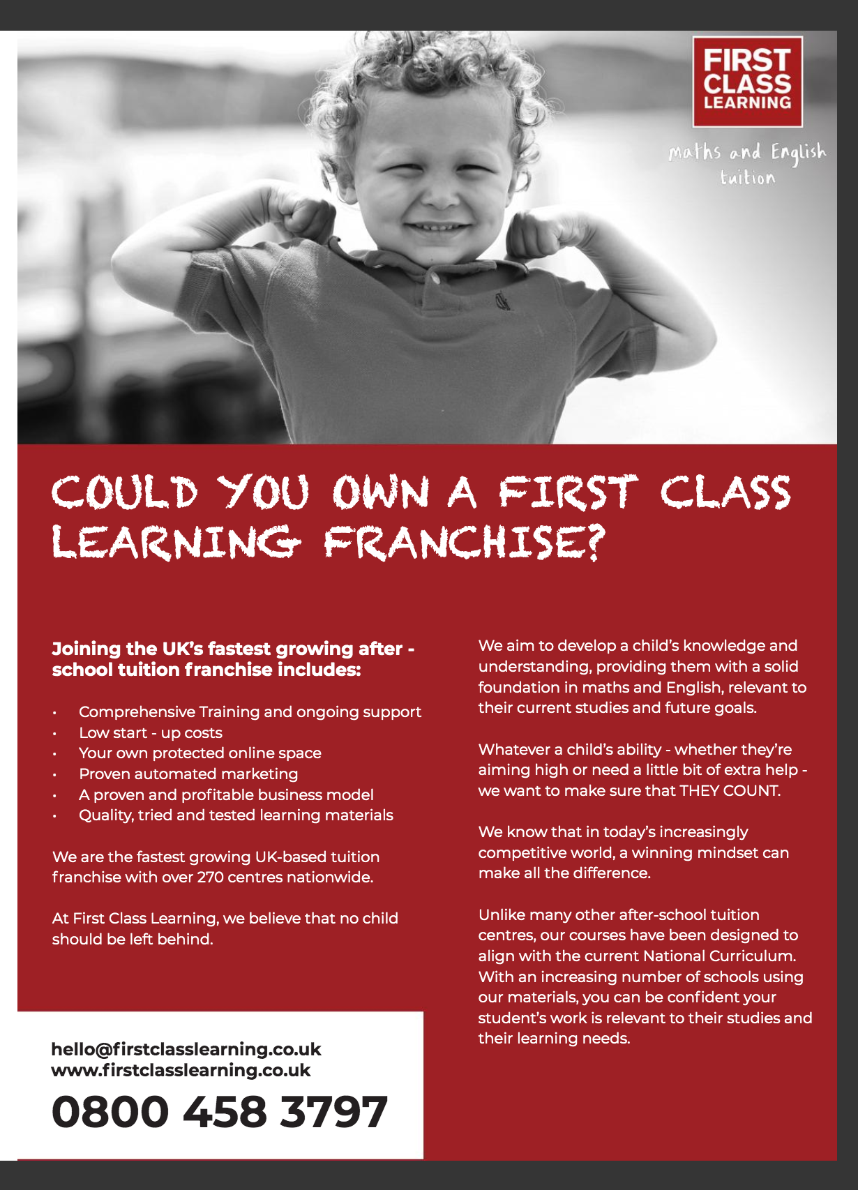
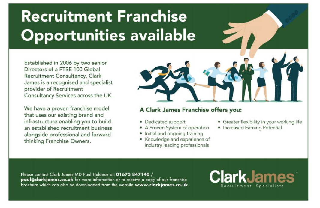
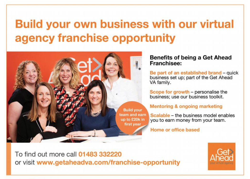
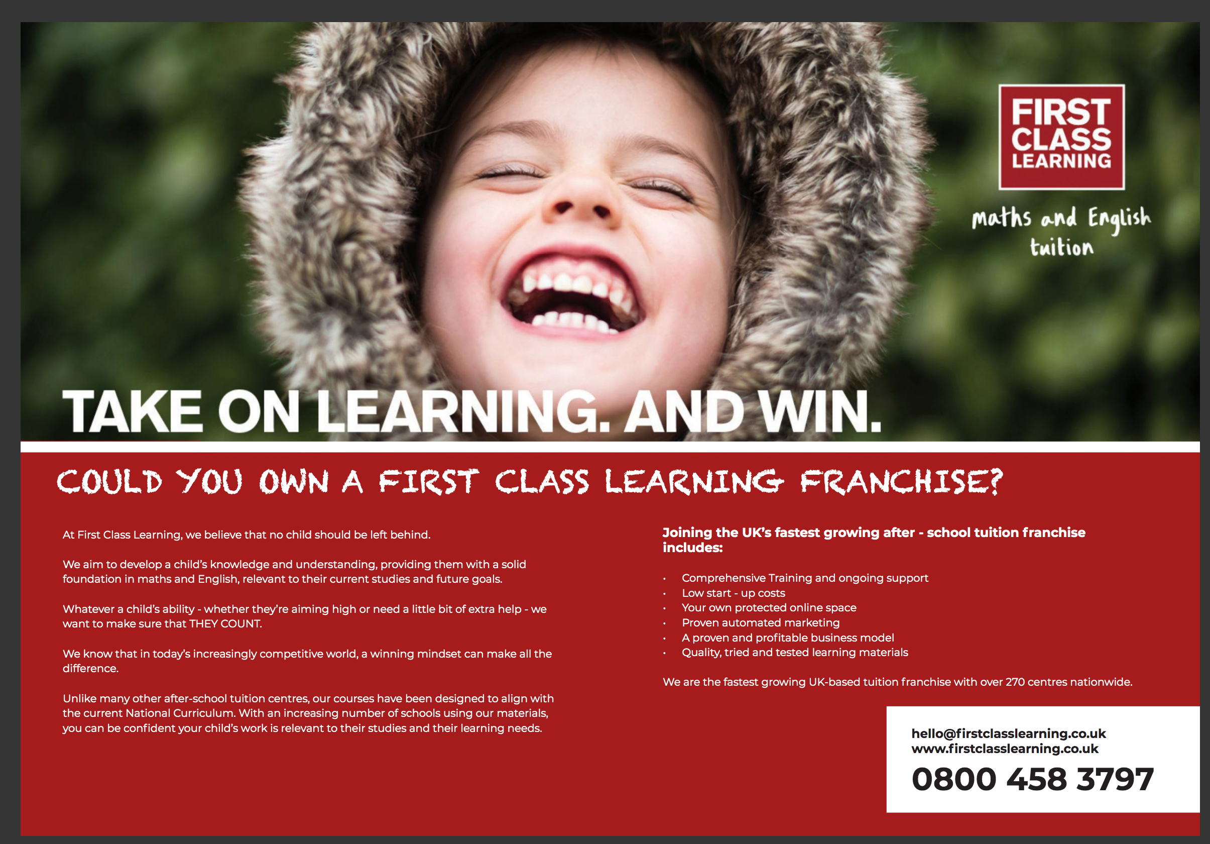
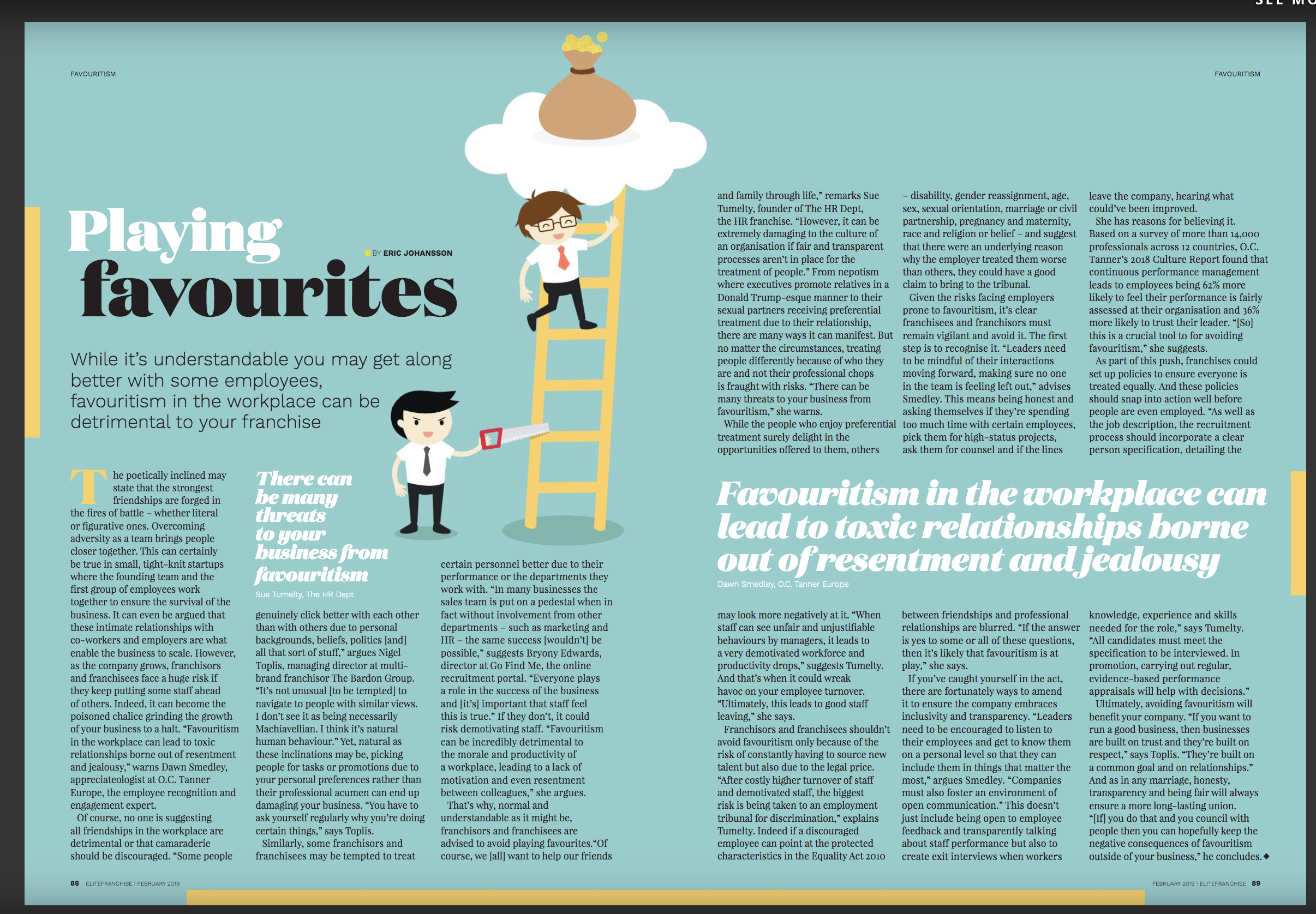
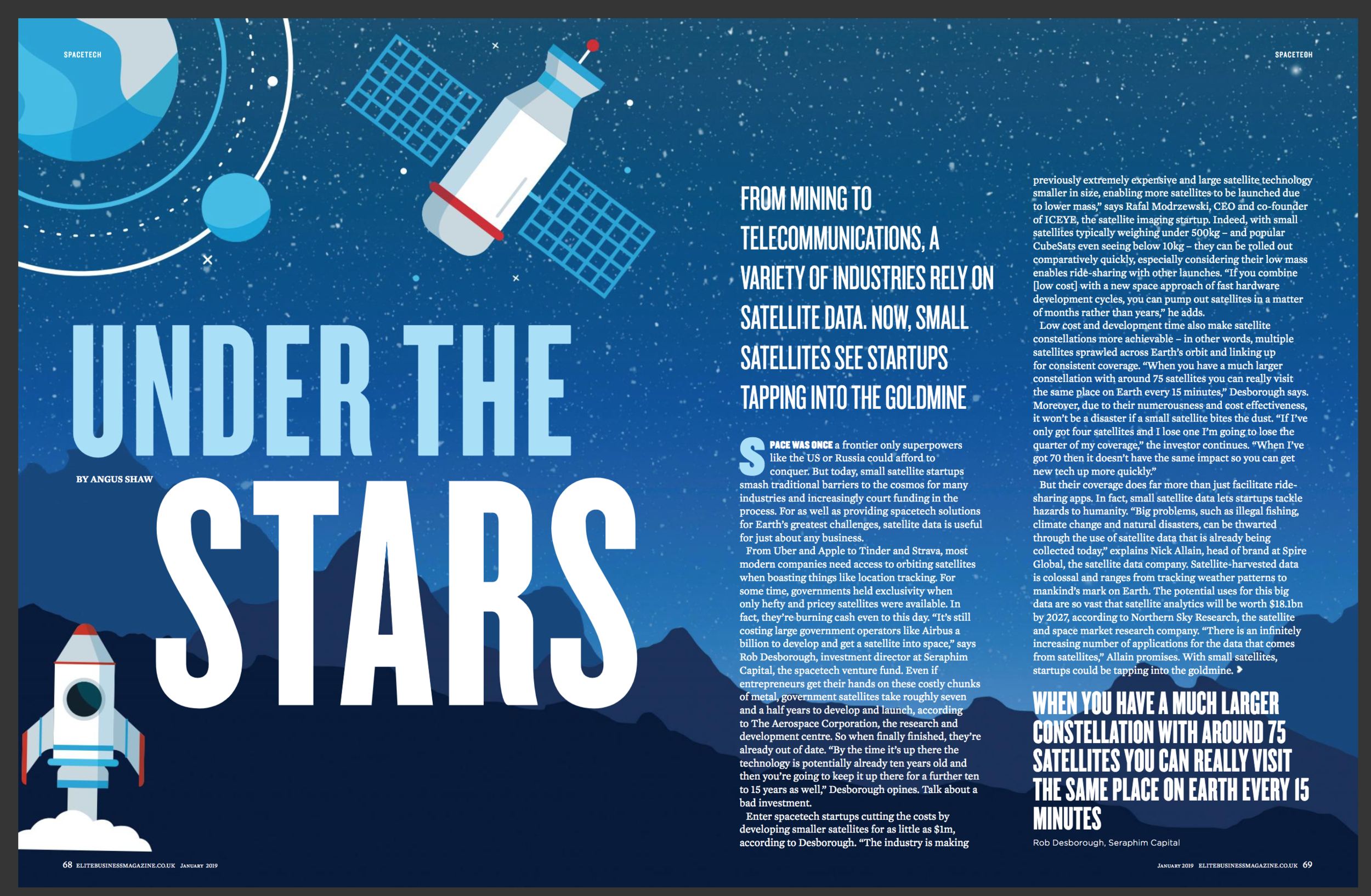
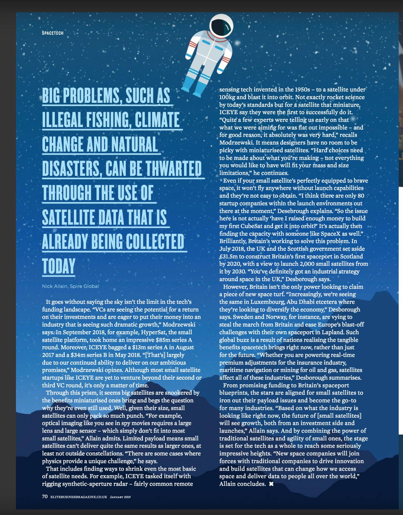
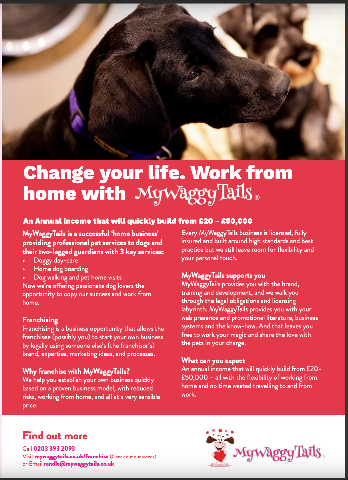
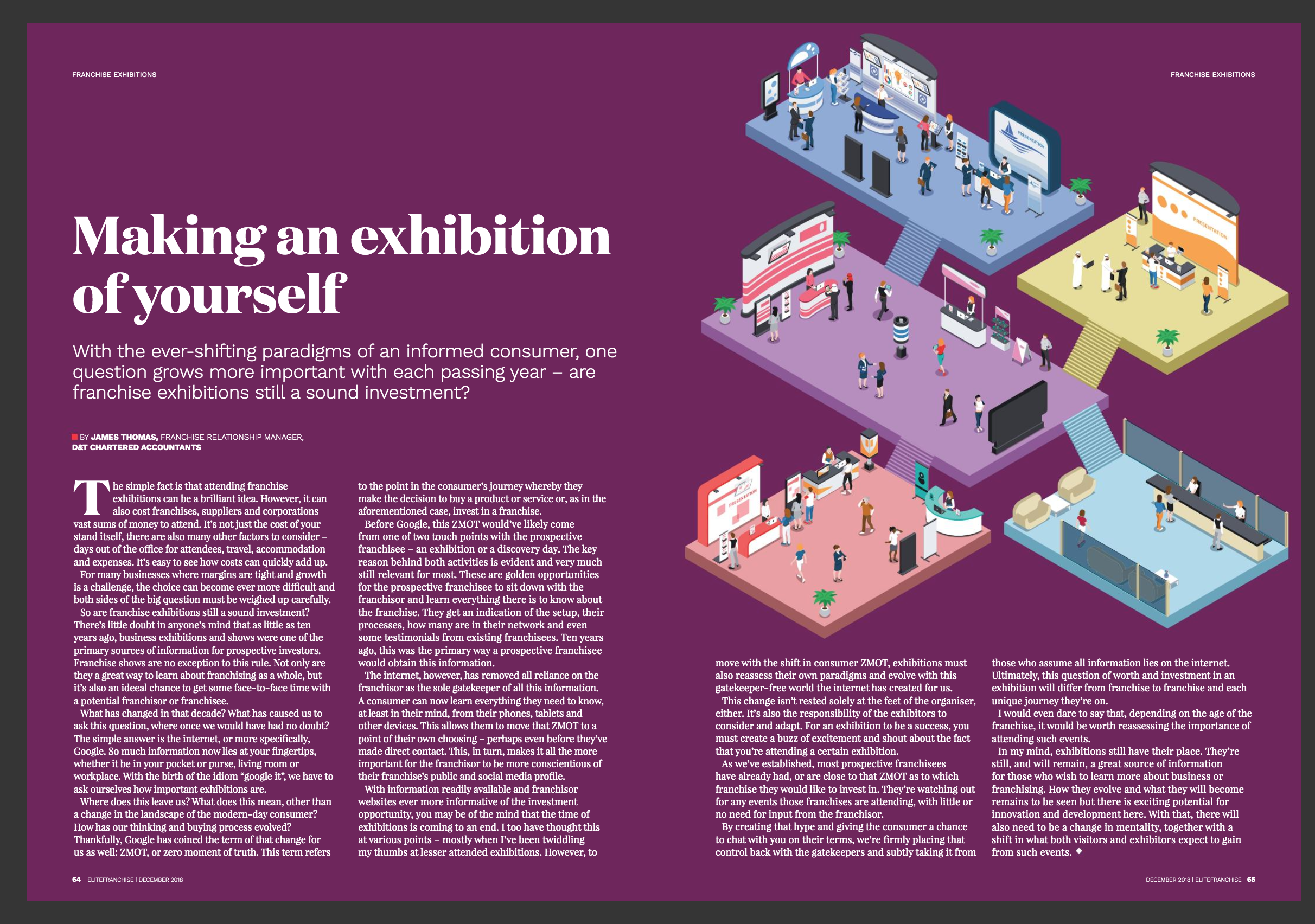
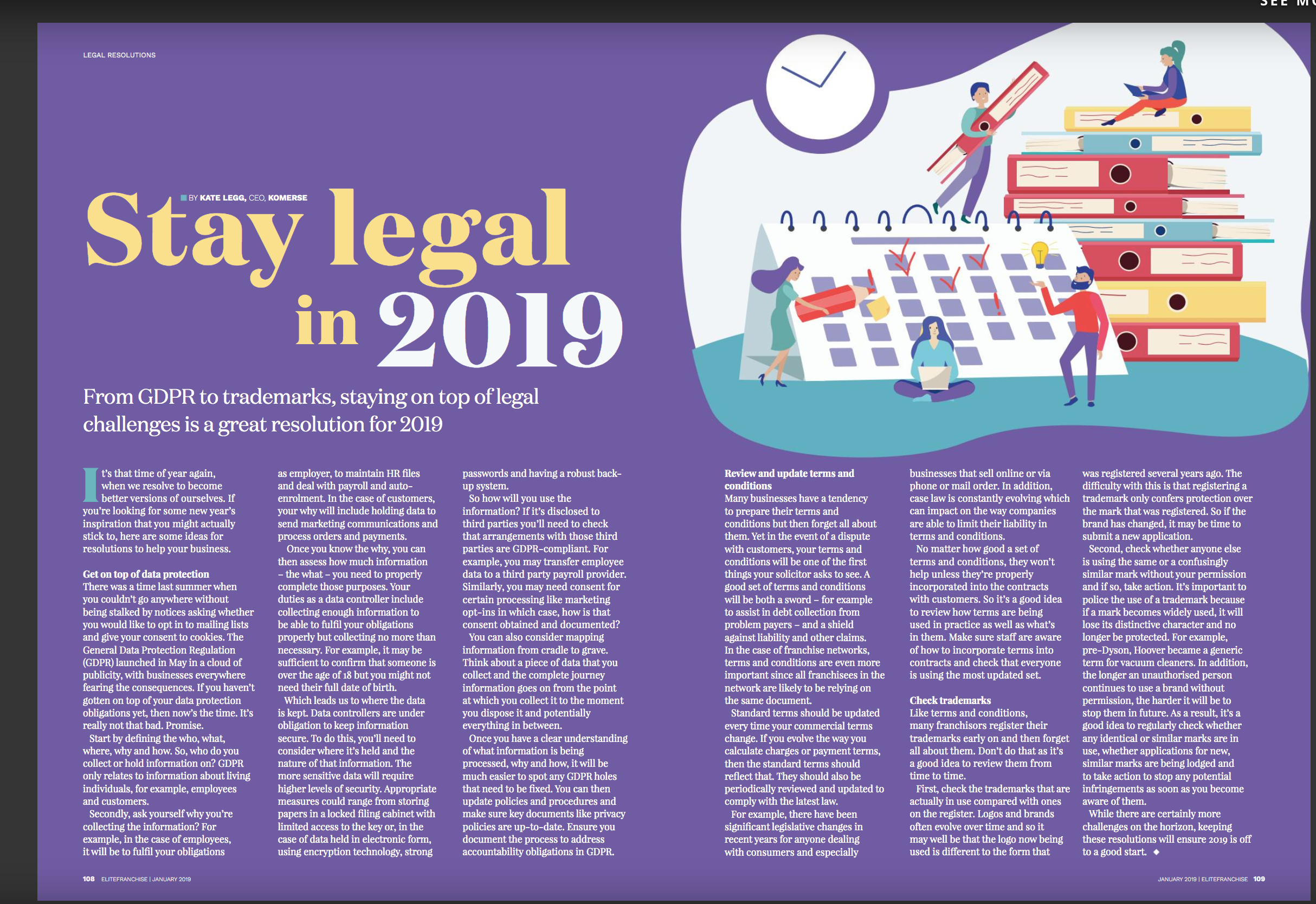
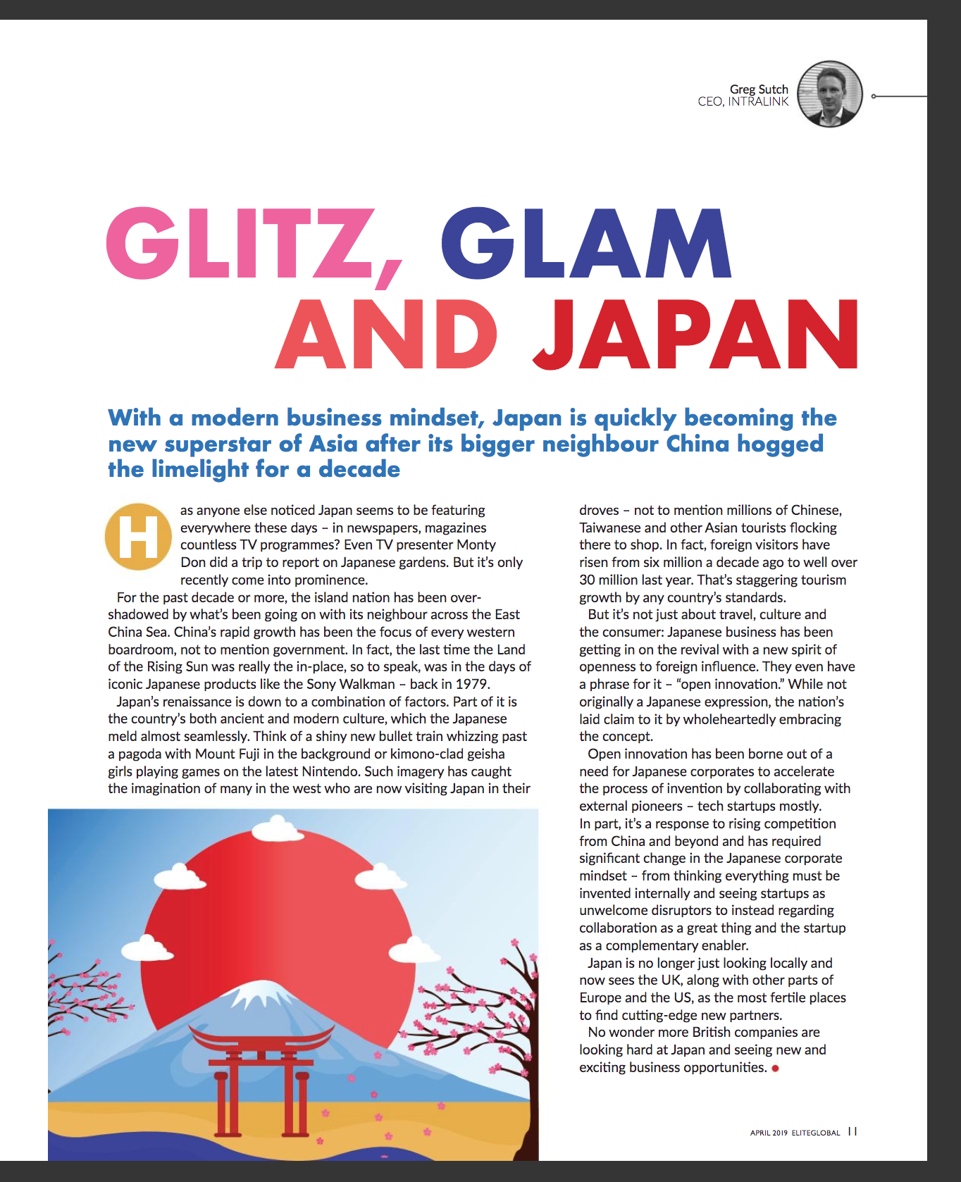
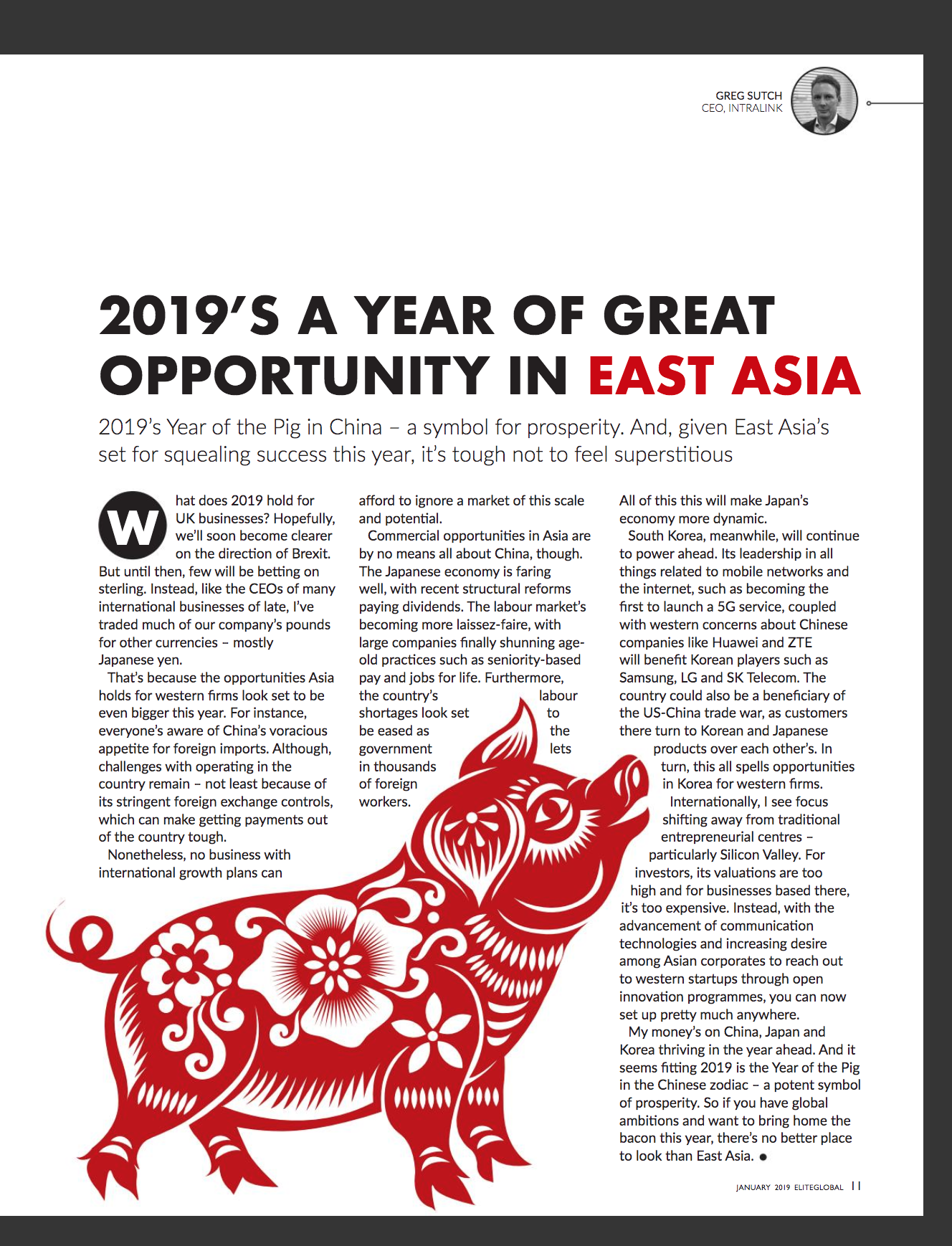
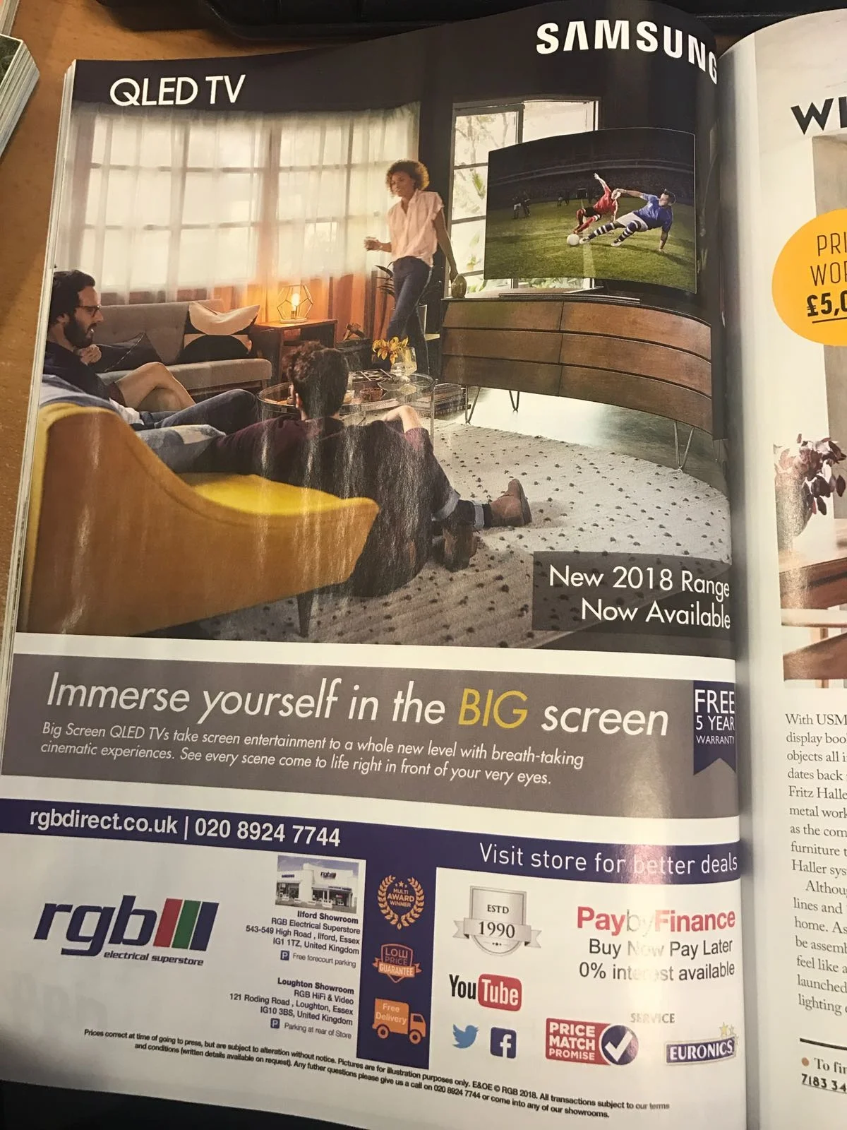
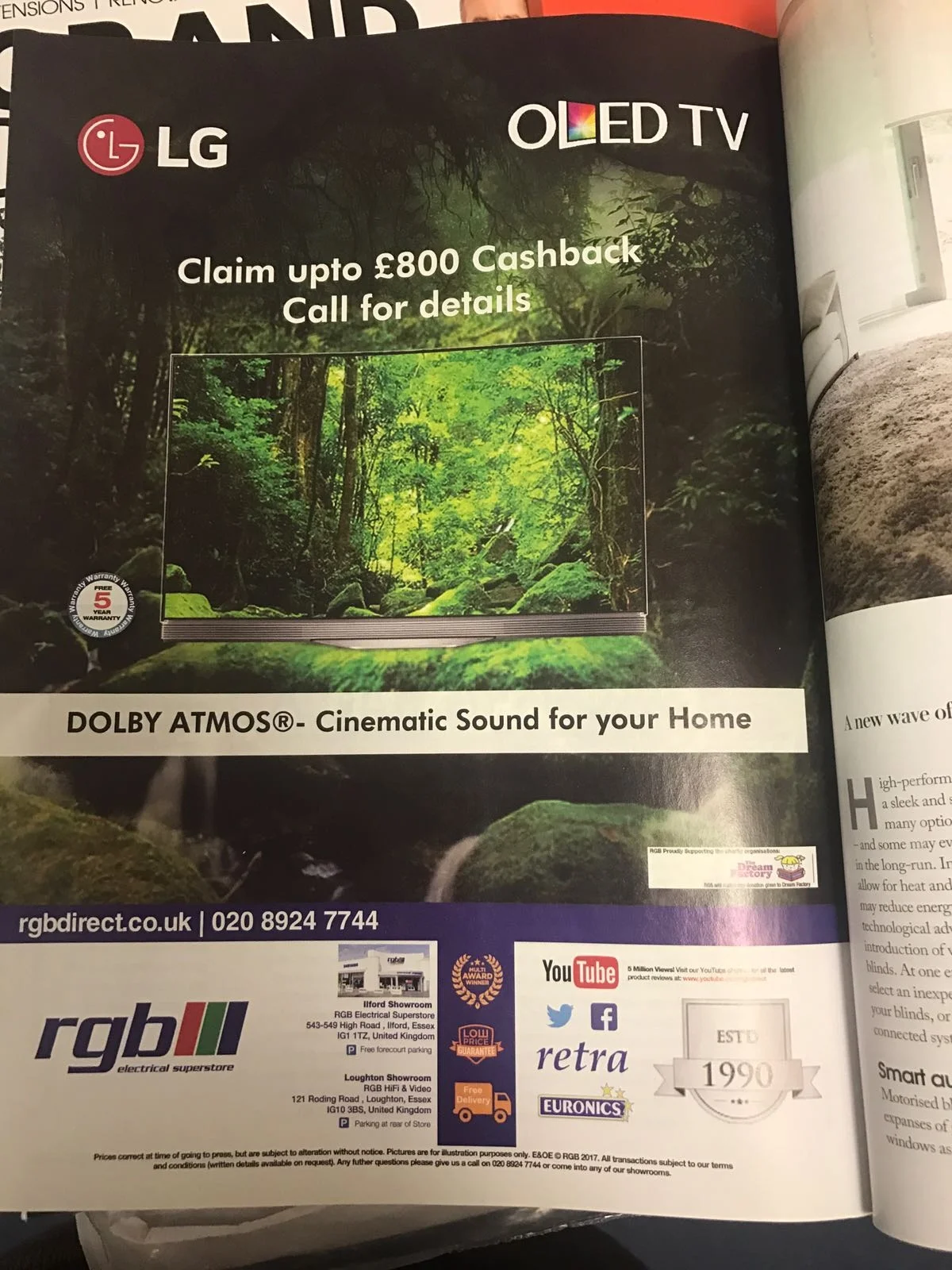
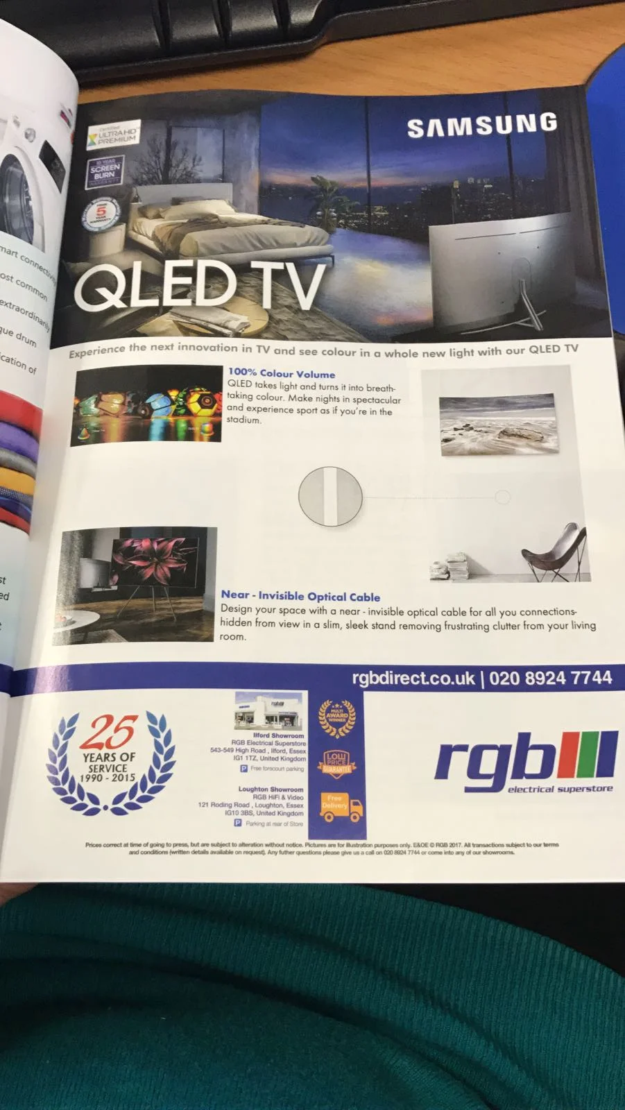
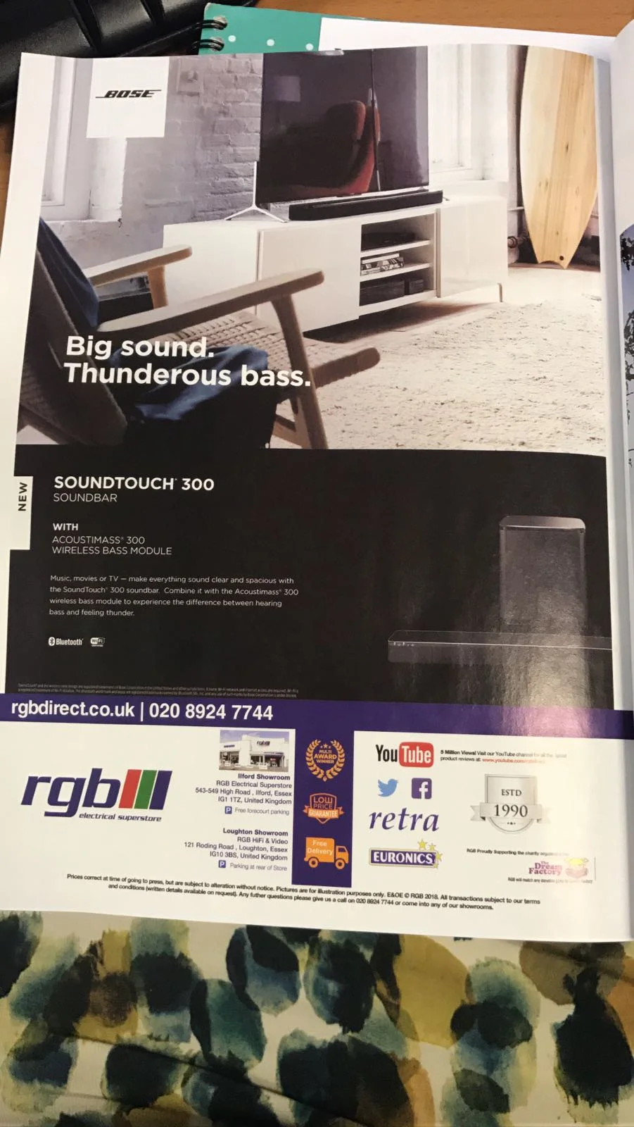
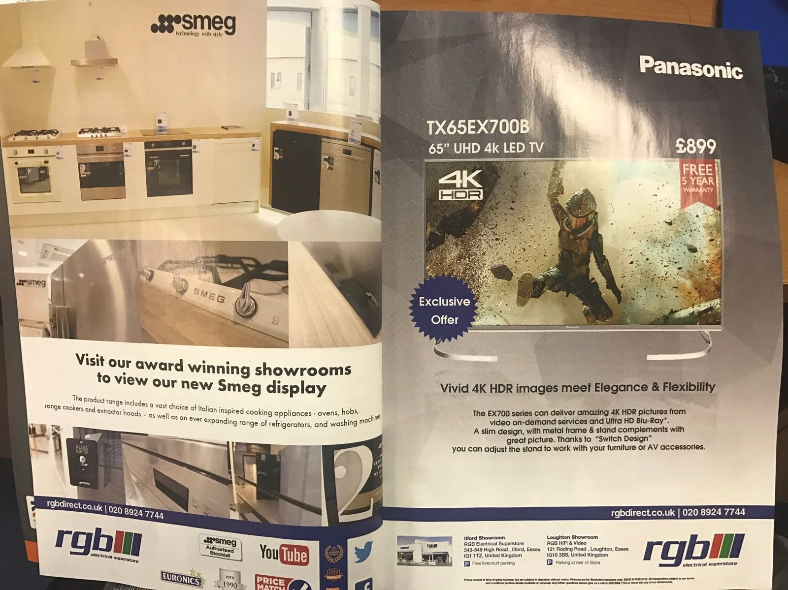
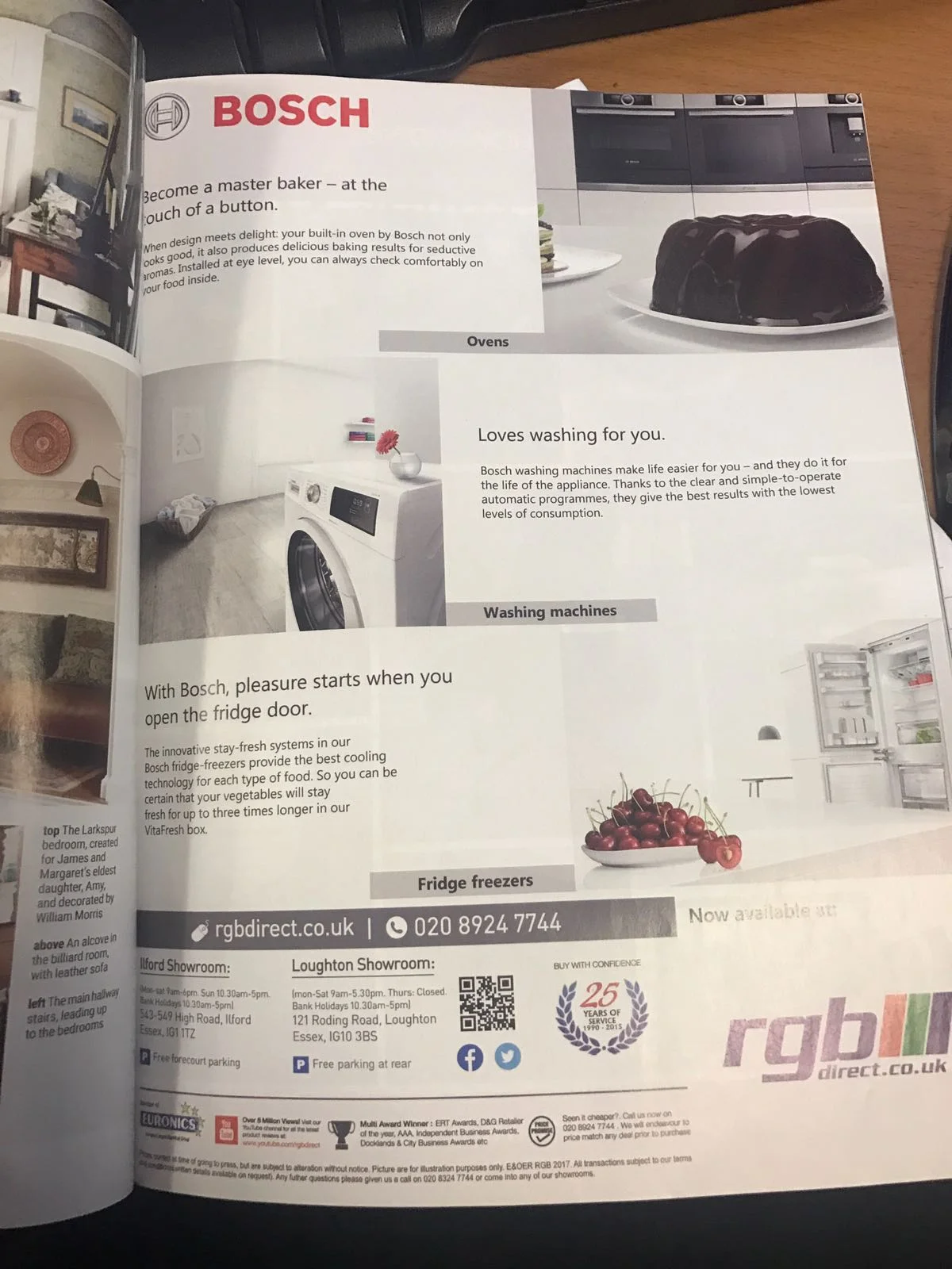
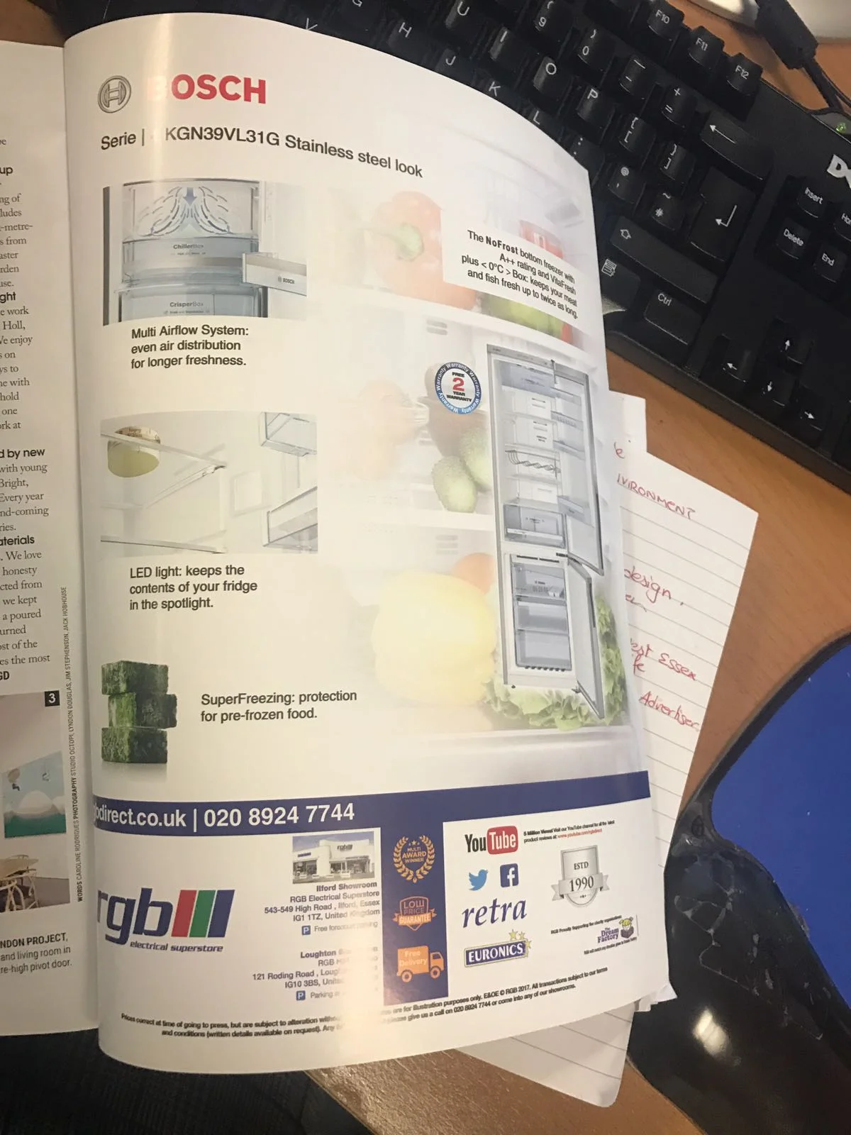
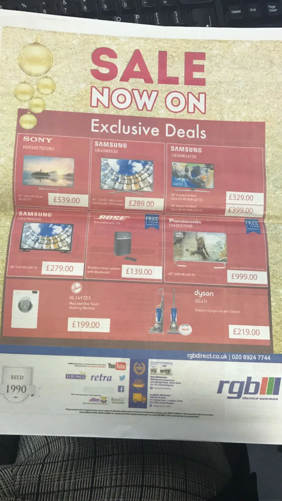
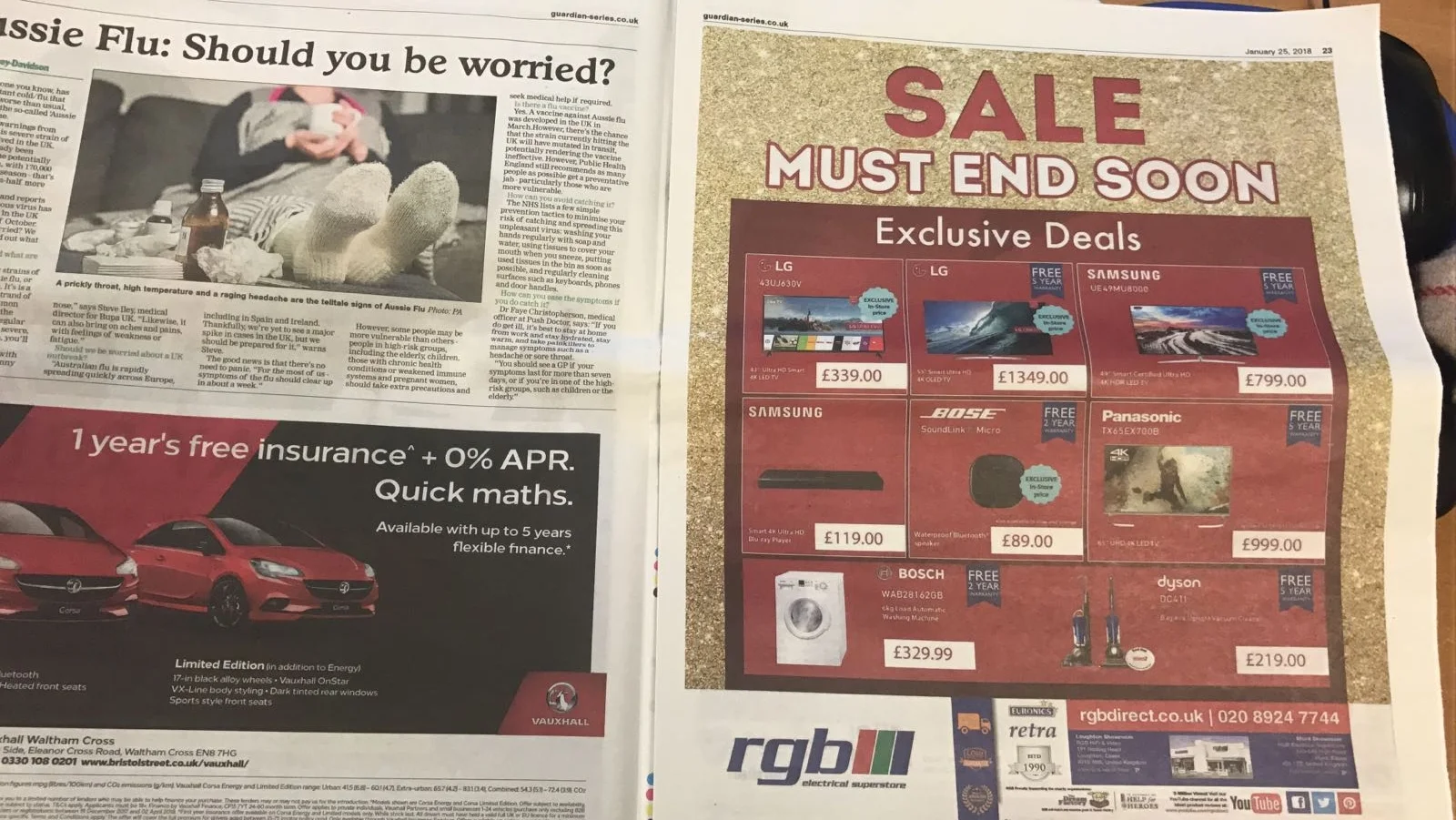
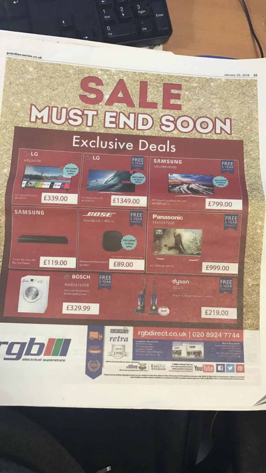
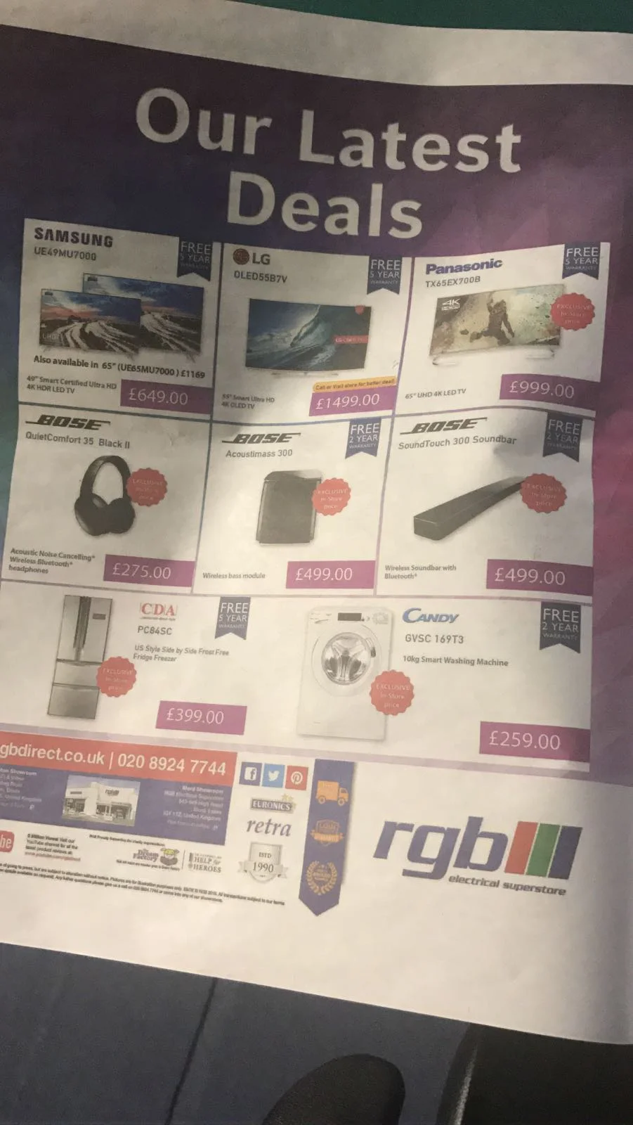
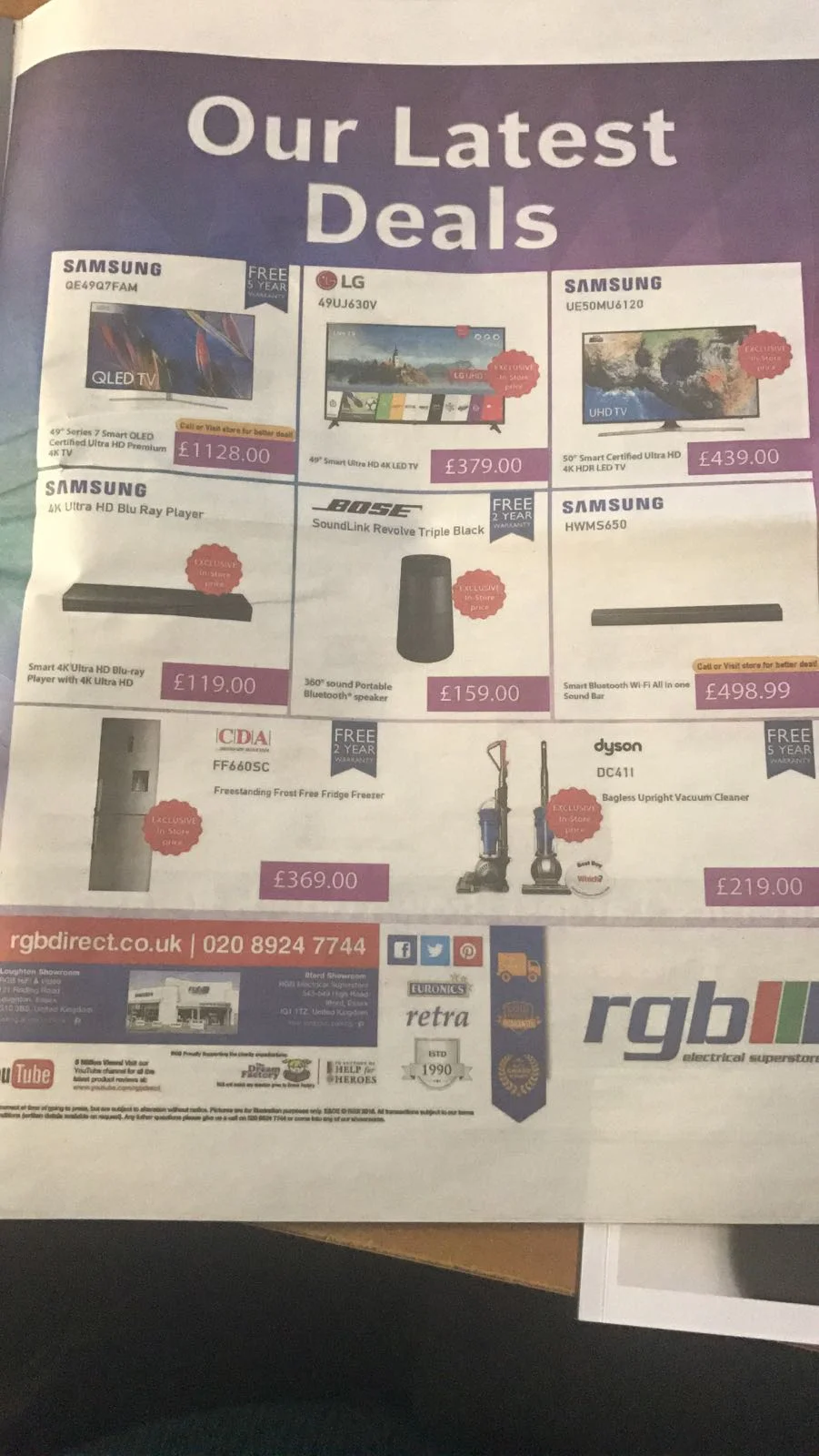
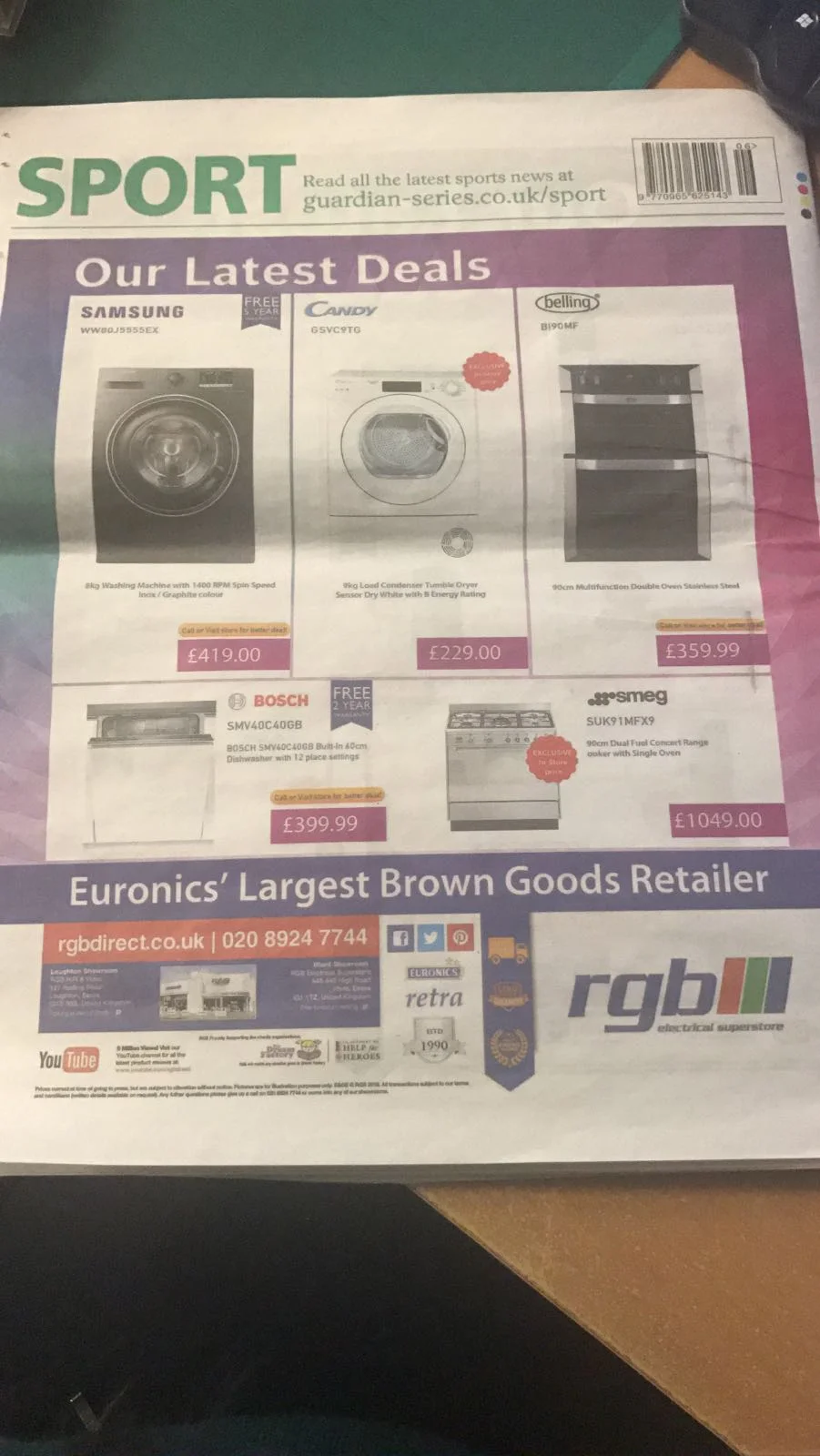
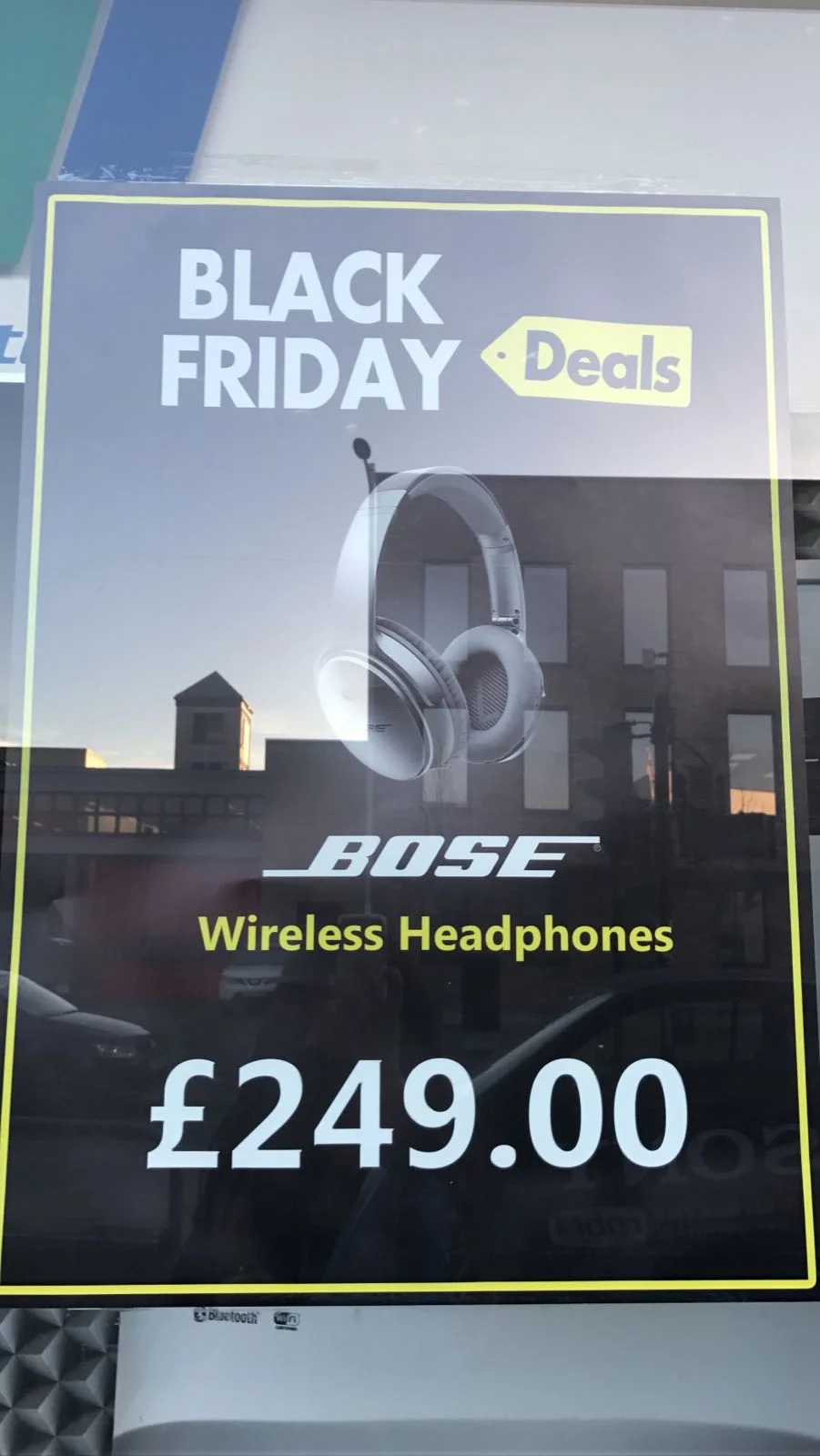
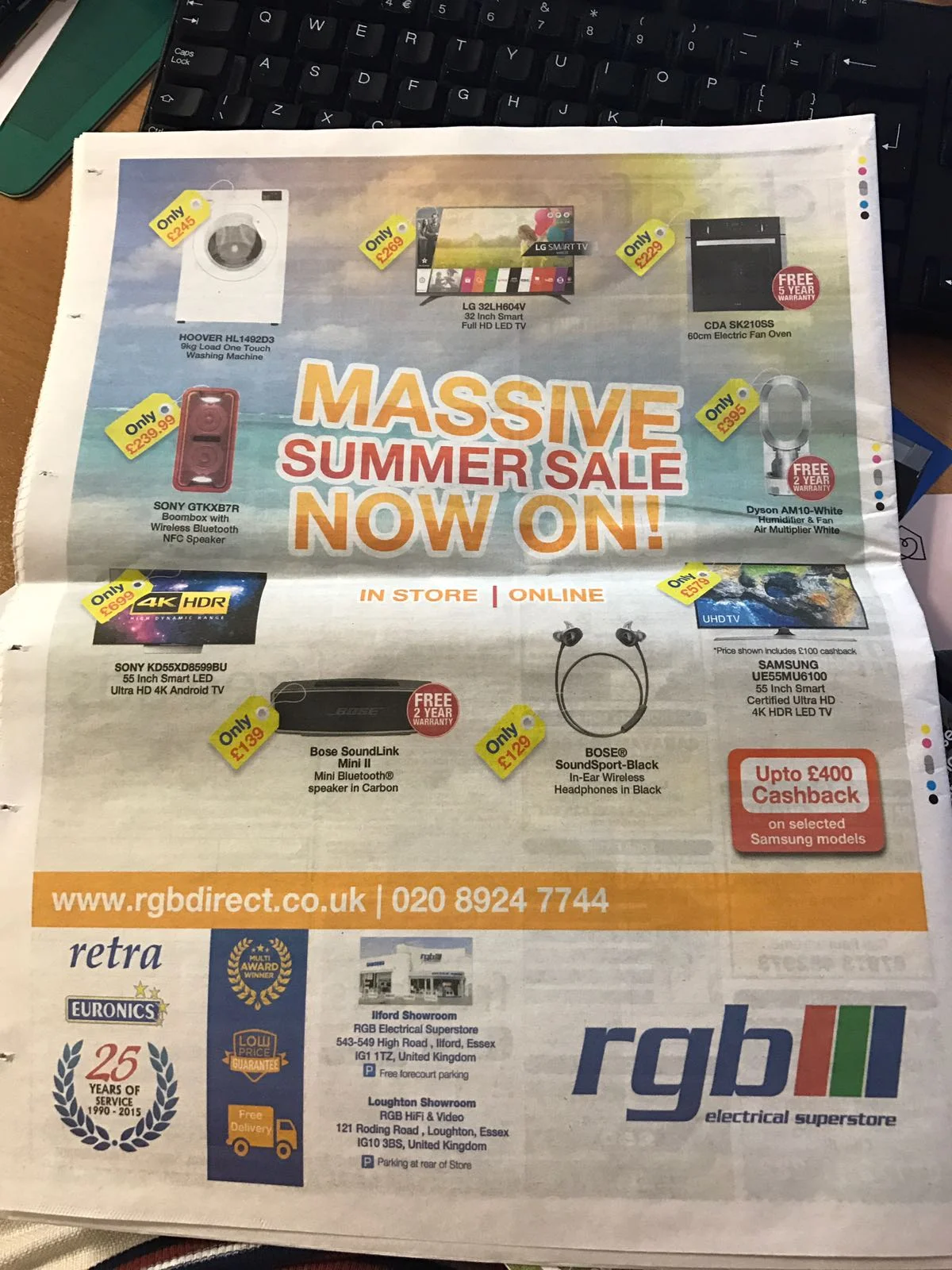
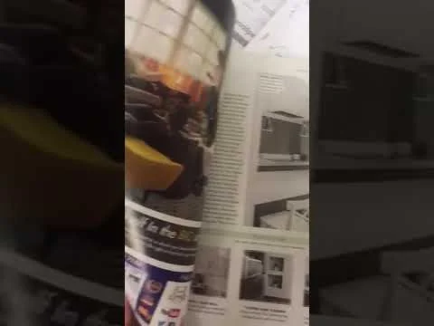
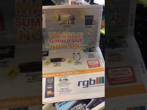
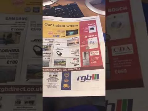
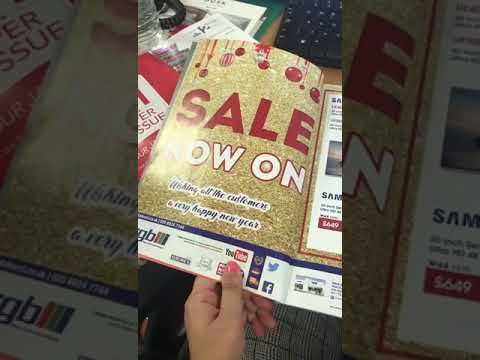
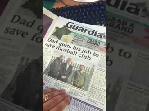
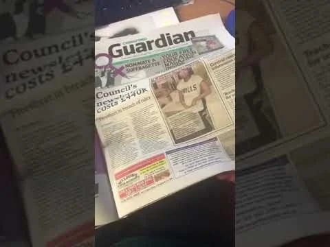
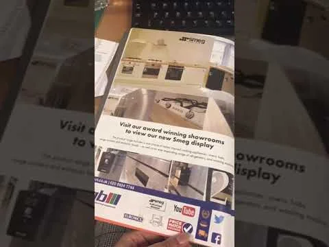
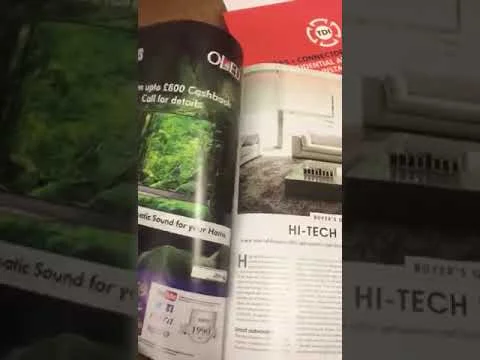
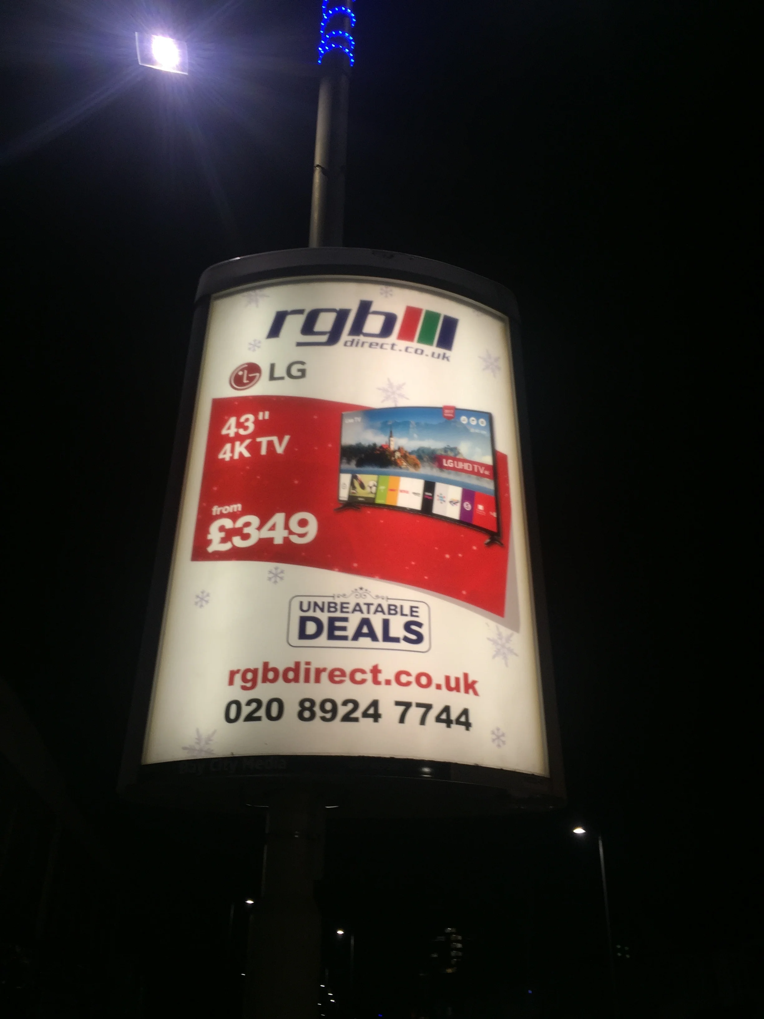
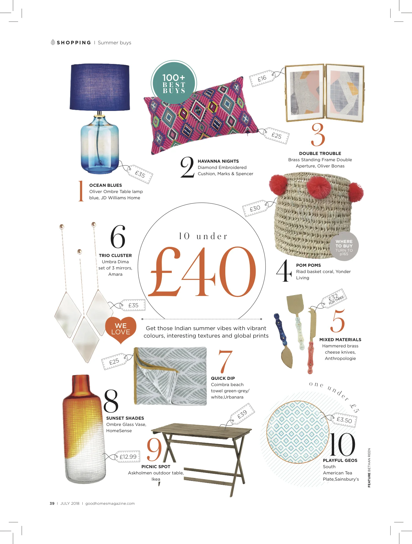
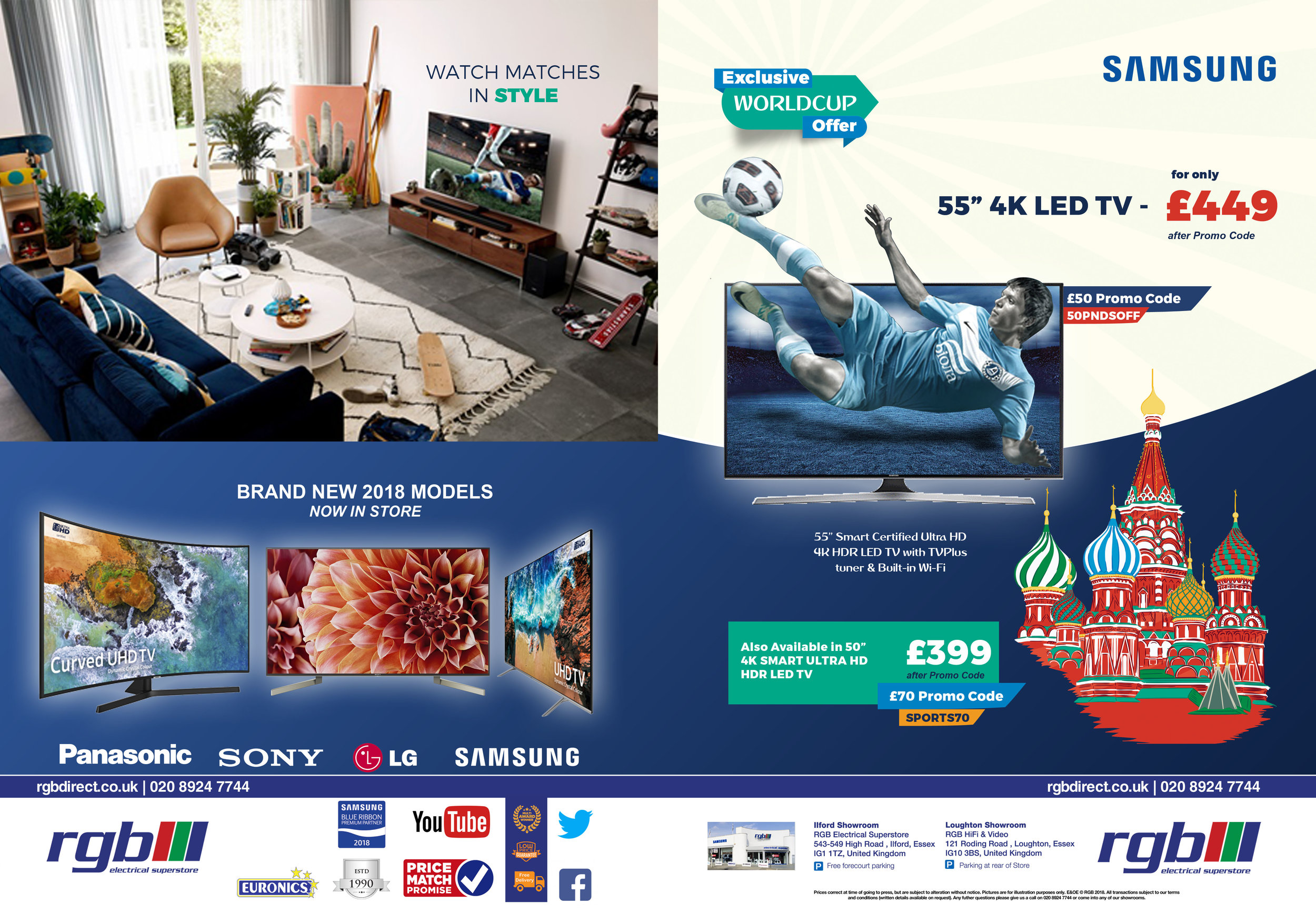
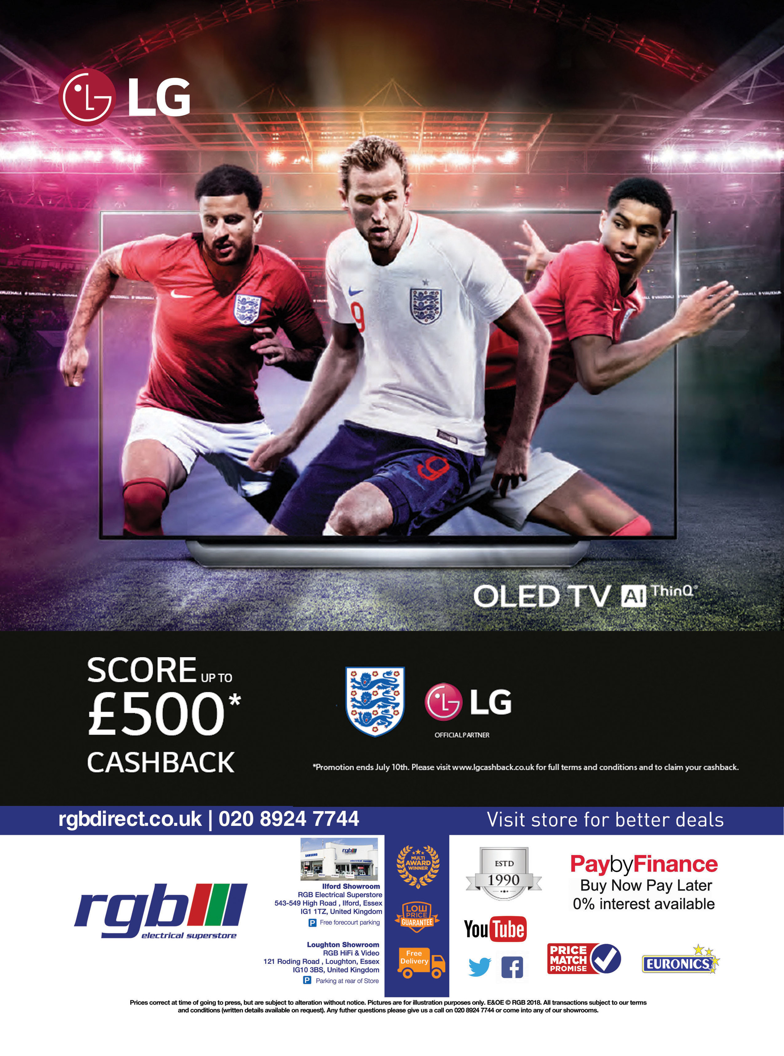
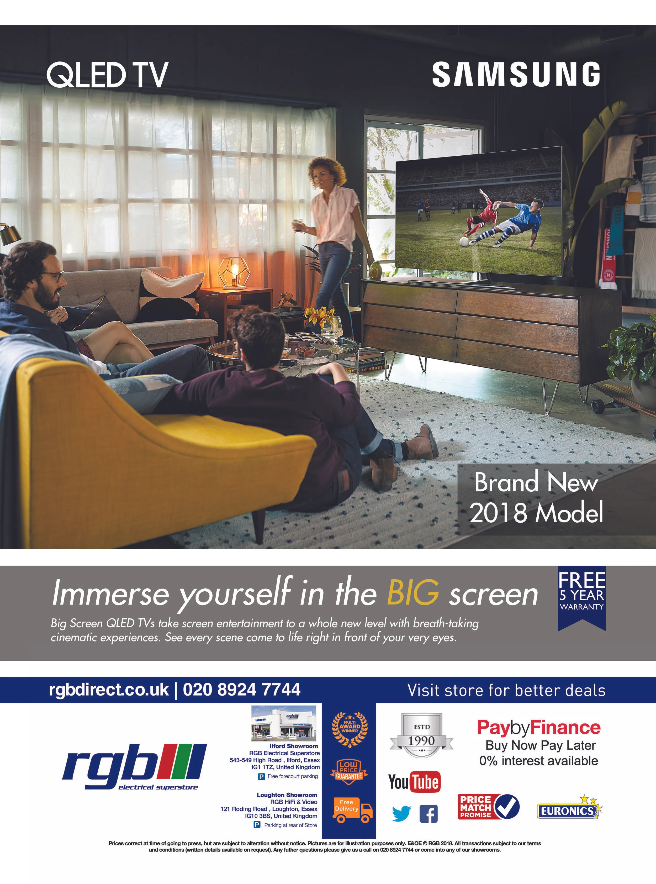
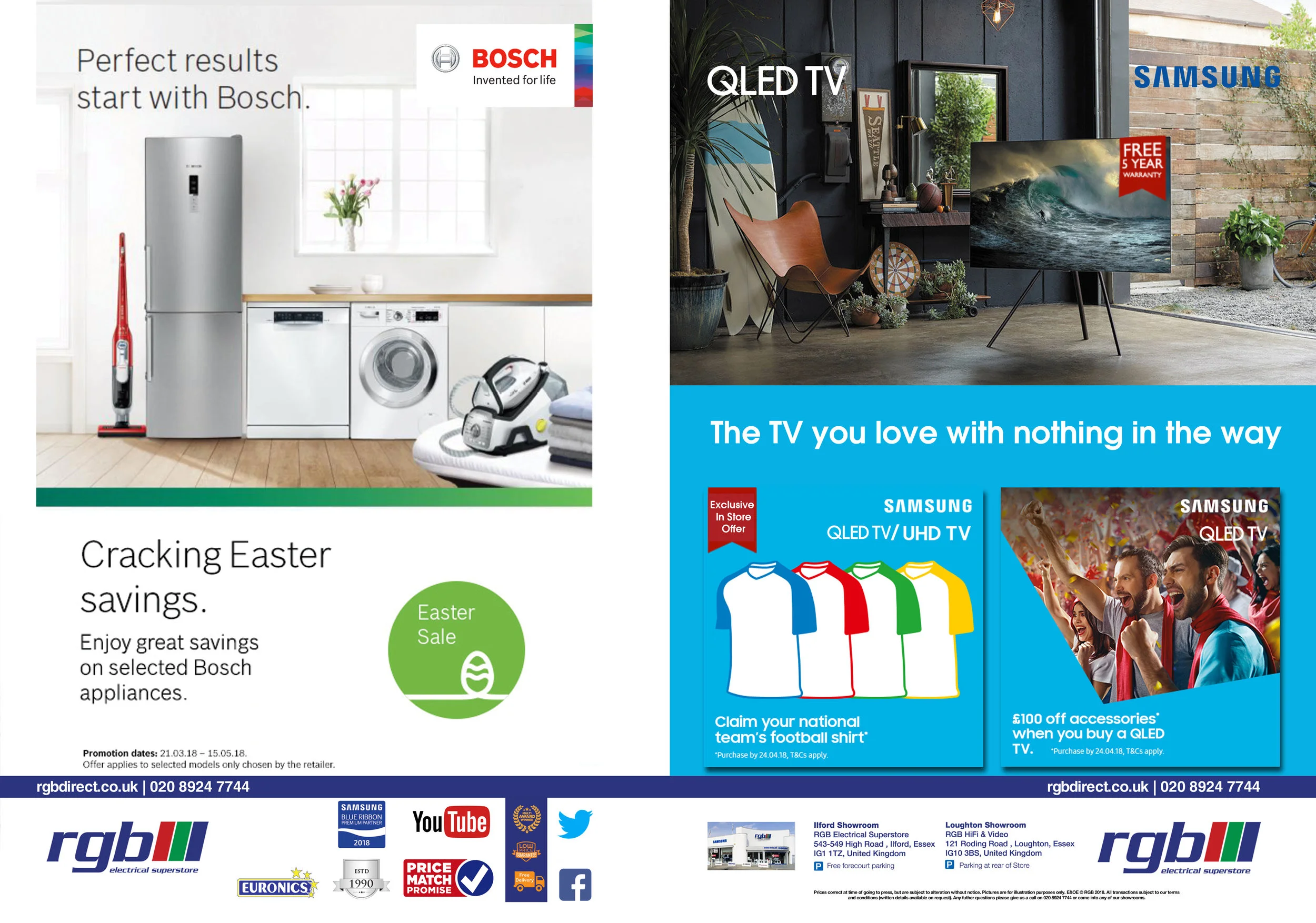
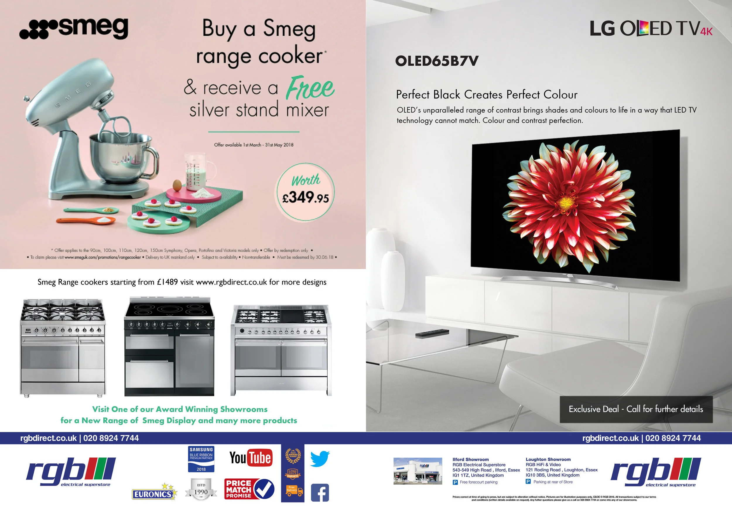
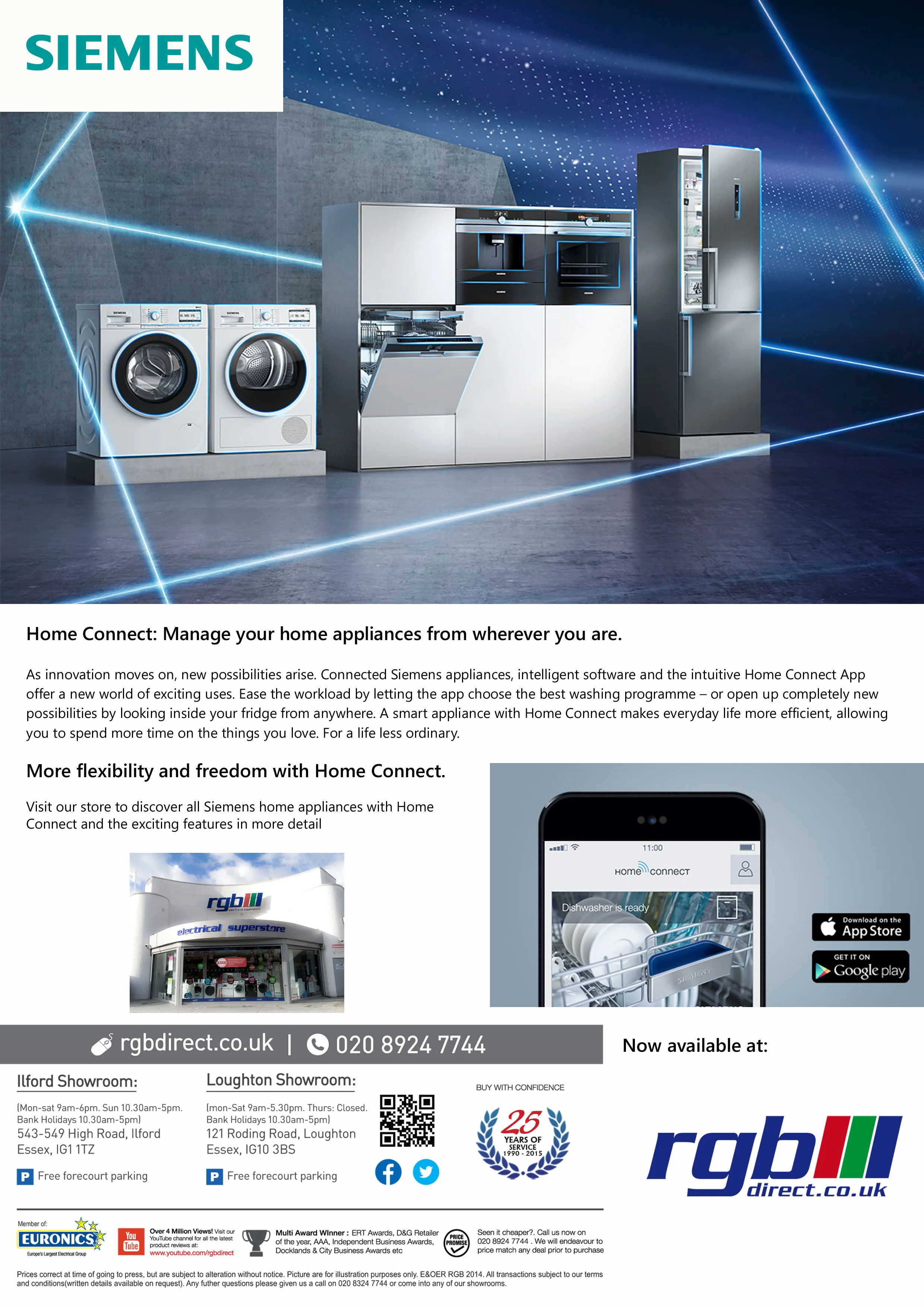
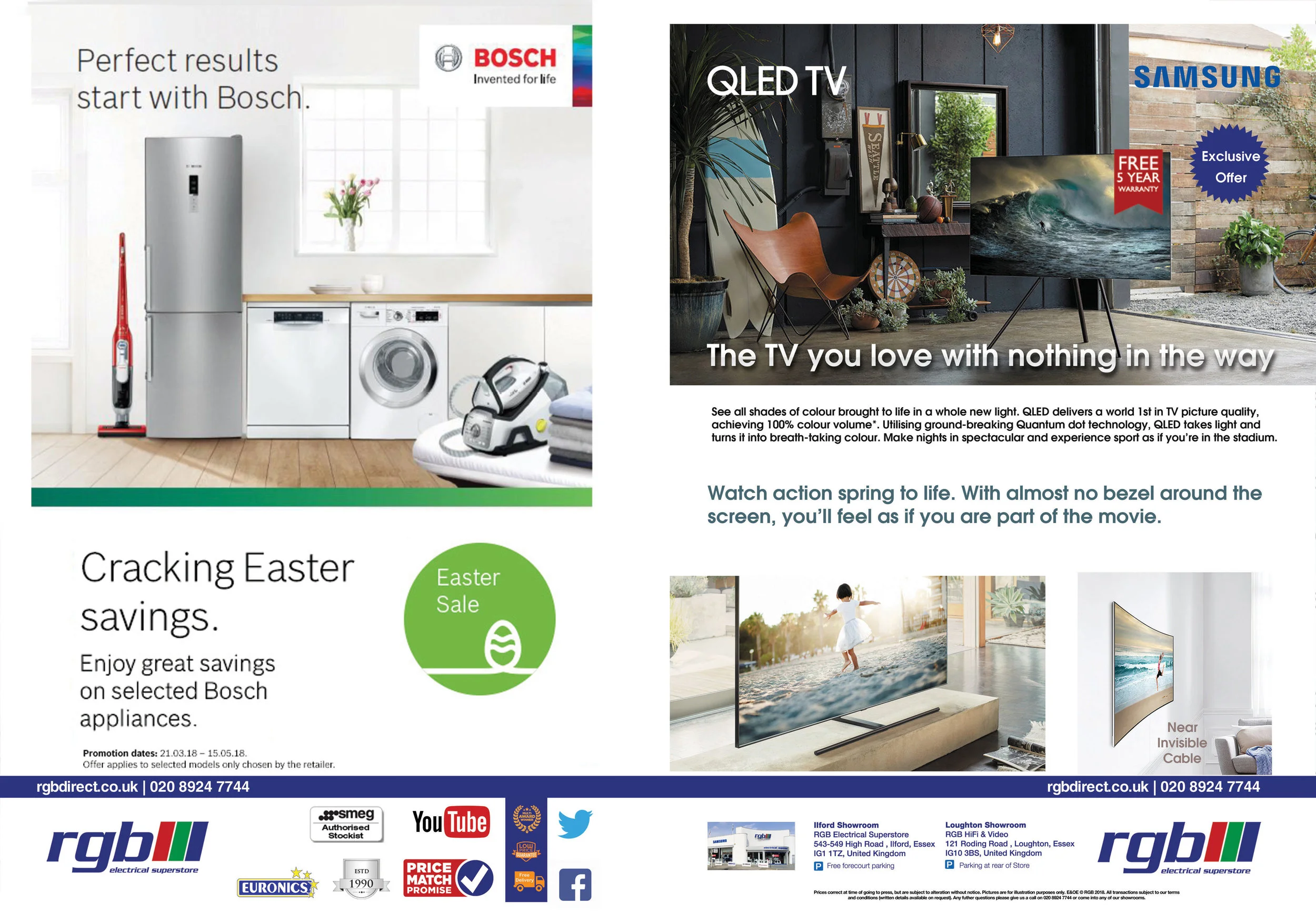
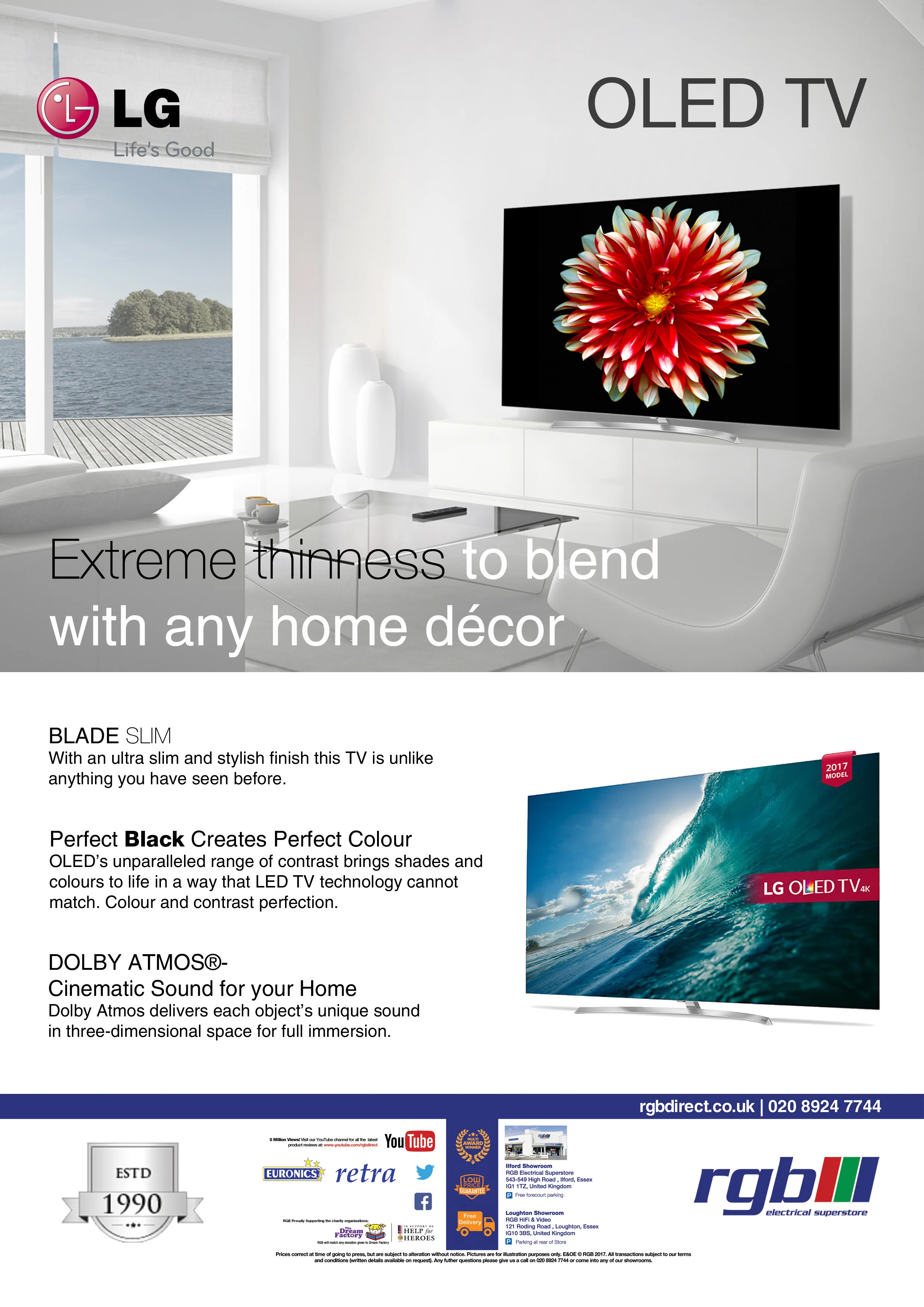
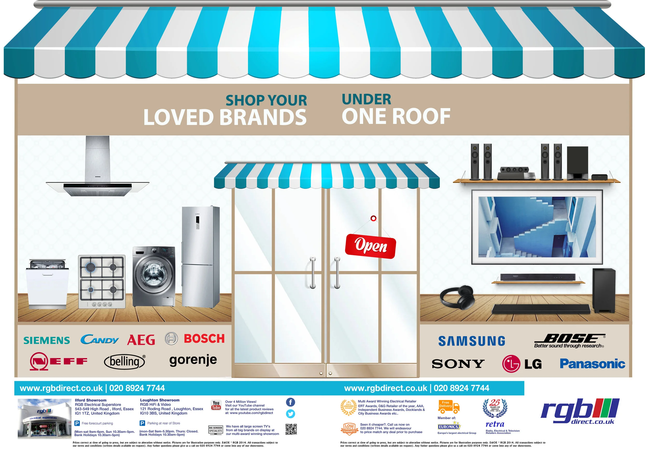
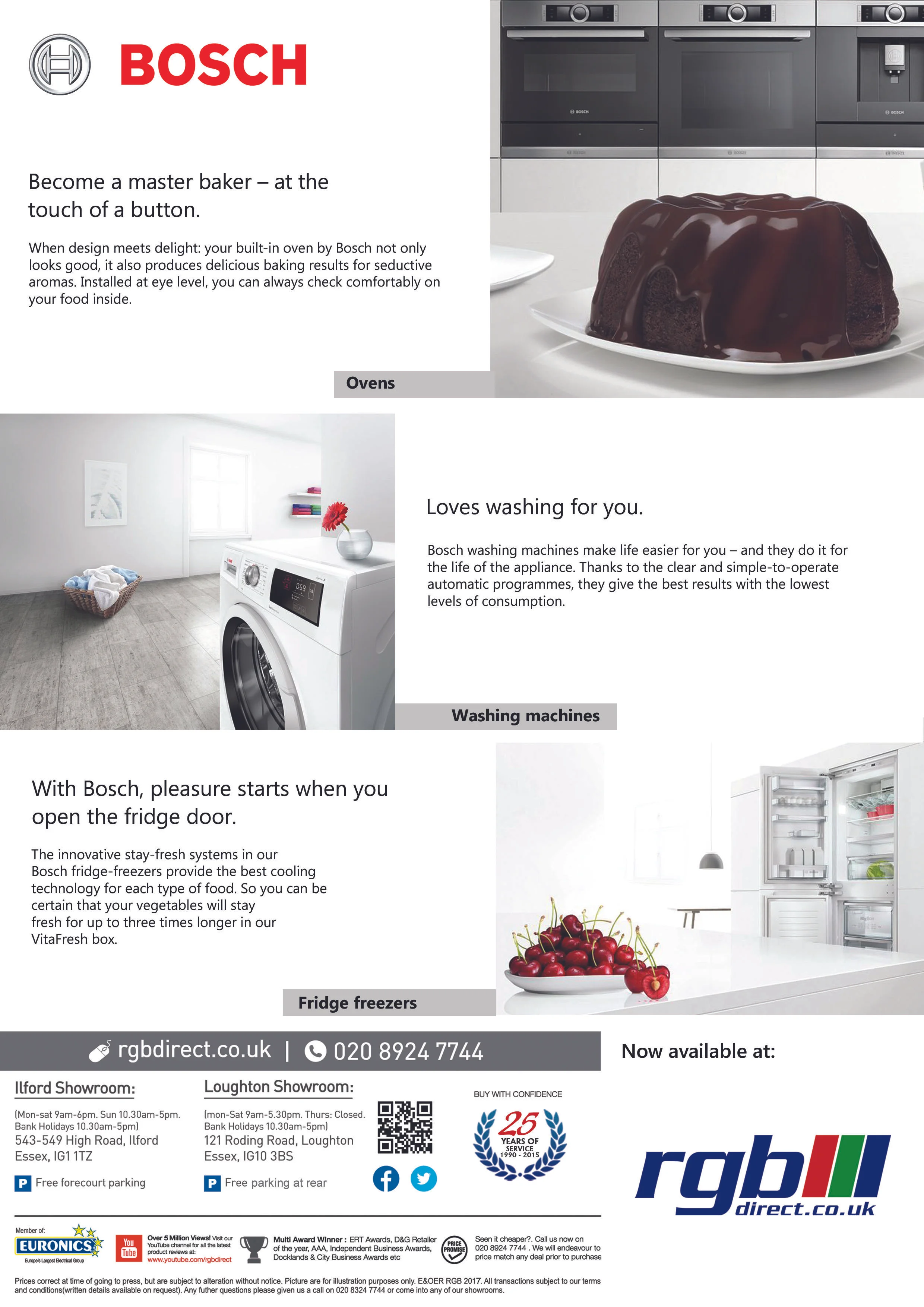
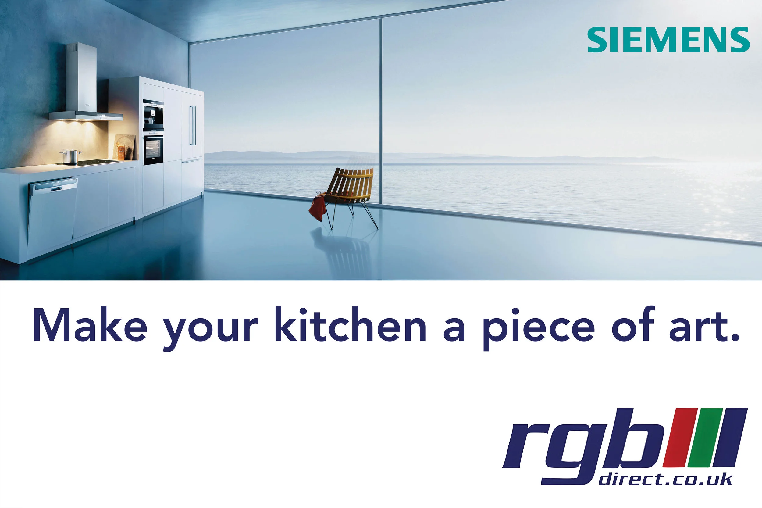
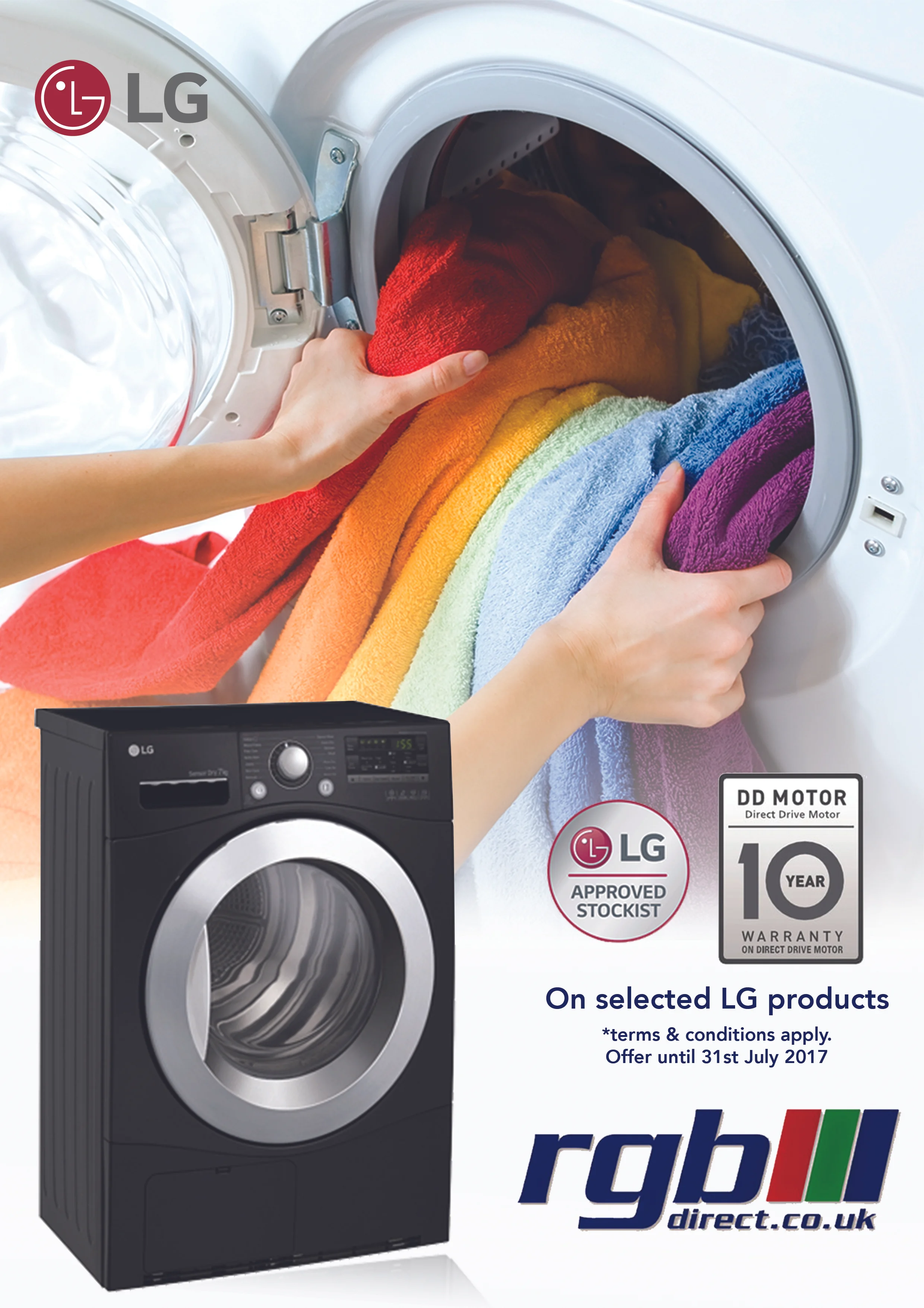
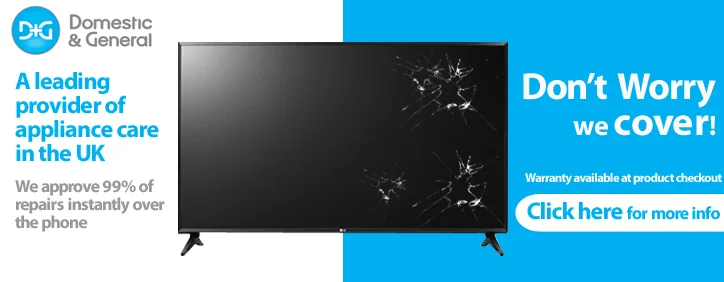
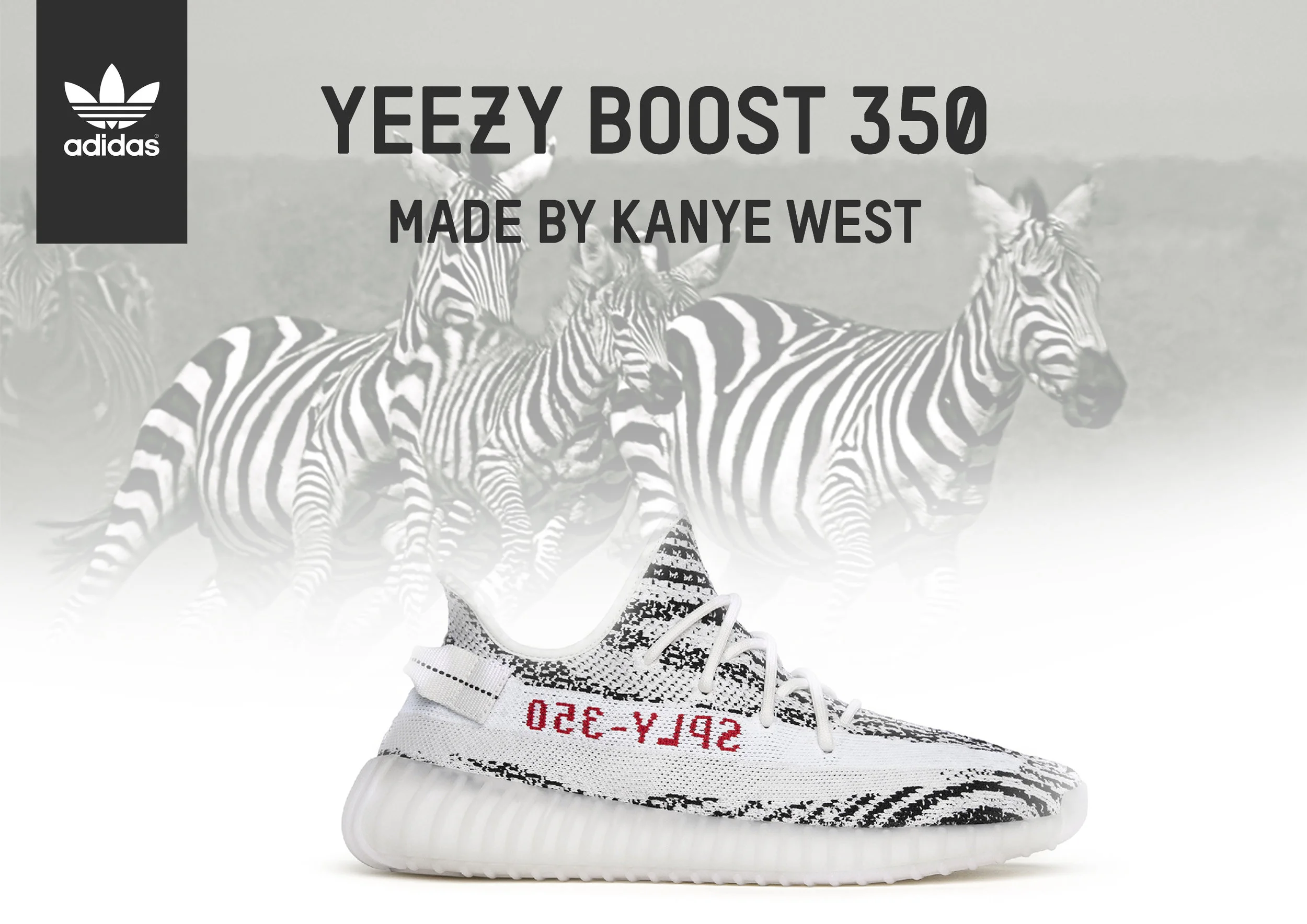
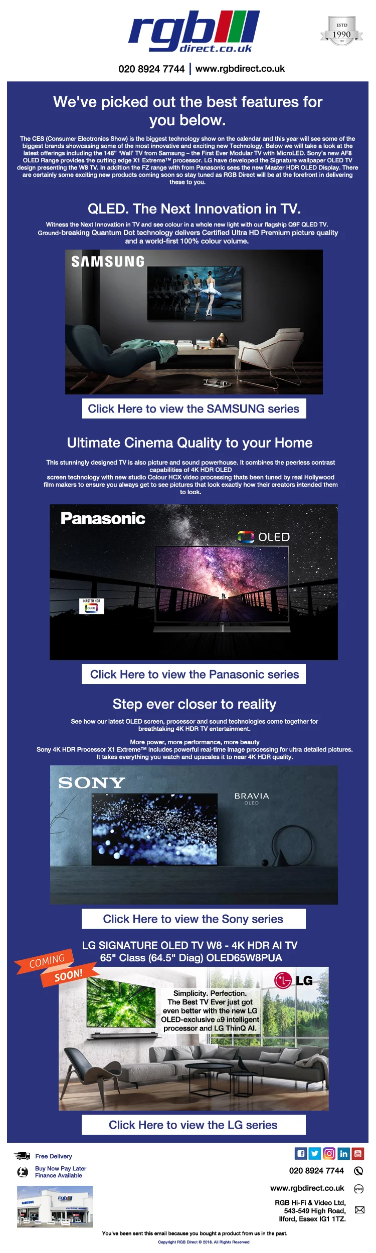
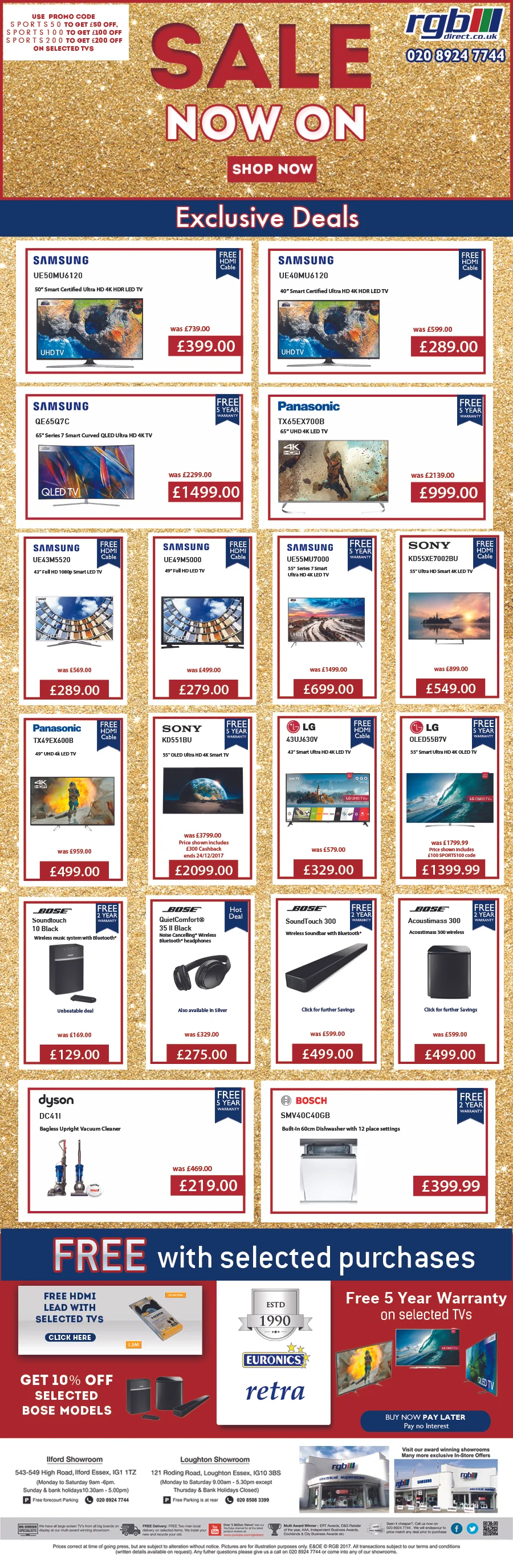
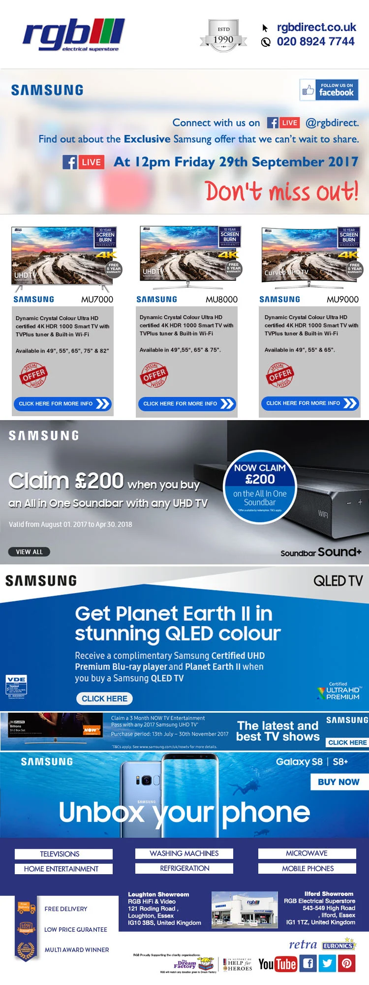
Below are few pages that I designed for magazines and adverts that I created for Channel Edge Media and RGB Direct. They include designs printed for magazines such as Grand Design, Good Homes, West Essex Life, Elite Franchise, Elite Business etc and Newspapers like Guardian, Yellow Advertiser and Enquirer. Also, other print based artwork for example Billboards, Lamp posts and A1 posters.